
The Quiet Drama of Recca Art's Abstract Eye Solar Eclipse
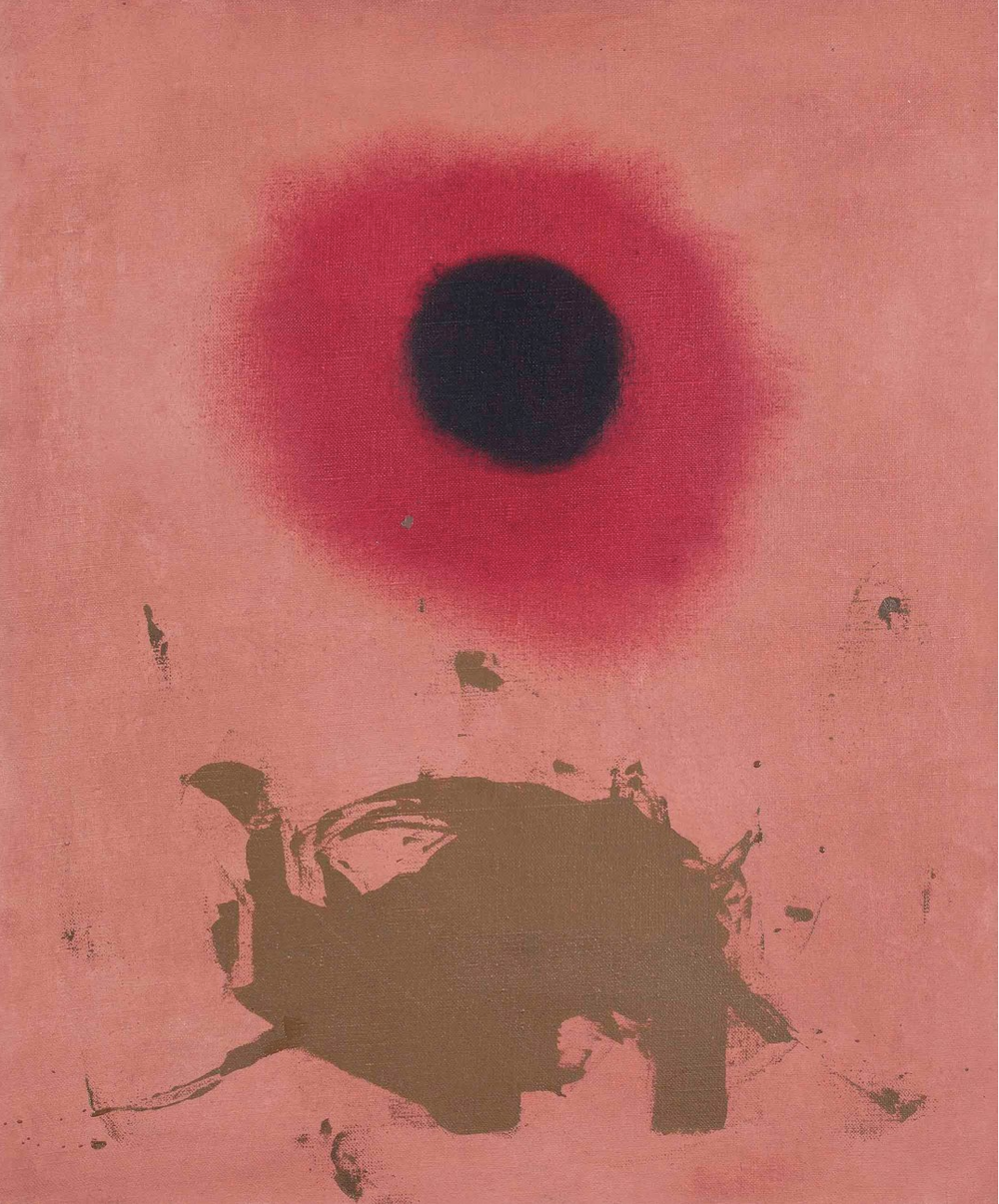
Recca Art's Abstract Eye Solar Eclipse pairs a soft salmon background with a deep crimson-to-black gradient circle and a grounded brown shape below. The composition feels both meditative and graphic, making it a strong small-scale focal point above a sofa, headboard, or console in contemporary, soft modern, and transitional rooms.
Quick read
A small print with the presence of something larger — quiet on the wall, but impossible to ignore.
Product reference
Piece: Abstract Eye Solar Eclipse - Wall Art by Recca Art
Format: Print
Size family: small
View the productThe first thing you notice is the circle. A dense black core fades outward through burgundy and rose, sitting against a warm salmon field like a sun caught mid-eclipse. Below it, a rough brown shape settles across the lower third — uneven, almost geological. That contrast between the soft gradient above and the textured form below is what gives Recca Art's Abstract Eye Solar Eclipse its pull.
It's a small print, but it doesn't behave like one. The composition is built around a single high-contrast focal point, which means the eye locks in immediately. On a wall, it reads more like a statement piece than a supporting accent.
What kind of wall art this actually is
This is a contemporary abstract print with pop-art and graffiti undertones — graphic enough to feel modern, but warm enough to avoid the cold edge that some abstract work carries. The coral pink background keeps the mood soft. The black-to-crimson gradient adds weight. The brown floor shape gives it gravity.
If you're comparing it to other abstract wall art, think of it as the middle ground between a moody black-and-white print and a bright pop-art canvas. It has color personality without leaning loud.
How it changes a room
In daylight, the salmon background reads brighter and the gradient feels airy. Under lamplight, the burgundy ring deepens and the black core looks almost velvet. Rooms with warm bulbs will pull more of the coral and terracotta tones forward; cooler light flattens it slightly and emphasizes the graphic shape.
It pairs especially well with walnut wood, cream linen, and terracotta accents. Against a white wall it feels crisp and gallery-like. On a warmer wall color — bone, putty, soft clay — it settles in and reads more atmospheric.
Who it suits
This piece works for buyers who want one strong visual moment instead of a busy gallery wall. It fits contemporary, soft modern, and transitional interiors most naturally. If your room already has a lot of pattern or competing artwork, the eclipse can feel crowded. Give it space, and it rewards you.
It's less suited to traditional, heavily ornamented rooms or maximalist setups where every wall is already doing something.
A quick styling scenario
Picture a low, linear sofa in cream linen. A walnut coffee table. A terracotta throw folded over one arm. Hang the print centered above the sofa, slightly higher than you'd instinctively place it — the circle wants air around it. The result is a living room that feels considered without feeling staged.
In a bedroom, position it behind the headboard on a calm wall color. The warm tones keep the room intimate while the dark center adds quiet drama. In a dining room, place it on the wall opposite the table or above a narrow sideboard so it becomes the view during meals.
Common mistaken assumptions
Because the composition looks minimal, some buyers expect it to disappear into the wall. It doesn't. The contrast between the black core and the coral field is strong enough that the piece commands attention even at smaller scale. Plan around it as a focal point, not a filler.
It's also not a pastel piece. The pink reads warm and earthy, closer to salmon and clay than to blush or millennial pink. Worth knowing if you're matching it to existing textiles.
Product details
- Type: Contemporary abstract print
- Size: Small — best as a focused single piece rather than part of a grid
- Style direction: Abstract with pop-art and graffiti influence
- Color palette: Salmon and coral pink, burgundy, deep black, earthy brown
- Texture notes: Soft gradient circle paired with a rougher, more painterly brown form
- Best rooms: Living room above a low sofa, bedroom behind a headboard, dining room opposite the table or above a console
- Pairs well with: Warm walnut wood, cream linen upholstery, terracotta and clay accents
For a small print, it carries unusual weight on the wall — which is exactly why it works as a focal point in rooms that don't need more noise. See it in full at Abstract Eye Solar Eclipse - Wall Art by Recca Art.