
Navy, Coral, and Cream: Why This Abstract Floral Canvas Works in So Many Rooms
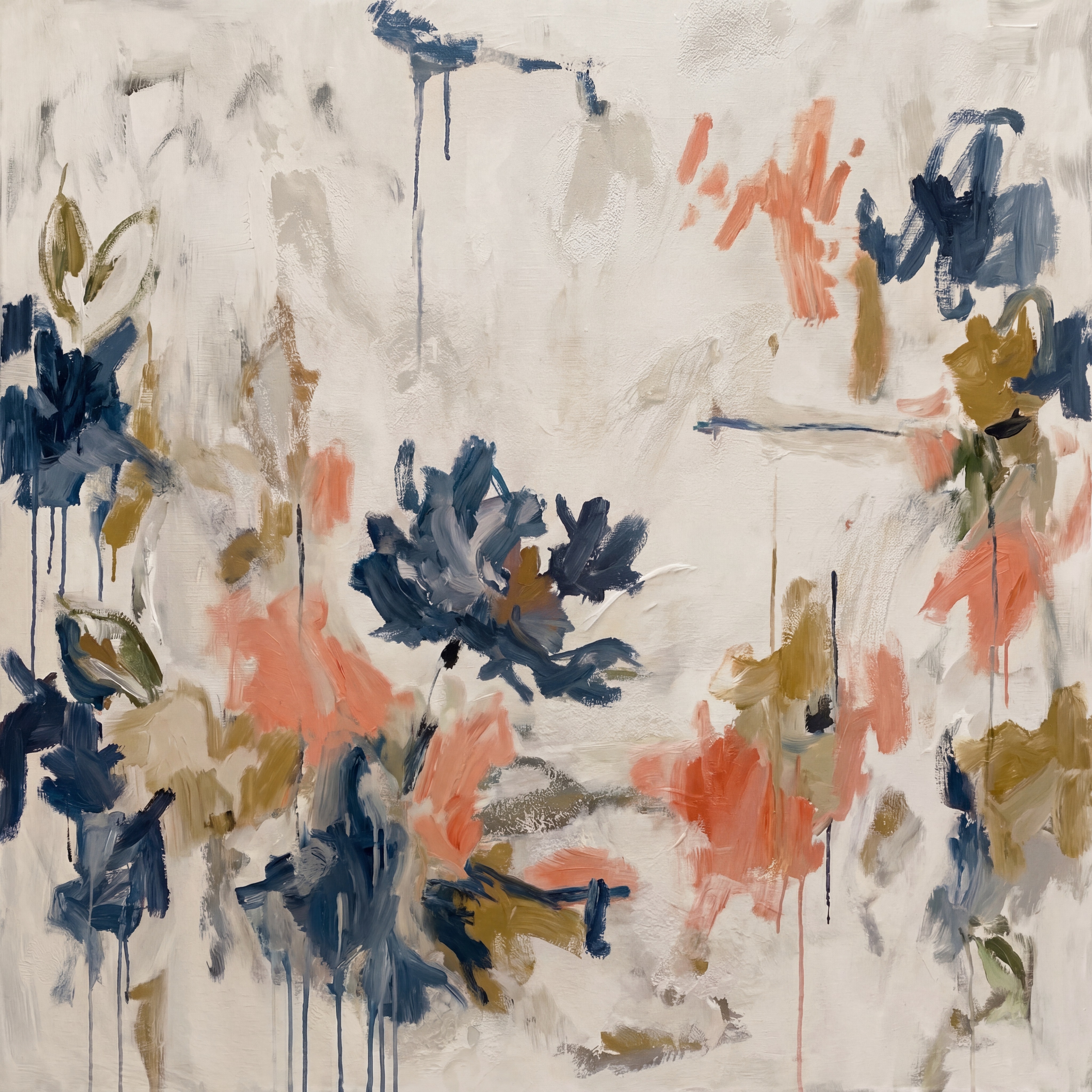
Abstract Floral Navy Coral Drift is a hand-painted large-format canvas from Fir Gallery featuring gestural botanical marks in navy, coral, and warm gold on a pale cream ground. The composition clusters near the edges and lower centre, leaving an open mid-field that keeps the piece from feeling dense. It reads well in living rooms, bedrooms, and dining rooms — particularly in soft modern, transitional, and French Country interiors with warm white walls and natural materials.
Quick read
Loose botanical gestures, an unhurried hand, and a cream field that breathes — this is abstract floral art that earns its place on the wall.
Product reference
Piece: Abstract Floral Navy Coral Drift - Wall Art by Fir Gallery
Format: Hand-painted
Size family: large
View the productAt first glance, Abstract Floral Navy Coral Drift reads as soft and a little wild at the same time — loose clusters of navy, coral, and warm gold brushwork scattered across a pale cream ground, with enough open space between them to let the painting breathe. It doesn't announce itself. It settles into a room and makes the wall feel considered without making the whole space feel decorated.
What the Painting Actually Looks Like
The marks are gestural and confident — thick strokes layered over thinner ones, occasional drips of dark navy trailing downward from upper passages, olive and sage threading quietly through the gold areas. None of it feels accidental, but none of it feels labored either. The clusters sit near the edges and the lower centre, leaving the middle deliberately open. That negative space is doing real compositional work: the cream field isn't just background, it's part of the rhythm.
The color range is warmer than it might look in a small thumbnail. Coral skews toward blush-terracotta rather than bright orange. The navy is deep but not cold. Gold reads as honey-toned in warmer light. Together they hold a quiet tension — enough contrast to be interesting, muted enough to live with.
How It Reads in a Room
Scale matters here. As a large-format canvas, this piece has enough surface area for the open centre to register properly. Shrink it down and the composition loses its logic — the breathing room collapses, and the clusters start to feel crowded rather than deliberately spaced. This is a painting designed to be seen at size.
In daylight, the cream ground picks up warmth from natural light and the whole canvas feels airy. Under lamp or pendant light in the evening, the navy passages deepen and the coral holds its warmth — the piece shifts slightly in mood without becoming a different painting. That kind of behavior is worth noting when you're placing art in a room you use across different times of day.
Where It Works Best
Above a low sofa is the obvious placement, and it earns that obvious answer. The open centre keeps a wide wall from feeling compressed, and the botanical clusters sit at just the right visual weight to anchor the seating area without crowding it. Warm white linen upholstery, light oak legs, a jute rug — this piece fits that composition without requiring it.
In a bedroom above the headboard, the coral and navy read as grounded rather than stimulating at resting eye level, which is a real distinction from brighter or higher-contrast abstract work. It works on a side wall near a chair too, if the room is wide enough to give it space.
Dining rooms are underrated for this kind of piece. On the wall facing the table, loose botanical gestures provide quiet visual texture during a meal — present enough to notice, calm enough to ignore when conversation takes over. Above a slim console or sideboard along a dining wall, it anchors without dominating.
Interior Styles and What to Pair It With
Soft modern, transitional, and French Country interiors are the natural fits. Warm white or off-white walls let the cream ground blend rather than contrast at the edges. Light oak, rattan, and natural linen are easy companions. Soft blush or terracotta textile accents in the room — a throw, a cushion, a rug border — echo the coral in the painting without needing to match it exactly.
It holds its own against bolder textural interiors too, as long as the surrounding palette doesn't compete directly with the navy or coral. If your room leans heavily into saturated color, this piece may read as quieter than you want. If your room leans minimal or all-white, the warmth in the gold passages will pull the painting forward in a way that feels inviting rather than jarring.
What to Know Before You Buy
Because this is hand-painted, surface texture is part of the experience — brushwork, layering, and the slight relief of thicker passages are all visible up close. No two canvases will be identical, which is characteristic of original and hand-painted work rather than a flaw to account for.
- Type: Hand-painted canvas
- Size: Large format
- Palette: Navy, coral, warm gold, olive, sage, cream
- Ground: Pale cream — pairs with warm white and off-white walls
- Finish: Layered brushwork with natural texture and occasional paint drips
- Best rooms: Living room, bedroom, dining room
- Interior styles: Soft modern, transitional, French Country
- Furniture companions: Warm white linen, light oak, soft blush upholstery, rattan
If you want a large abstract floral that doesn't shout but still changes the room, this one is worth a long look — start with Abstract Floral Navy Coral Drift - Wall Art by Fir Gallery.