

Quiet Motion: Reading the Abstract Green Wave Still Tide on a Living Wall
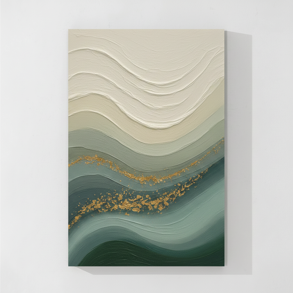
Fir Gallery's Still Tide reads as a slow gradient of texture and color, moving from heavy cream impasto at the top into smoother forest green at the base, with scattered gold leaf softening the middle. It works best as a calm focal point above a sofa, bed, or desk in Japandi, soft modern, or wabi-inspired rooms.
Quick read
A horizon you can read in brushstrokes, not pixels.
Product reference
The first thing you notice about Abstract Green Wave Still Tide is the surface. Thick cream ridges sit across the top of the canvas like sculpted weather, then loosen as the color shifts down through soft sage, misted greens, and finally a grounded forest tone at the base. A thin scatter of gold leaf threads along one mid-section ridge — small enough to feel incidental, deliberate enough to hold your eye.
It's a hand-painted piece, and it shows. The impasto at the top has real dimension, while the lower bands flatten out into smoother, quieter passages. That contrast between built-up texture and calm color is what gives the canvas its mood: less crashing wave, more slow tide.
What kind of wall art this actually is
This sits in the abstract category, but it leans organic-modern with a wabi-sabi sensibility. There's no sharp linework, no high-contrast moment, no graphic punch. Instead, you get a tonal landscape that behaves almost like a horizon line — readable as water, as fog, as terrain, depending on the room around it.
For buyers comparing textured canvas wall art against flat printed pieces, the difference here is physical. Light catches the cream ridges differently in the morning than it does under a warm lamp at night. The painting changes with the room.
How it reads in a room
Above a low linen sofa, the deep forest base does the anchoring work — it visually weights the seating area while the cream upper field lifts the eye toward the ceiling. On a pale grey or warm white wall, the gradient feels like it belongs to the architecture rather than sitting on top of it.
Behind a headboard, the layered greens read as receding depth, a kind of quiet landscape that doesn't compete with bedding or lamps. In a home office facing a desk, it gives your eyes something tonal and slow to land on between tasks — easier than a graphic print, less generic than a solid color panel.
Who it suits, and who it doesn't
This piece fits naturally in Japandi rooms, soft modern interiors, and wabi-inspired spaces leaning on light oak, warm white linen, and brushed brass. The gold leaf in particular pairs well with brass hardware and warm metallics — a small detail that makes the canvas feel intentional rather than decorative.
It's less suited to high-contrast modern rooms, bold maximalist palettes, or interiors built around black metal and stark white. The whole composition is built on slow transitions, so it rewards rooms that also breathe.
Realistic expectations
A common assumption with abstract green wave wall art is that the gold detail will read as flash. It doesn't. The gold here is restrained — fragments along a ridge, not a bold band. If you want a piece with strong metallic presence, this one will feel quieter than expected. If you want subtle warmth threaded through cool greens, that's exactly what it delivers.
Another thing to keep in mind: because the upper half is heavily textured cream, the canvas needs some breathing room. Crowding it with shelves or sconces too close will flatten the impasto effect. Give it wall space.
A short styling scenario
Picture a living room with a low oatmeal-linen sofa, a light oak coffee table, and brushed brass floor lamp. The wall behind the sofa is warm white. Hung centered, about eight to ten inches above the back cushions, the canvas anchors the seating zone with its forest base and pulls the eye upward through the cream ridges. A ceramic vase in unglazed stoneware on the side table picks up the texture conversation. Nothing competes; everything settles.
Product details
- Type: Hand-painted canvas, large scale
- Style: Abstract, organic-modern, wabi-sabi, minimalist
- Palette: Cream and off-white through sage and mist green into deep forest tones, with scattered gold leaf accents
- Texture: Heavy impasto across the upper field; smoother, flatter passages at the base
- Best placement: Above a low sofa, behind a headboard, or on a desk-facing wall in a home office
- Pairs with: Light oak, warm white linen, brushed brass; Japandi, soft modern, and contemporary wabi-inspired interiors
- Wall context: Reads best on warm white, pale grey, or soft neutral walls with breathing room around the frame
If you want a canvas that quiets a wall without disappearing into it, take a closer look at Abstract Green Wave Still Tide.