
Held Still: Why This Brown Textured Abstract Earns Its Place on the Wall
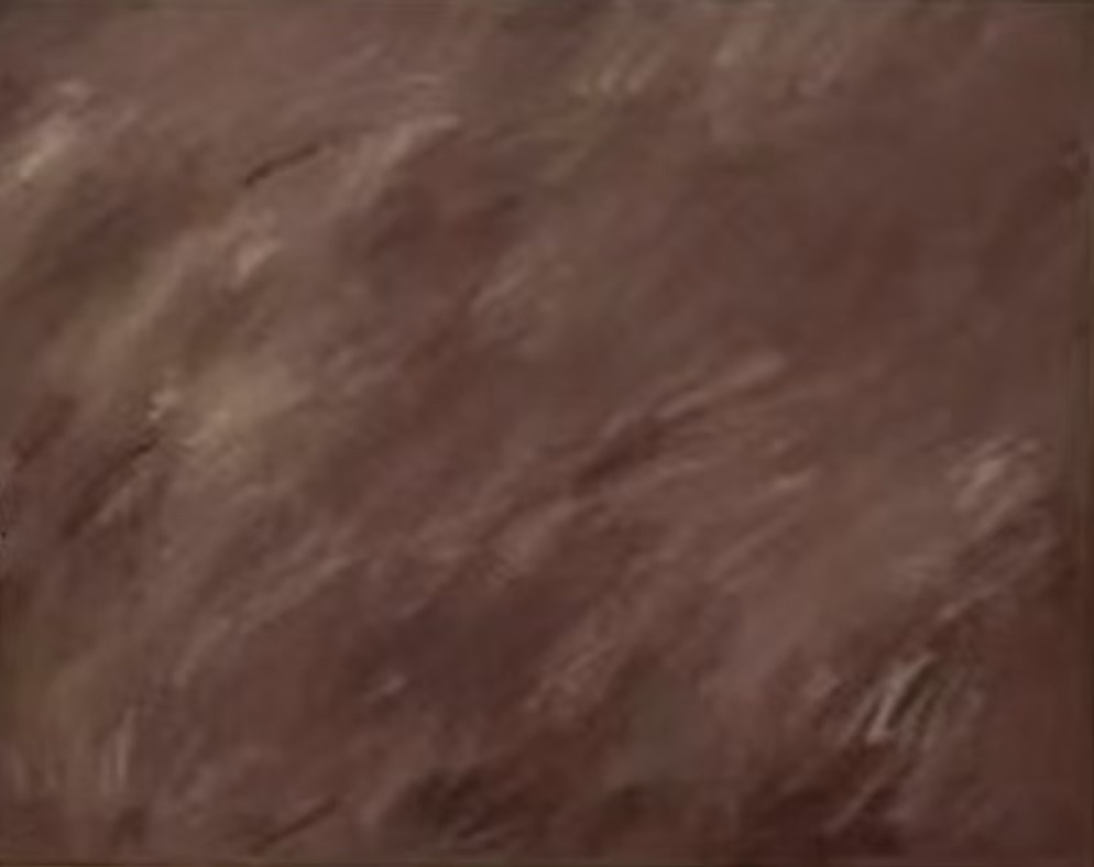
Brown Textured Abstract Held Still by Fir Gallery is a large hand-painted wall art piece built entirely from warm, close-toned browns — raw sienna, dusty mauve, aged terracotta — with no focal point, no contrast drama, and no competing elements. What it offers instead is visual mass and calm materiality, qualities that make it genuinely useful above a sofa, behind a headboard, or on a dining room wall where stillness is the point.
Quick read
It does not perform. It simply holds — and that restraint is exactly what makes it work.
Product reference
Piece: Brown Textured Abstract Held Still - Wall Art by Fir Gallery
Format: Hand-painted
Size family: large
View the productAt first glance, Brown Textured Abstract Held Still reads as a single field of warm brown. Look longer and the surface starts to open up — pale striations drifting in loose diagonals, subtle ridges where the paint has built up and compressed, soft variations in tone that shift from muted rose-brown at the edges toward something slightly deeper at the center. There is no focal point pulling your eye to one corner. The composition simply spreads, slowly, and holds.
What Kind of Piece This Actually Is
This is a large-format, hand-painted abstract — not a print, not a digital reproduction. The texture is physical: layered and compressed in a way that catches light differently depending on where you stand and what time of day it is. The palette stays within a deliberately narrow range — raw sienna, dusty mauve, aged terracotta — and that restraint is central to how the piece works. Nothing here competes. The surface does one thing and does it with complete commitment.
Buyers sometimes expect abstract art to feel graphic or expressive. This one does neither. It belongs to a quieter category — textured neutrals that function more like a material surface than a conventional painting. Think wabi-sabi more than abstract expressionism.
How It Reads in a Room
Scale matters here. As a large piece, it has enough visual weight to anchor a wall without hardware or layering. Above a low dark leather sofa, the warm tones ground the space while letting the furniture stay dominant below. The relationship feels balanced rather than competitive.
In a bedroom behind a linen or aged-oak headboard, it adds the kind of visual mass that settles the room. Not dramatic — settled. That distinction is worth sitting with before you buy. If you want something that energizes a space or creates a strong graphic moment, this is not it. If you want something that makes a room feel more complete and more material, it delivers that consistently.
Dining rooms are an underused placement for this kind of piece. On the wall opposite a window, the muted brown tones soften through the day as natural light shifts — the piece actually changes character between morning and evening in a way that keeps it from feeling static.
Interior Styles It Fits
The piece sits most naturally in contemporary wabi-inspired rooms, rustic modern spaces, and Japandi interiors — anywhere that favors calm materiality over contrast. It pairs well with warm oak shelving, terracotta ceramics, stone-linen upholstery, and off-white or stone-colored walls. On a bright white wall it still works, though the contrast will make the warm tones read more prominently than they would against a softer ground.
What it resists: very cool-toned rooms, high-gloss surfaces, and interiors built around graphic color. The palette is warm and muted by design, and fighting that will cost you the thing that makes it distinctive.
One Realistic Styling Scenario
Picture a living room with warm oak floors, a low charcoal linen sofa, and walls in a warm greige. This piece centered on the main wall — no gallery arrangement, just the single canvas — reads as an anchor. Add a terracotta ceramic on the shelf below and the tonal conversation between the wall art and the objects becomes part of what the room is doing. Nothing shouts. Everything holds.
What to Know Before You Buy
Because this is hand-painted, the texture visible in product photography is real and present on the actual surface. Lighting condition changes how the ridges and striations read — in lamplight the surface becomes warmer and the compression more visible; in daylight it flattens slightly and reads closer to a tonal field. Both readings work, they just work differently.
If you are comparing this against framed prints in similar brown tones, the main difference is surface presence. A print in these colors will read as flat and smooth. This one reads as material. That difference is significant in person and worth factoring into the decision.
Product Details
- Type: Hand-painted original wall art
- Size: Large format
- Palette: Raw sienna, dusty mauve, aged terracotta — warm, close-toned neutrals
- Texture: Layered and compressed; physical ridges visible and tactile
- Finish: Matte surface with natural paint texture throughout
- Best placements: Above a low sofa, behind a headboard, on a dining room feature wall
- Interior fit: Wabi-inspired, Japandi, Rustic Modern, Contemporary Neutral
- Wall color pairing: Off-white, warm greige, stone — cool whites will increase contrast
If a room that leans calm and material is what you are building toward, Brown Textured Abstract Held Still - Wall Art by Fir Gallery is one of the more considered options in this palette range.