
A Cubist Still Life That Reads Like Collage on the Wall
This cubist still life print layers checkerboard patterns, diamond motifs, and soft pastel rectangles around a fractured burgundy vessel. It works as a focal piece above a sofa, sideboard, or desk, and pairs easily with walnut wood, brass accents, and cream upholstery in mid-century, contemporary, and transitional interiors.
Quick read
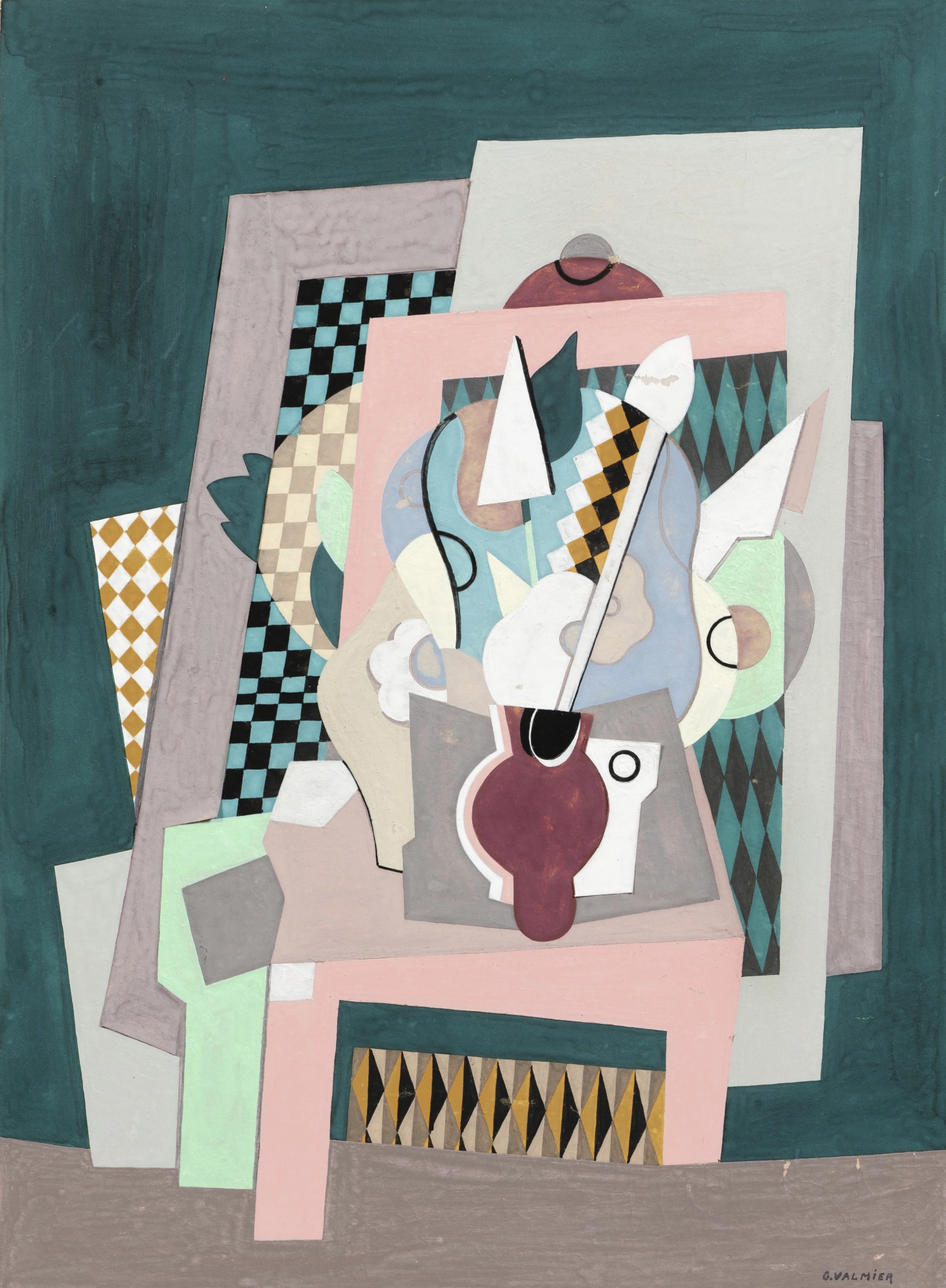
Fragmented forms, calm pastels, and a burgundy center holding the composition together.
Product reference
Piece: Cubist Still Life Collage - Wall Art by Recca Art
Format: Print
Size family: small
View the productThe first thing you notice is the layering. Pink and gray rectangles stack behind black-and-mint checkerboards, burgundy and gold diamonds, and a fractured white shape that reads almost like a guitar neck cutting through the center. Underneath it all sits a deep red vessel, broken into pieces but still clearly the anchor of the composition. It's a cubist still life translated into something closer to paper collage — graphic, structured, and a little playful.
This is an abstract print in the cubist tradition, but the palette keeps it grounded for modern rooms. Warm earth tones meet cool pastels, so it doesn't feel heavy or academic. It reads as a considered piece of wall art rather than a loud statement.
How It Feels in a Room
On the wall, the piece behaves like a focal point that still allows the rest of the room to breathe. The dark teal background gives it weight, while the soft pinks, mints, and grays keep things light. From across the room you see strong geometry. Step closer and the smaller details — the checker squares, the little black circle, the curved line tracing through the middle — start to pull you in.
It's graphic without being aggressive. Calm enough for a home office, interesting enough for a dining wall where people sit for a while.
Who It Suits
This one lands best in mid-century modern, contemporary, and transitional interiors. It pairs naturally with walnut wood, brass hardware, and cream or oatmeal upholstery. If your room already leans toward clean lines, tapered legs, or a mix of warm wood and cooler metal accents, the color palette will slot in without much effort.
It's less suited to heavily traditional rooms or maximalist spaces with lots of competing pattern. The artwork already carries its own pattern language, so it prefers walls and furniture that let it speak.
Realistic Expectations
A few things worth knowing before you hang it:
- It reads as a focal piece, not a quiet background accent. Plan the wall around it.
- The palette is soft overall, but the burgundy vessel and black checker areas create real visual weight at the center.
- Under warm lamplight, the pinks and golds come forward. In daylight, the teal and mint feel cooler and more graphic.
- It rewards closer viewing, so hanging it where people actually pause — above a sofa, behind a desk, on a dining feature wall — makes more sense than a hallway flyby.
A Quick Styling Scenario
Picture a mid-century sofa in cream bouclé, a walnut coffee table, a brass floor lamp arching overhead. Hang this print centered above the sofa, roughly six to eight inches above the back cushion. The pink rectangle inside the composition picks up softer textiles in the room, while the teal background ties back to any deeper greens or blues you already have in pillows or rugs. The result feels collected rather than matched.
In a home office, place it on the wall behind your desk. It gives the video-call backdrop some intelligence without becoming a distraction during the workday.
How It Compares
Against a large-scale abstract painting, this print feels more composed and intentional — less about gesture, more about structure. Against a botanical or line-drawing print, it brings significantly more visual energy and color play. If you've been weighing a single graphic print versus a gallery wall, this piece can carry a wall on its own, which often simplifies the styling decision.
Product Details
- Type: Fine art print
- Style: Abstract, cubist, collage-inspired illustration
- Size tag: Small — best suited to intimate walls, above a console, desk, or smaller sofa
- Color direction: Deep teal ground with burgundy, mint, pale pink, gold, gray, and black accents
- Subject: Still life reinterpreted through geometric planes and pattern
- Best rooms: Living room, home office, dining room
- Pairs with: Walnut wood, brass accents, cream upholstery, mid-century and transitional furniture
- Placement notes: Above a mid-century sofa, behind a desk, on a dining feature wall opposite windows, or above a wooden sideboard
If a quietly graphic, pattern-rich cubist piece sounds like the right anchor for your space, take a closer look at the Cubist Still Life Collage - Wall Art by Recca Art.