
Color, Held in Place: Recca Art's Geometric Color Block Studies
Geometric Color Block Studies by Recca Art is a small-scale abstract print that turns three colors into a controlled visual statement. The red, rust-brown, and deep blue stay in strict territories, which gives the piece a calm structural presence rather than a loud one. It works well above a low sofa, behind a desk, or on a bedroom side wall where light can shift the colors through the day.
Quick read
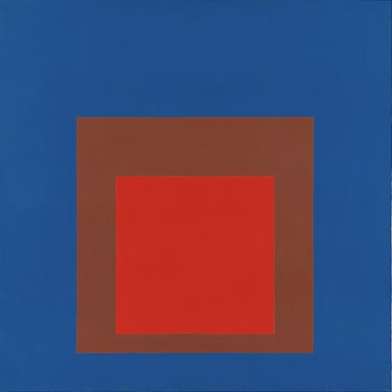
Three colors, three boundaries, and a quiet kind of tension at the center.
Product reference
Piece: Geometric Color Block Studies - Wall Art by Recca Art
Format: Print
Size family: small
View the productThe first thing you notice is the geometry: a saturated red square nested inside a rust-brown border, both floating on a field of deep blue. Nothing bleeds, nothing softens. The composition holds its edges, and that restraint is what gives the print its presence. It reads graphic from across the room and almost meditative up close.
This is a small-scale abstract print built on the language of mid-century color field painting — three flat colors, clear boundaries, and a centered weight that lets the surrounding blue breathe. It's the kind of piece that anchors a wall without competing with the furniture in front of it.
How It Reads in a Room
Color block art like this tends to do one of two things: dominate, or quietly organize. Recca Art's piece leans toward the second. The red pulls the eye in, the brown softens the jump, and the blue field acts almost like negative space — a built-in mat that helps the print sit cleanly on any wall color, especially warm whites, greiges, and oat tones.
In daylight, the blue stays cool and confident. Under warm lamplight in the evening, the rust border deepens and the red turns a touch more vermilion. It's a small shift, but it's the reason geometric prints with limited palettes age well — they keep revealing themselves.
Who It's For
This print suits people drawn to mid-century modern, minimalist, and contemporary interiors — rooms with warm oak wood, cream linen upholstery, or matte black accents. If your space already runs neutral and you want one decisive piece of color, this does that job without going maximalist.
It's less ideal if you're after texture, brushwork, or something painterly. The appeal here is flatness and proportion. That's a feature, not a limitation, but it's worth knowing before you compare it against hand-painted abstracts or heavier oil-on-canvas options.
Placement That Actually Works
Above a low sectional sofa, the print becomes a focal point without crowding the seating. Behind a desk in a home office, it brings visual order — useful on video calls, easy to live with during long work hours. In a bedroom, try it on a side wall opposite the windows, above a low dresser or bench, where shifting daylight can quietly animate the color relationships.
A quick styling note: because the composition is centered and symmetrical, hang it slightly lower than instinct suggests. Around 57 to 60 inches to the center, or roughly 6 to 8 inches above a sofa back, usually lands right. Centered alignment matters more here than with organic abstracts.
Common Misreads
People sometimes assume bold color prints will overpower a room. With this one, the deep blue field actually grounds the palette and keeps it from feeling loud. Others expect a small print to disappear on a large wall — at this size, it works best as a focused accent rather than a wall-filling statement. Pair it with a console, a chair, or a shelf below to give it scale.
Product Details
- Type: Fine art print, abstract geometric composition
- Size tag: Small — suited for accent walls, above consoles, or as part of a curated arrangement
- Palette: Deep blue field, rust-brown border, saturated red center
- Style direction: Minimalist, mid-century modern, contemporary
- Finish: Flat, even surface that emphasizes pure color relationships over texture
- Best rooms: Living room, home office, bedroom
- Pairs well with: Warm oak furniture, cream linen, matte black hardware, woven or jute textures
How It Compares
Against a large abstract canvas, this print trades scale for precision. Against a black-and-white minimalist print, it brings color confidence without losing the clean-lined feel. And against a heavily textured oil painting, it offers a more graphic, architectural read — closer to a poster aesthetic in the best sense, with the discipline of color field painting behind it.
If you want a graphic anchor that doesn't shout, explore Geometric Color Block Studies - Wall Art by Recca Art.