

A Closer Look at Impressionist Garden Meadow Dreams: Soft Color, Real Room Presence
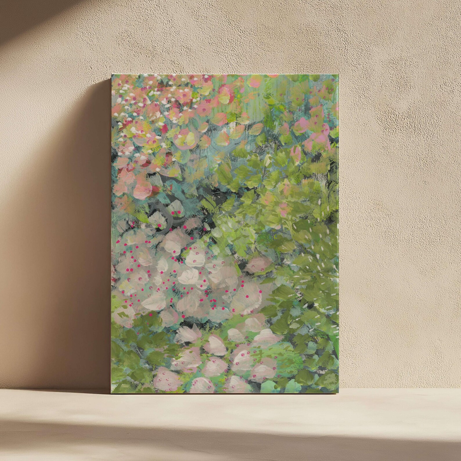
Impressionist Garden Meadow Dreams by Fir Gallery is a medium-scale impressionist floral print built from layered brushstrokes of coral, sage, chartreuse, and magenta. It reads as a textured, light-filled garden scene that softens modern interiors and pairs naturally with linen, oak, and cream tones.
Quick read
A quiet, painterly floral that feels less like decoration and more like a window into a sunlit garden.
Product reference
At first glance, Impressionist Garden Meadow Dreams looks like a patch of garden caught mid-bloom. Coral and peach blossoms gather along the top of the canvas, then dissolve into layers of sage, chartreuse, and deeper forest greens. Small magenta dots scatter through pale, stone-like shapes near the bottom, giving the eye somewhere quieter to land. It's a floral, but not a tidy one — the brushwork stays loose, and the color does most of the talking.
What makes the piece visually distinct
This is an impressionist botanical print, which means depth comes from color temperature rather than sharp edges. Warm pinks sit against cool greens, transparent washes meet thicker opaque passages, and the painted surface feels lit from within. There's no single focal flower demanding attention. Instead, the composition moves — top-heavy with blossoms, grounded by foliage, punctuated by those small magenta marks that keep the lower half from feeling heavy.
How it feels in a room
The piece reads as calm but not flat. It adds softness and a sense of light without pulling the room into a single accent color. In daylight, the greens lift and the pinks warm up. Under lamplight, the whole canvas settles into a more muted, almost dusk-like palette. That shift is part of what makes it feel like a real painting on the wall rather than a printed graphic.
It works best as a quiet focal point — strong enough to anchor a sofa or headboard, but gentle enough that it won't fight a patterned rug or upholstered furniture nearby.
Who it suits
Soft modern, transitional, and French country interiors tend to absorb this kind of impressionist floral easily. If your room leans on cream linen upholstery, natural oak, sage accents, or warm neutrals, the palette slots in without forcing a color story. It's a good fit for people who like florals but find traditional botanical prints too literal, and for rooms that already have texture — boucle, linen, rattan, raw wood — where a painterly surface adds to the layering instead of competing with it.
It's less suited to high-contrast, graphic, or industrial spaces. In a room built around black metal, hard geometry, or saturated jewel tones, the soft edges can read as washed out.
Realistic expectations
This is a print, not a hand-painted original, so the brushwork you see is faithfully reproduced rather than physically raised on the surface. The texture reads visually, especially from a few feet back. Up close, you'll see the painter's layering and color shifts clearly, but don't expect impasto ridges under your fingers. Buyers who want true painted texture should look at hand-painted canvas options; buyers who want the impressionist look without the original-artwork price will find this strikes a fair balance.
A quick styling scenario
Picture a living room with a low cream linen sectional, an oak coffee table, and a window to the left. Hung centered above the sofa, the piece picks up daylight from that window and shifts subtly through the afternoon. A pair of sage ceramic vases on the console nearby echo the foliage tones without matching them too closely. Nothing in the room is loud, but the wall finally feels finished.
How it compares to nearby options
Compared to tighter botanical illustrations or pressed-flower prints, this one trades clarity for atmosphere. Compared to abstract pastel art, it gives you more subject matter to read — recognizable blossoms, foliage, light. And compared to darker moody florals, it stays airy, which makes it easier to live with in rooms where you want the wall art to soothe rather than dominate.
Product details
- Type: Impressionist botanical wall art print
- Size category: Medium — substantial enough to anchor a sofa, headboard, or sideboard without overwhelming a mid-sized wall
- Palette: Coral and peach blossoms, chartreuse to forest greens, soft neutrals, magenta accents
- Finish: Painterly surface with visible layered brushwork; texture reads visually rather than physically
- Best rooms: Living room above a linen sectional, bedroom behind a headboard, dining room opposite a window or above a wooden sideboard
- Pairs well with: Cream linen upholstery, natural oak or walnut, sage accents, indoor plants, warm neutral walls
- Interior directions: Soft modern, transitional, French country
For a closer look at the full composition and available options, see Impressionist Garden Meadow Dreams.