
A Quiet Kind of Statement: Living With Monochrome Abstract Quiet Interval
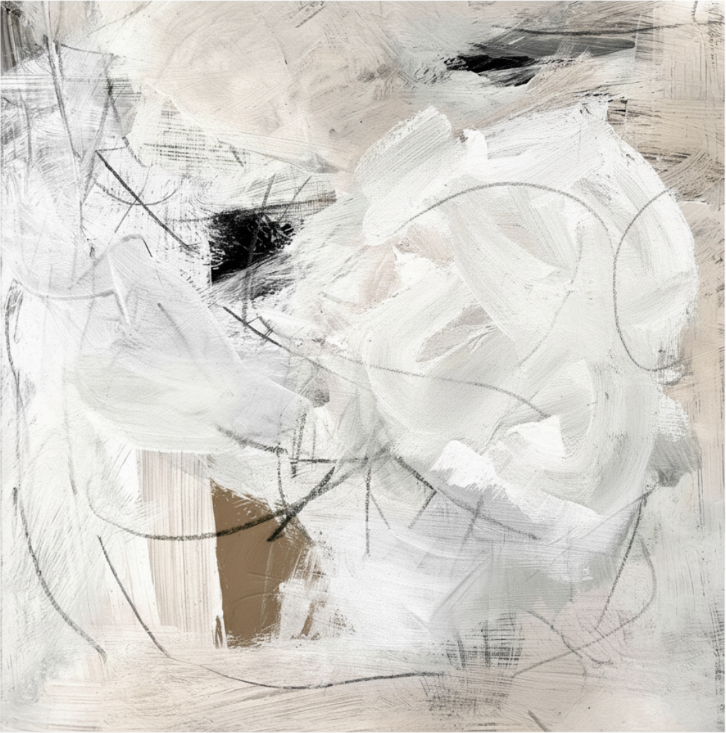
Monochrome Abstract Quiet Interval is a layered, hand-painted neutral abstract built from broad white brushstrokes, faint graphite lines, and two darker anchor points. It reads as calm but not empty, and works best as a quiet focal piece above a sofa, headboard, or desk in Japandi, wabi-inspired, or minimalist rooms.
Quick read
Weight held without containment — dense at the core, open at the edges.
Product reference
Piece: Monochrome Abstract Quiet Interval - Wall Art by Fir Gallery
Format: Hand-painted
Size family: medium
View the productThe first thing you notice about Monochrome Abstract Quiet Interval isn't a color or a shape — it's the surface. Broad white brushstrokes move across a pale, textured ground in loose, overlapping arcs, with thin graphite lines looping beneath the paint where the layers thin out. It reads as a painting that was built rather than performed.
The palette stays almost entirely achromatic: chalk, warm ivory, soft grey. Two darker passages interrupt that quiet — a dense black accumulation near the upper left, and a small exposed square of raw tan near the lower center. Those two anchor points hold the composition in place without ever feeling heavy.
What kind of wall art this actually is
This is a hand-painted neutral abstract, not a flat print. The texture is part of the subject. In plain terms: it's a layered monochrome abstract canvas where the brushwork, the underdrawing, and the bare ground all stay visible at once. That's what gives it depth on a wall instead of a graphic, posterized look.
If you've been comparing minimalist abstract prints, large black-and-white photography, or smooth gallery-style canvases, this sits in a different lane. It's quieter than a high-contrast graphic piece and more tactile than a clean digital print.
How it reads in a room
On a wall, the piece settles in rather than announcing itself. From across the room, you read it as a soft pale mass with two darker beats. Up close, the graphite lines and brush layers come forward and the painting starts to feel handmade.
It changes noticeably between daylight and lamplight. Daylight pulls out the warm ivory and the tan square. Evening light flattens the field slightly and lets the dark upper-left passage do more of the work. Either way, the mood stays calm — closer to a wabi-inspired stillness than a bold contemporary statement.
Who it suits
This one tends to land well with people leaning Japandi, contemporary wabi-inspired, or quiet minimalist. If your room already runs warm white linen, light oak, and soft taupe upholstery, the painting reads as part of the same family rather than a contrast piece.
It's less of a fit if you want artwork that drives the room — saturated color, sharp geometry, or a clear figurative subject. Quiet Interval is a focal point, but a low-volume one. It rewards a room that already has some breathing space.
A realistic styling scenario
Picture a living room with a low bouclé sofa in warm white, a light oak coffee table, and a single ceramic lamp. Hung centered above the sofa, the painting gives the wall a soft anchor without crowding the seating. The dark upper-left passage lines up roughly with the lamp on the side table, and suddenly the whole arrangement feels intentional instead of staged.
The same piece behind a headboard works differently — the composition becomes more about horizontal calm, and the tan square reads as a small warm note near the pillows. Above a desk, it gives the eye something to rest on between tasks without pulling focus.
Common mistaken assumptions
- It's not pure white. There's real warmth in the ivory and tan, so it won't disappear against a cool gray wall.
- It's not a print. The brushwork has physical texture and slight irregularity — that's intentional.
- It's not a high-contrast statement. The black passage is small relative to the field; this is a tonal piece, not a graphic one.
Product details
- Type: Hand-painted abstract on canvas
- Style: Neutral monochrome abstract, minimalist, lightly graffiti-influenced underdrawing
- Palette: Chalk white, warm ivory, soft grey, with a black anchor and a small raw tan square
- Surface: Layered brushwork over visible graphite lines; matte, textural finish
- Size tag: Medium — scaled for above a sofa, headboard, console, or desk
- Best rooms: Living room, bedroom, home office
- Pairs with: Warm white linen, light oak wood, soft taupe upholstery
- Interior directions: Japandi, contemporary wabi-inspired, minimalist
For a layered neutral abstract that holds a wall without raising its voice, look closer at Monochrome Abstract Quiet Interval - Wall Art by Fir Gallery.