
Still and Considered: Why This Grey Abstract Painting Works in the Rooms That Usually Fight Art
Some wall art announces itself. This one settles in. Monochrome Abstract Still Interval by Mond Studio is a hand-painted grey abstract that works through texture, weight, and compositional restraint — suited to living rooms, home offices, and foyers where the walls need presence without noise.
Quick read
Cool grey, granular texture, and vertical mass — the kind of painting that makes a minimal room feel deliberately composed rather than simply bare.
Product reference
Piece: Monochrome Abstract Still Interval - Wall Art by Mond Studio
Format: Hand-painted
Size family: large
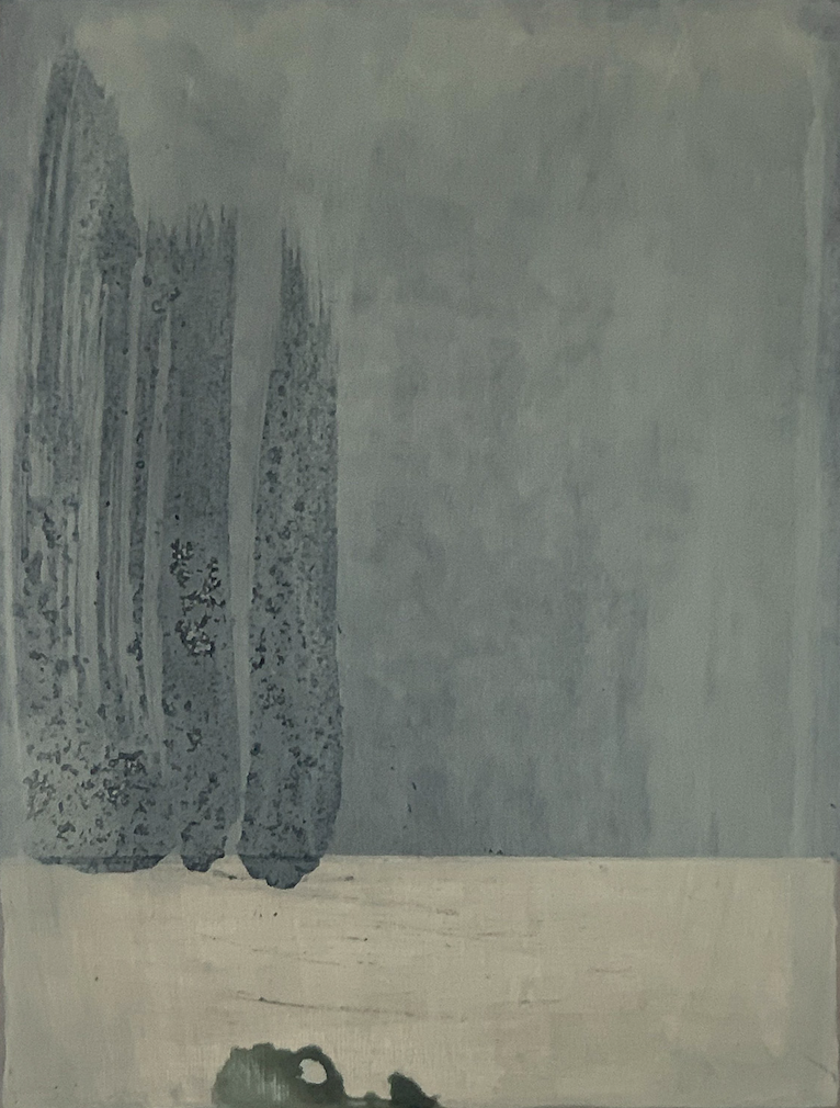
View the productTwo tall forms rise from a pale horizontal ground against a field of cool, atmospheric grey. Their surfaces are dense and granular — not brushed smooth, but accumulated, as if built up slowly. The rest of the canvas stays open. That tension between concentrated weight on the left and unresolved space on the right is what gives this piece its staying power.
What It Actually Looks Like
This is a monochrome painting in the truest sense — nearly everything sits within a single grey register. The vertical columns read darker and rougher than the ground behind them, which shifts between soft cloud-grey and something closer to pale concrete. Near the lower edge, a small dark form offers a quiet counterpoint to the vertical mass above. It doesn't explain itself. That ambiguity is intentional, and it's part of what makes the composition hold up over time.
The texture is real. As a hand-painted work, the surface carries physical depth — not a printed approximation of texture, but actual material variation across the canvas. In direct light, the granular columns cast faint shadow. In warmer lamplight, the tones shift warmer and the surface reads more dimensional. Both readings work.
How It Affects a Room
Large grey abstract paintings can flatten a room if the composition is too even. This one avoids that because the visual weight is off-center. The left side anchors; the right side breathes. That asymmetry means the piece draws the eye without trapping it — a meaningful distinction when you're placing something above a sofa or on a desk-facing wall where you'll see it for hours.
The mood is still and interior. Not cold, not decorative, not graphic in the way black-and-white art often reads. Closer to wabi-sabi in sensibility — something that values restraint and surface over statement.
Where It Fits and Where It Doesn't
Above a low, minimal sofa on a pale or white wall, the vertical forms anchor the seating area with quiet authority. It works especially well when surrounding objects are kept sparse — this painting rewards negative space around it rather than competing with a gallery wall arrangement.
In a home office, placed on the wall directly facing the desk, the subdued tones and contained composition offer visual rest without distraction. That's genuinely useful in a workspace, where art often either disappears or becomes too activating.
In a foyer — particularly a narrow one — the vertical emphasis aligns naturally with the proportion of the space. Above a slim console with a single object, it reads as considered rather than decorated.
Where it doesn't fit as well: rooms with warm wood-heavy palettes, maximalist layering, or strong color. This piece is built for cool whites, light concrete, brushed steel, linen, and pewter. Put it next to saturated color and it recedes in a way that feels accidental rather than deliberate.
Who Buys This Kind of Work
Buyers typically come to this piece from one of two directions: they're building a Japandi or minimalist interior and want a large-format anchor without a figurative subject, or they've tried prints and found the surface reads flat in person. A hand-painted monochrome abstract at this scale offers something a canvas print can't — physical presence and tonal variation that shifts with the light in the room.
It also suits buyers who want art that doesn't date. Trend-driven wall art tends to feel obvious within a few years. This composition, in this palette, sits closer to the kind of work that reads differently as the room around it evolves.
A Realistic Note on Expectations
Monochrome work can look more minimal in photographs than in person. The texture and tonal range are more apparent at close range and in changing light. If you're coming from colorful or high-contrast art, the restraint here can feel sparse at first — that's the point, and it usually resolves once the piece is placed in the right context.
Product Details
- Type: Hand-painted original wall art
- Size category: Large
- Palette: Monochrome grey — cool, muted, with slight tonal range between columns and ground
- Surface texture: Granular, physically built-up surface; reads dimensionally in direct or raking light
- Style direction: Abstract, minimalist, wabi-sabi
- Best rooms: Living room, home office, foyer
- Interior pairings: Japandi, contemporary minimalist, wabi-inspired
- Furniture and finish pairings: Cool white linen, light concrete grey, brushed pewter metal
- Placement notes: Works above a low sofa, on a desk-facing office wall, or at the end of a narrow hallway above a console; needs breathing room — avoid clustering with other art
If you're looking for a large-format painting that holds a minimal room without overworking it, Monochrome Abstract Still Interval - Wall Art by Mond Studio is worth considering seriously.