
Fracture Lines and Relief: Why This Monochrome Canvas Works
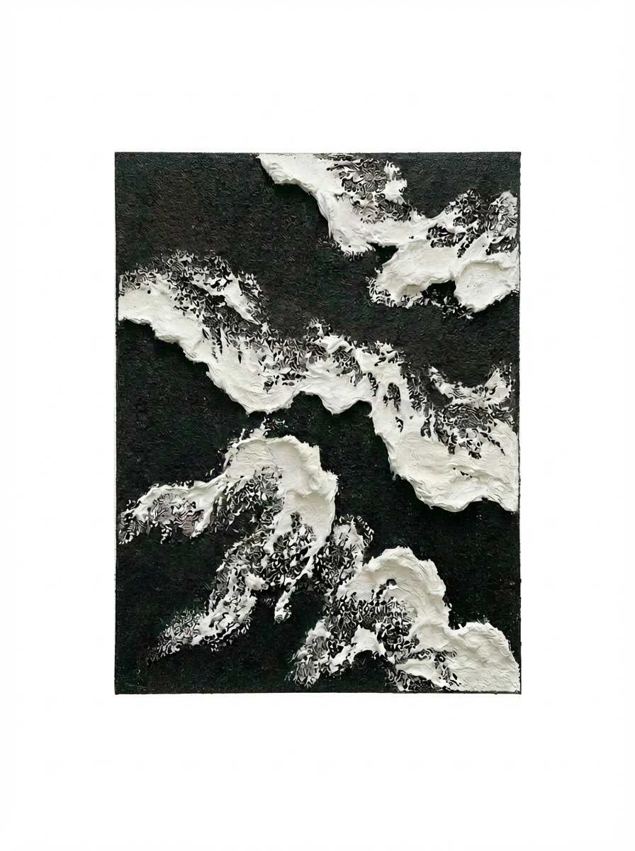
The Monochrome Textured Abstract Fracture by Mond Studio is a large-format, hand-painted canvas in black and white with thick raised relief. The white forms push outward from the center in branching extensions across a dense black ground, creating a composition that reads as geological and pressurized. It suits living rooms, foyers, and home offices where the walls can hold intensity.
Quick read
Dense black ground, raised white fractures, and a diagonal composition that expands like ice breaking across dark water.
Product reference
Piece: Monochrome Textured Abstract Fracture - Wall Art by Mond Studio
Format: Hand-painted
Size family: large
View the productAt first glance, this piece reads as geology. A dense black ground covers nearly the full canvas, and white forms push outward from the center in branching, irregular extensions — thick and raised, with edges that fragment where the two tones meet. That boundary zone is the most visually active part of the composition. Neither color fully dominates, and the transition feels more like erosion than contrast. The overall effect is satellite imagery of ice splitting across dark water.
What Makes It Different From Printed Abstract Art
This is a hand-painted canvas with actual 3D relief — the white areas are physically raised from the surface, not simulated through shading or print. That matters in a real room. The texture catches light differently across the day, and under a directional lamp it casts small shadows along the raised edges, which deepens the whole composition. A flat print in the same palette wouldn't do that.
The composition also carries more compression than most monochrome abstracts. Negative space is minimal here. The forms push diagonally across the canvas as though caught mid-expansion, which gives the piece a sense of pressure that calmer, more open abstracts don't have.
How It Reads in a Living Room
Above a wide, low sofa on a white or concrete-grey wall, the diagonal composition pulls the eye across the full seating area rather than anchoring it in one spot. That makes it work especially well in longer living rooms where a single centered piece can feel undersized. The black ground holds its weight against both light and dark furniture — charcoal upholstery reads quietly against it, and off-white sofas let the piece lead.
One thing worth knowing: this is not a background piece. It draws attention. If the room already has a lot of competing visual elements — patterned textiles, bold shelving, layered gallery walls — it will fight for dominance. It works best when given clear wall space and room to breathe on at least two sides.
Foyer and Home Office Placement
A foyer end wall suits it well, partly because the compressed energy of the composition reads naturally at close range. You don't need fifteen feet of distance to appreciate the texture and the fracture lines — they're legible from a few steps away. On a narrow end wall opposite the entry, it creates an immediate focal point that holds without overwhelming a smaller space.
In a home office, the wall directly facing a desk is a strong placement. The piece is visually active enough to hold attention during idle moments, but the monochrome palette keeps it from becoming a distraction the way color-heavy abstracts sometimes do.
Interior Styles It Fits
It aligns most naturally with minimalist, industrial, and contemporary wabi-inspired interiors — spaces that already use raw materials, matte finishes, and restrained palettes. Matte black metal frames, raw concrete surfaces, and dark shelving all sit well with it. It does not need a frame to feel complete, but a thin matte black float frame reinforces the graphic quality of the black ground if the wall is very light.
It's a harder fit in warmer, more layered interiors — think warm-wood Scandinavian or heavily curated maximalist spaces. The monochrome palette and geological texture lean cool and structural, and they tend to pull against rooms built around warmth and softness.
Realistic Expectations
Because this is hand-painted with textured relief, the surface variation is intentional — no two pieces are identical. The raised edges along the white forms will look slightly different depending on how the light hits them, which is part of what makes it feel like an object rather than a reproduction. If you're comparing it to a flat print or a canvas transfer, the physical presence is genuinely different.
Scale matters too. This is listed as a large-format piece, and the diagonal composition needs room to read at full impact. In a small room with low ceilings, it may feel more pressurized than intended.
Product Details
- Type: Hand-painted canvas with 3D raised relief
- Palette: Monochrome — black ground, white relief forms
- Size: Large format
- Finish: Textured, matte surface with visible brushwork and raised edges
- Best rooms: Living room, foyer, home office
- Wall colors that work: White, off-white, light concrete grey, charcoal
- Furniture pairings: Matte black metal, dark charcoal upholstery, raw concrete, off-white linen
- Framing: Works unframed or with a thin matte black float frame
If your room can hold its intensity, this piece earns the wall — see full sizing and details for the Monochrome Textured Abstract Fracture - Wall Art by Mond Studio.