
A Folk Art Landscape That Plays Like a Storybook on the Wall
Naive Folk Village Pastoral by Recca Art is a small folk-style landscape print built on saturated color zones, black outlines, and storybook shapes. It works as a cheerful focal point in a breakfast nook, kids' room, or home office, and pairs naturally with pine wood, cream-painted furniture, and primary accents.
Quick read
Color-blocked, hand-drawn, and quietly joyful — a folk landscape that warms a wall without overwhelming it.
Product reference
Piece: Naive Folk Village Pastoral - Wall Art by Recca Art
Format: Print
Size family: small
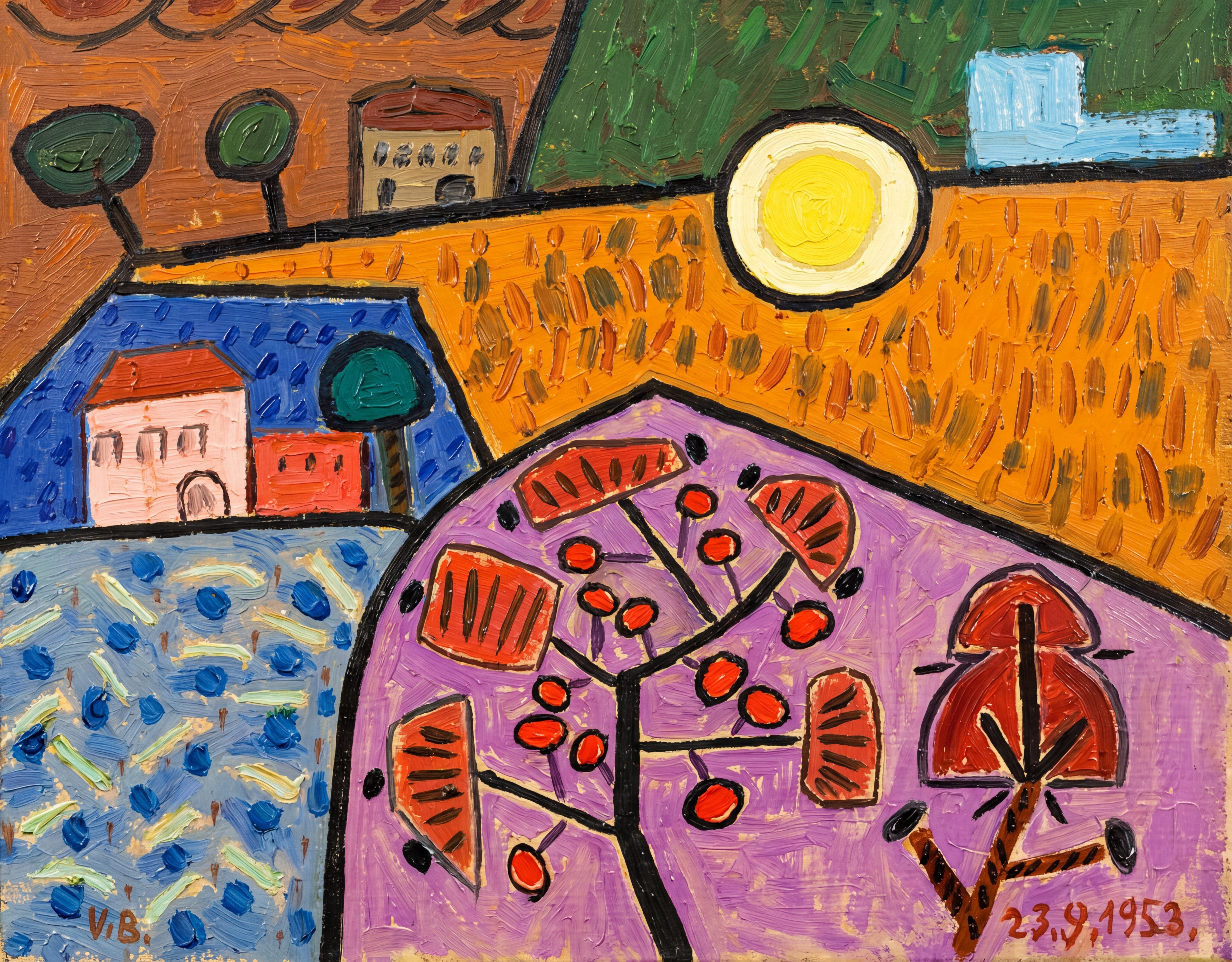
View the productThe first thing you notice about Naive Folk Village Pastoral is how confidently it divides the wall into color. Orange wheat fields run along the top, a violet foreground anchors the bottom, and a yellow sun sits dead center like a punctuation mark. Houses, trees, and a fruit-laden branch are drawn with the kind of childlike directness you'd find in a folk tale illustration — flat, outlined in black, and unbothered by perspective.
It's small in scale, but it doesn't behave small. The color contrast does the heavy lifting, which is why this print tends to read as a focal point even when hung in a modest spot.
What Kind of Wall Art This Is
This is a folk art landscape print in a naive, pop-influenced style. Think hand-drawn village scene meets graphic color-block painting. The composition leans decorative rather than realistic, with saturated oranges, blues, purples, and reds held together by heavy outlines. It has the spirit of a storybook page enlarged onto a wall.
If you've been comparing minimalist line art, muted abstracts, or moody landscapes, this one sits firmly on the warmer, more expressive end of the spectrum.
How It Reads in a Room
In daylight, the orange field and yellow sun pull forward and the print feels lively and sun-warmed. Under lamplight, the purples deepen and the black outlines become more graphic, giving it a cozier, slightly folk-poster quality at night.
Because the palette is built on primaries and warm secondaries, the piece tends to energize a wall rather than blend into it. It plays well next to natural pine, cream-painted cabinetry, and rooms that already lean soft modern or Scandinavian — the warmth balances out lighter, quieter materials without clashing.
Where It Actually Belongs
Two rooms suit it especially well:
- Breakfast nook or dining corner. Hung above a kitchen console or banquette, it picks up the morning light and adds personality to casual dining without demanding a formal frame setup.
- Kids' room or playroom. Above a low bookshelf or toy bin, the storybook quality lands naturally. It feels playful without skewing too juvenile, so it can grow with the room.
It's also a strong desk-facing piece in a home office. The composition gives your eye somewhere interesting to land between tasks, but it isn't busy enough to distract.
Realistic Expectations
This isn't a quiet, neutral print. If your room already has strong patterns, layered textiles, or a saturated accent wall, the print may compete rather than complement. It performs best with calmer surroundings — white or warm-neutral walls, simple wood tones, and minimal nearby art.
It's also worth setting expectations on scale. As a small-format print, it works beautifully on a narrow wall, in a gallery cluster, or above a compact piece of furniture. Over a full-size sofa or a king bed, you'd want to pair it with other works rather than rely on it as a solo statement.
How It Compares to Similar Pieces
Compared with abstract color-field prints, this one has more narrative — you can read the village, the trees, the fruit. Compared with traditional landscape paintings, it's far more graphic and stylized. And next to typical kids' room art, it feels more like a real piece of folk art than a themed decoration, which is part of why it ages well as children grow.
A Quick Styling Scenario
Picture a breakfast nook with a round pine table, two cream chairs, and a linen pendant light overhead. The wall behind is bare and off-white. Hang this print slightly off-center above a small console holding a ceramic vase and a stack of cookbooks. The orange and yellow pick up the wood tones; the purple grounds the lower half so it doesn't float. The corner suddenly feels intentional.
Product Details
- Type: Wall art print
- Style: Naive folk art, pop-influenced, abstract landscape
- Size: Small-format — best as a focused accent or part of a gallery wall
- Color direction: Warm primaries — orange, yellow, red, with violet and blue grounding
- Finish: Print reproduction with visible brushwork and graphic black outlining
- Best rooms: Kids' room, dining nook, home office
- Pairs with: Natural pine wood, cream-painted furniture, primary-colored accents, soft modern and Scandinavian interiors
If you want a small piece that brings personality without taking over the room, take a closer look at Naive Folk Village Pastoral - Wall Art by Recca Art.