

Quiet Weight: Inside a Hand-Painted Neutral Panel Composition
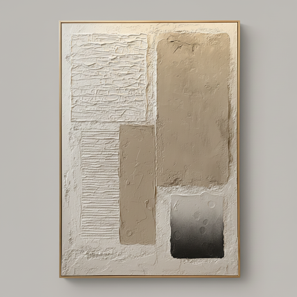
This piece uses sculpted plaster-like texture and a restrained cream-taupe-charcoal palette to create a calm, dimensional focal point. The five rectangular panels carry different surface logic — ridges, striations, smooth clay, and a gradient — making it feel architectural in person while staying soft enough for living rooms, bedrooms, and home offices in Japandi, soft modern, or wabi-inspired interiors.
Quick read
A neutral composition that earns its presence through texture, not contrast.
Product reference
At first glance, this piece reads less like a painting and more like a section of a sculpted wall. Five rectangular panels sit across a cream plaster ground, each with its own surface behavior — horizontal ridges on the lower left, cracked striations up top, two smooth taupe blocks holding the center, and a small charcoal-to-grey gradient anchoring the bottom right. The composition is asymmetrical but balanced, with negative space doing real work between the forms.
The takeaway is simple: this is a neutral textured abstract that gets its impact from material depth, not color. It behaves like 3D plaster wall decor — carved in places, pressed in others — which is why it photographs flat but feels substantial in person.
How It Reads in a Room
Because the palette stays inside cream, taupe, and a single charcoal accent, the piece settles into a room instead of competing with it. The dark lower-right panel is the one moment of contrast, and it does a lot of quiet work — without it, the composition would drift into pure tonal territory and lose its anchor.
In daylight, the ridges and striations cast their own micro-shadows, so the surface shifts subtly through the day. Under warm lamplight in the evening, the taupe blocks deepen and the texture becomes more pronounced. That's the main reason this kind of hand-painted panel art tends to outperform a printed equivalent: the surface responds to light the way a real object would.
Who It Suits
This one lands well for buyers leaning into Japandi, soft modern, or wabi-inspired interiors — rooms built around warm white linen, light oak, and soft taupe upholstery. If your space already has visual noise (bold rugs, saturated art elsewhere, heavy patterns), this piece will read as a calming counterweight. If your room is already very minimal, it becomes the textural focal point you've probably been missing.
It's less suited to high-contrast, jewel-toned, or traditional interiors. The piece doesn't pivot toward drama, and trying to force it into a maximalist room usually flattens its best quality, which is restraint.
Focal Point or Supporting Piece?
At a large scale, it functions as a focal point — but a quiet one. Above a low, wide linen sofa, it distributes attention horizontally and fills a broad wall without crowding it. Behind a headboard, the geometry stays calm enough not to interfere with sleep-space mood. On a home-office wall facing the desk, the segmented panels give the eye natural resting points, which tends to read as focused rather than busy.
One honest tradeoff: this is not a piece that pops from across the room. If you want immediate visual punch or a strong color story, look elsewhere. This one rewards proximity and steady light.
A Quick Styling Scenario
Picture a living room with a low oak-legged sofa in warm bouclé, a jute rug, a ceramic table lamp, and a linen curtain pulled to one side. The wall above the sofa has been blank for months because every piece you tried felt too loud or too thin. This panel painting lands in that gap — large enough to hold the wall, textured enough to feel intentional, and neutral enough to let the oak and linen keep doing their job.
Product Details
- Type: Hand-painted textured abstract wall art on canvas
- Size: Available in large-format options suited to sofas, headboards, and feature walls
- Palette: Cream ground with taupe panels and a single charcoal gradient accent
- Finish: Sculpted plaster-style surface with mixed textures — ridged, striated, smooth, and gradient
- Style fit: Japandi, soft modern, contemporary wabi-inspired, organic minimalist
- Best placement: Above a low linen sofa, centered behind a headboard, or on a desk-facing office wall
- Pairs well with: Light oak, warm white linen, soft taupe upholstery, ceramic and stoneware accents
One note on expectations: because the surface is built up by hand, no two pieces are perfectly identical. Slight variations in ridge depth and plaster texture are part of the work, not a flaw.
For readers who want a calm, textural anchor with real material presence, take a closer look at Neutral Textured Abstract Quiet Panels.