

A Quiet Anchor: Inside the Neutral Textured Abstract Still Interval
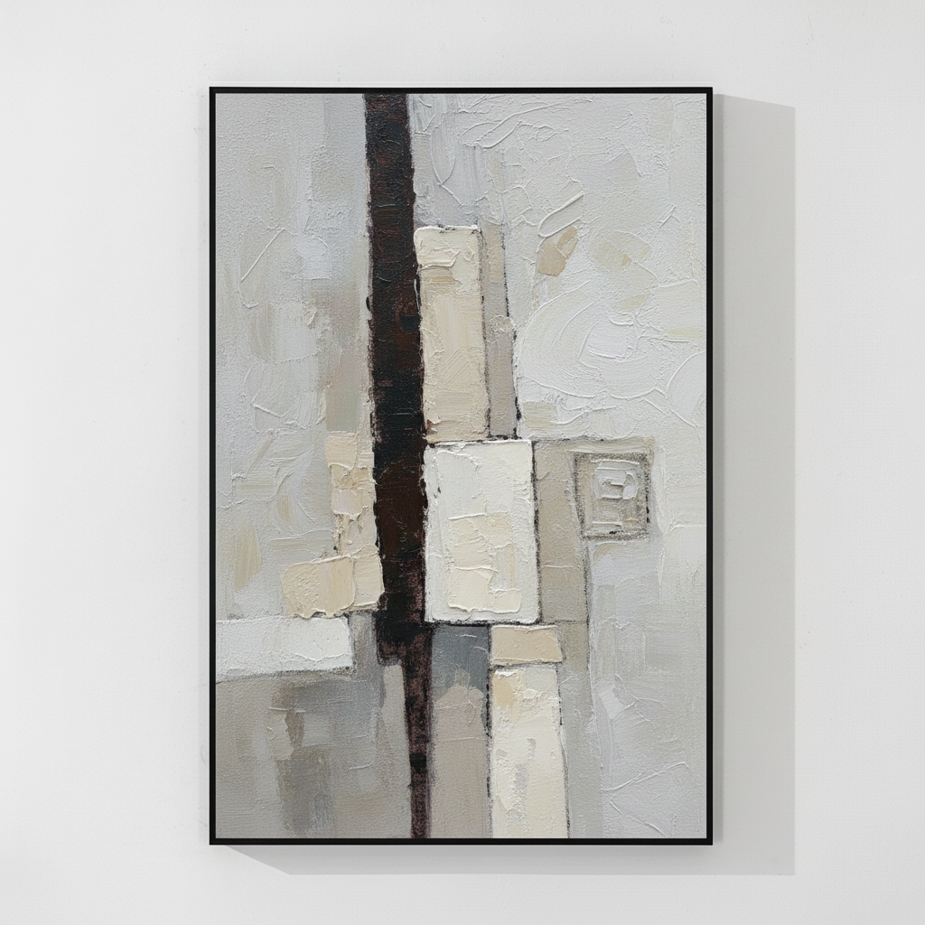
Still Interval is a hand-painted neutral abstract that balances a dark vertical stripe against thick, plaster-like rectangles in cream and ivory. It reads as architectural and quiet at once, making it a strong choice for Japandi, soft modern, and minimalist rooms where texture matters more than color contrast.
Quick read
Restrained structure, material weight, and a palette that breathes — a neutral abstract built to settle a room rather than command it.
Product reference
Piece: Neutral Textured Abstract Still Interval
Format: Hand-painted
Size family: large
View the productThe first thing you notice in Neutral Textured Abstract Still Interval isn't color — it's weight. A dark vertical stripe runs straight through the center of the canvas, acting like a structural beam. Around it, thick rectangles in cream, ivory, and warm white sit with the density of troweled plaster, their edges uneven, their surfaces built up rather than brushed on. Step back, and the composition reads architectural. Step closer, and it becomes a study in material.
This is a hand-painted neutral abstract canvas, not a print, and the texture is doing most of the talking. The surrounding field holds in soft grey and pale stone, with quieter geometric impressions drifting toward the edges. Tension gathers at the meeting point of the vertical axis and the horizontal mass, then releases outward into open ground.
How It Reads in a Room
Hung above a low, linear sofa, the vertical line gives the wall a clear anchor without crowding it. The palette is soft enough that the piece doesn't fight the rest of the room, but the central form has enough mass to hold its own on a bare wall. In daylight, the plaster-like surfaces catch shadow and reveal more dimension. Under warm lamplight in the evening, the cream tones deepen and the dark stripe recedes slightly — the painting feels heavier, more grounded.
It works as a focal piece, but a quiet one. If you want art that announces itself with color or scale alone, this isn't that. If you want a canvas that gives a room structure and rhythm without dictating the mood, it earns its place.
Who It Suits
Still Interval leans toward interiors that already trust neutrals: Japandi rooms with light oak and linen, soft modern spaces with warm white walls, minimalist setups where one strong piece does the work of three. It pairs naturally with soft taupe upholstery, pale wood, and matte ceramic accents. It's less at home in high-contrast, color-saturated rooms — the textures are too subtle to compete with bold pattern or jewel tones.
A common mistake is treating this kind of neutral abstract as a safe background piece. It isn't background. The texture and the dark axis give it real presence, which is why it works best with breathing room around it rather than crowded gallery walls.
How It Compares
Against a flat printed abstract, the hand-painted surface here is the differentiator — you can read the layering up close, and the cream forms cast their own micro-shadows. Compared with louder geometric canvases, it stays quieter and more architectural. Next to wabi-sabi pieces that lean rough and organic, Still Interval feels more composed, with cleaner internal structure even though the surface itself is far from smooth.
A Real-World Placement
Picture a living room with a long, low oatmeal sofa, a light oak coffee table, and warm white walls. Centered above the sofa at roughly eye-level when seated, the canvas gives the wall a vertical lift it was missing. The dark stripe lines up loosely with the edge of the coffee table below, and the cream blocks pick up the linen tones in the cushions. Nothing about the room shifts dramatically — it just feels resolved.
Product Details
- Type: Hand-painted canvas, not a print
- Style: Abstract, organic modern, wabi-sabi, minimalist
- Palette: Cream, ivory, warm white, soft grey, pale stone, dark brown axis
- Texture: Heavy 3D plaster-like build-up; visible layering and uneven edges
- Size tag: Large — suited to feature walls and above-furniture placement
- Best rooms: Living room, bedroom, home office, dining room
- Best placement: Above a low sofa, behind a headboard, or on a desk-facing wall
- Pairs with: Light oak, warm white linen, soft taupe upholstery
- Interior fit: Japandi, soft modern, minimalist
For readers comparing neutral textured canvases for a calm, modern room, it's worth seeing the surface detail and scale up close on Neutral Textured Abstract Still Interval.