
A Quiet Study in Olive: Inside Fir Gallery's Textured Terrain Piece
Olive Green Abstract Terrain by Fir Gallery is a hand-painted, heavily textured abstract that pairs two olive-leaning greens against a rough off-white mass. The composition feels grounded and slow, working best as a calm focal point in living rooms, bedrooms, and home offices that lean Japandi, wabi-inspired, or soft modern.
Quick read
Layered, matte, and quietly tectonic — a green-and-white abstract that behaves more like terrain than paint.
Product reference
Piece: Olive Green Abstract Terrain - Wall Art by Fir Gallery
Format: Hand-painted
Size family: large
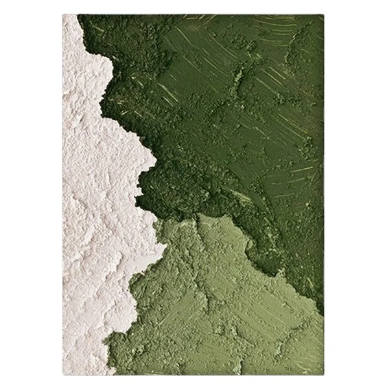
View the productAt first look, Olive Green Abstract Terrain reads less like a painting and more like a cross-section of land. A dense forest green sits in the upper right, a softer sage settles below it, and a thick, chalky off-white mass pushes in from the left. Where they meet, the edge is ragged — not drawn, but built up by hand in plaster-like relief. The piece feels still, weighted, and quietly tectonic.
What makes it visually distinct
Most green abstract wall art leans either gestural or graphic. This one does neither. The greens are laid in with a palette knife, leaving directional ridges that catch light at an angle. The white side is rougher, almost mineral — closer to dried clay than paint. That contrast between matte chalk and pigment-rich green is what holds your eye, and it's also what makes the piece feel hand-built rather than printed.
It's a textured abstract in the truest sense: the surface itself carries as much of the composition as the color does.
How it behaves in a room
Hung above a low linen sofa, the vertical weight of the white edge anchors one end of the seating area while the greens stretch out across the wall. Above a headboard, the olive tones soften into a warm white or greige backdrop and bring the room down a notch without darkening it. In a home office, placed on the wall facing the desk, the cool greens give the eye somewhere to rest between tasks.
In daylight, the texture is the loudest element — shadows shift across the ridges as the sun moves. Under lamplight, the piece quiets down and the color relationships take over. Both modes feel intentional.
Who it's for
This piece suits rooms that already lean organic: raw wood, linen upholstery, stoneware, plaster walls, neutral rugs. It fits comfortably inside Japandi, contemporary wabi-inspired, and soft modern interiors. If your space runs glossy, high-contrast, or maximalist, this won't be the right voice — it's built for restraint.
It also tends to work better as a single statement than as part of a gallery wall. The texture and scale want room to breathe.
Realistic expectations
Because it's hand-painted, no two pieces are identical. Ridge patterns, the exact line of the diagonal, and the depth of the plaster relief will vary slightly. That's part of what makes it feel like an object rather than a print. Buyers expecting a flat, uniform canvas should consider a printed alternative instead.
The greens read as muted and earthy in person — closer to dried herb and moss than bright emerald. If you're matching to a specific paint color, treat the tones as a range, not a swatch.
How it compares
Against a typical green and white abstract painting printed on canvas, this version trades crisp reproducibility for physical depth. Against fully monochrome textured art, it offers more compositional movement thanks to the diagonal split. And compared with smaller framed prints, the large hand-painted format gives you a real focal piece — the kind that defines a wall instead of decorating it.
A quick styling scenario
Picture a living room with a low oatmeal linen sofa, light oak coffee table, and a jute rug. The wall behind the sofa is warm white. Center this piece above the sofa, leave the surrounding wall bare, and add a single ceramic lamp on a side table. That's the whole room — the artwork carries the visual weight, and everything else stays quiet around it.
Product details
- Type: Hand-painted abstract wall art on canvas
- Size: Available in large format, suited to sofas, beds, and feature walls
- Finish: Heavy palette-knife texture in the greens; plaster-like 3D relief in the off-white area
- Palette: Forest green, powdery sage, chalky off-white
- Style direction: Organic modern, wabi-sabi, minimalist abstract
- Best rooms: Living room above a low sofa, bedroom above a headboard, home office facing the desk
- Pairs well with: Warm white linen, light oak, soft greige upholstery
For the full piece, sizing, and current availability, see Olive Green Abstract Terrain - Wall Art by Fir Gallery.