
A Quiet Horizon: Living With the Abstract Blue Seascape Still Horizon
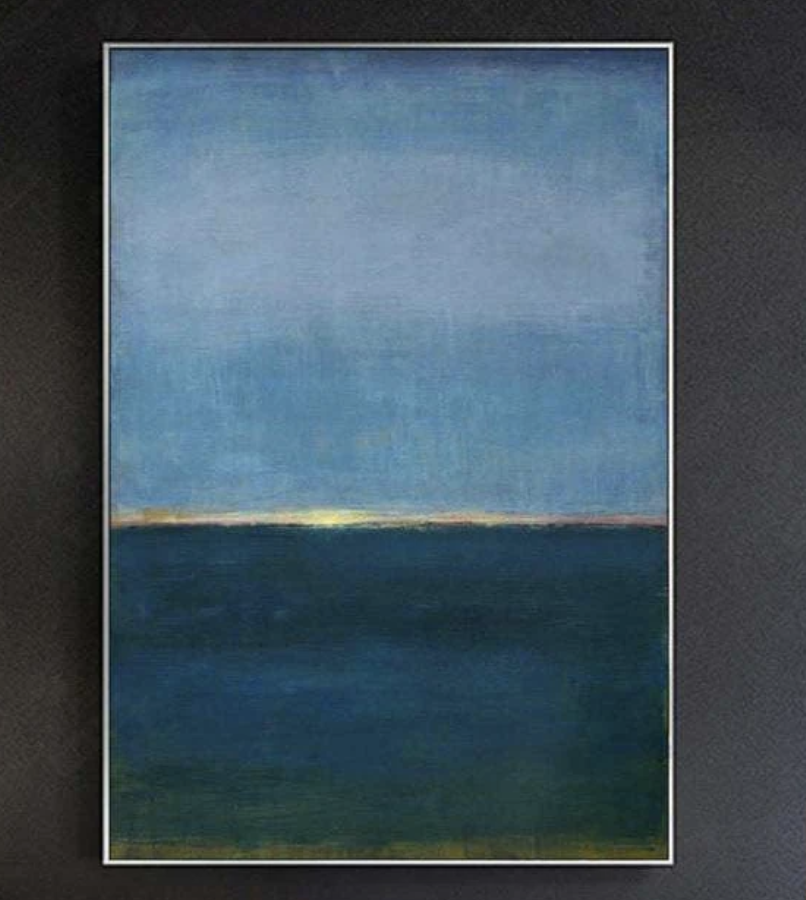
The Abstract Blue Seascape Still Horizon is a hand-painted canvas built on two broad color fields — a heavy teal-green below, a cooler blue above — separated by a faint warm glow at the horizon. It reads as quiet, grounded, and atmospheric, working as a focal point above a sofa, bed, or low credenza in minimalist, Japandi, or soft modern interiors.
Quick read
Two fields of color, one held breath between them.
Product reference
Piece: Abstract Blue Seascape Still Horizon - Wall Art by Fir Gallery
Format: Hand-painted
Size family: large
View the productAt first glance, the Abstract Blue Seascape Still Horizon reads as two simple fields of color — a heavy teal-green below, a cooler muted blue above — divided by a thin, almost glowing band of ochre and dusty rose. Spend a little longer with it and the surface starts to do more work: brushed layers, a worked texture that has settled rather than smoothed, and a horizon line that hovers instead of cutting. It's abstract, but it carries the memory of an ocean.
This is a hand-painted canvas, not a print, and the difference shows in person. The lower field has weight. The upper field opens up. The narrow threshold between them is where the painting actually lives.
What the Piece Actually Does in a Room
Large abstract seascapes tend to fall into two camps — graphic and loud, or quiet and tonal. This one sits firmly in the second. It doesn't compete with furniture or architecture. Instead, it pulls a wall into a slightly slower register, the way a deep rug or a heavy curtain can.
On a pale plaster wall, the deep teal reads almost like a window into weather. Under lamplight, the blues warm and the horizon band glows a little more clearly. In daylight, the painting flattens slightly and feels more atmospheric than literal. That shift across the day is part of what makes it feel like real art rather than wall filler.
Who It's For
This piece tends to suit people drawn to minimalist, Japandi, and soft modern interiors — rooms with restraint, natural materials, and a preference for tonal layering over pattern. If your space leans warm-neutral with charcoal linen, warm white plaster, oak, or aged brass, the seascape will settle in without negotiation.
It's less suited to high-contrast, highly saturated rooms. Against a bright accent wall or next to busy gallery arrangements, the quietness of the composition can get lost.
Realistic Expectations
A few things worth knowing before you commit:
- The palette is genuinely deep. In low light, the lower field can read closer to black-green than teal.
- The horizon glow is subtle — it's a held tension, not a dramatic sunset.
- As a hand-painted work, brush texture and small tonal variations are part of the piece, not flaws.
- It works best at large scale. Sized too small, the composition loses the spaciousness that makes it feel like a horizon at all.
How It Compares to Other Seascape Wall Art
Compared to photographic ocean prints, this painting trades realism for mood. Compared to brighter coastal art — sun-bleached blues, sandy whites, sailboats — it's moodier, more architectural, more interior-design-led than vacation-led. Next to pure color-field abstracts, it keeps just enough horizon to feel like a place, which is often what makes a room feel anchored rather than decorated.
A Quick Styling Scenario
Picture a living room with a low charcoal linen sofa, a warm white wall behind it, and a pair of aged brass sconces. Hung centered above the sofa, the seascape lines up so the horizon sits just above eye level when seated. The teal field grounds the seating zone; the upper blue extends the wall upward and makes the ceiling feel taller. Add a dark wood coffee table and a single ceramic vessel, and the room is essentially done.
In a bedroom, the same logic applies above a headboard — the horizontal calm of the composition steadies the space. In a home office, on the wall you face from the desk, the cool upper field gives the eye somewhere to rest between tasks.
Product Details
- Type: Hand-painted canvas wall art, abstract seascape
- Style: Minimalist, abstract, soft modern
- Palette: Deep teal-green, muted navy-blue, with a thin ochre and dusty rose horizon band
- Texture: Worked brushwork, layered surface, settled rather than glossy
- Best scale: Large — designed to read as a single statement piece, not a gallery component
- Recommended rooms: Living room (above a low sofa), bedroom (above the headboard), home office (facing wall or above a credenza)
- Pairs well with: Charcoal linen upholstery, warm white plaster walls, aged brass fixtures, oak or walnut furniture
If your wall is asking for something quieter, deeper, and more atmospheric than the usual coastal print, take a closer look at the Abstract Blue Seascape Still Horizon - Wall Art by Fir Gallery.