
Blue Green Abstract Still Interval: A Cool, Textured Canvas That Holds the Room
Blue Green Abstract Still Interval by Fir Gallery is a hand-painted abstract canvas defined by vertical brushwork, cool layered color, and grounded charcoal passages. It reads as a calm focal piece above a sofa, headboard, or credenza, fitting soft modern, coastal, and transitional interiors without demanding the whole room.
Quick read
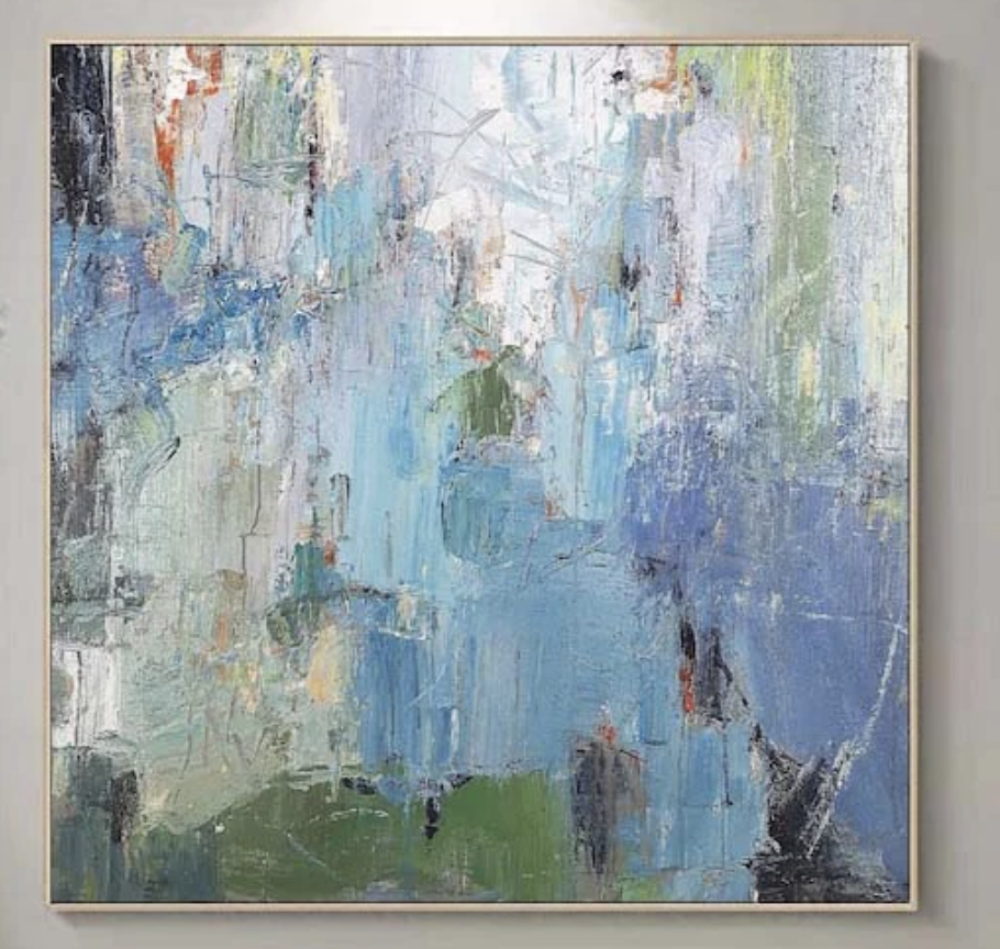
Cool blues, sage, and lavender pulled across a textured surface — built up, scraped back, and quietly resolved.
Product reference
Piece: Blue Green Abstract Still Interval - Wall Art by Fir Gallery
Format: Hand-painted
Size family: medium
View the productAt first glance, Blue Green Abstract Still Interval reads as a tall, weather-worn field of color — broad blues pulled vertically, interrupted by sage, muted lavender, and quieter passages of charcoal and olive near the base. It's a hand-painted abstract canvas that feels built rather than printed, with brushwork that compresses in some areas and drags loosely in others.
The composition opens near the upper center, where negative space lightens the painting before it settles back into denser layering below. Small flickers of rust and ochre surface between the cooler tones, adding warmth without breaking the overall calm.
How It Reads in a Room
This is a piece that holds a wall without demanding it. The vertical energy lifts the eye, while the cool palette keeps the surface quiet against warm white, greige, or soft plaster walls. It behaves like a focal point, but a restrained one — closer to a textured window than a graphic statement.
In daylight, the blues and sage feel airy and slightly weathered. Under lamplight, the darker charcoal areas deepen, and the lavender undertones pull forward. That shift is part of what makes a hand-painted abstract feel different from a flat print: the surface keeps changing as the light changes.
Who It Suits
This canvas tends to land well with buyers leaning toward soft modern, coastal, or transitional interiors — rooms with light oak, soft grey upholstery, linen, and a generally low-contrast palette. If your space already runs cool and layered, it folds in naturally. If your room is warm and saturated, it can still work, but it will read as a deliberate cool counterpoint rather than a blended accent.
It's less suited to high-contrast, heavily graphic interiors or rooms built around saturated jewel tones. There, the quiet tonal shifts can get lost.
Common Misreads
Two things are easy to assume incorrectly. The first is that a cool palette means a cold room — it doesn't, especially with the rust and ochre flickers and the warmth of natural wood nearby. The second is that abstract means busy. This piece is layered, but the rhythm is steady, and the upper negative space gives the eye somewhere to rest.
How It Compares
Against a large-scale graphic abstract, this one is softer and more atmospheric. Against a minimalist color-field canvas, it offers more texture and visual depth. If you're choosing between a clean printed abstract and a hand-painted piece with real brush movement, the tradeoff is clear: prints stay flat and predictable, while a textured abstract canvas like this one shifts with light and adds tactile weight to the wall.
A Quick Styling Scenario
Picture a living room with a low, linear sofa in soft grey, a light oak coffee table, and warm white walls. Centered above the sofa, this painting pulls the room upward and gives the seating area a clear anchor — without competing with a rug or throw pillows. Swap the setting to a bedroom, hang it centered behind a low headboard, and it becomes a calm backdrop instead of a focal point. Same canvas, different role.
Product Details
- Type: Hand-painted abstract canvas
- Style: Soft modern, coastal, transitional
- Palette: Cool blues, sage green, muted lavender, charcoal, with subtle rust and ochre accents
- Texture: Heavy directional brushwork, scraped and dragged passages, built-up surface
- Composition: Vertical movement with open negative space near the upper center
- Best placement: Above a low sofa, behind a headboard, or opposite a desk above a credenza
- Pairs with: Light oak wood, soft grey upholstery, warm white linen
- Rooms: Living room, bedroom, home office
Because each canvas is hand-painted, expect small variations in stroke and surface — that's part of what gives this style its presence on the wall.
For the full piece and current size options, see Blue Green Abstract Still Interval - Wall Art by Fir Gallery.