
The Quiet Drama of Gathered Forms: A Closer Look at a Gold-Toned Figurative Canvas
This piece reads as a cluster of softened human silhouettes flowing into one another across a warm neutral palette. The textured gold center pulls the eye, while cream and slate sections give the composition rhythm and air. It works best as a wide horizontal anchor over a sofa, headboard, or sideboard in soft modern, transitional, or lightly art deco rooms.
Quick read
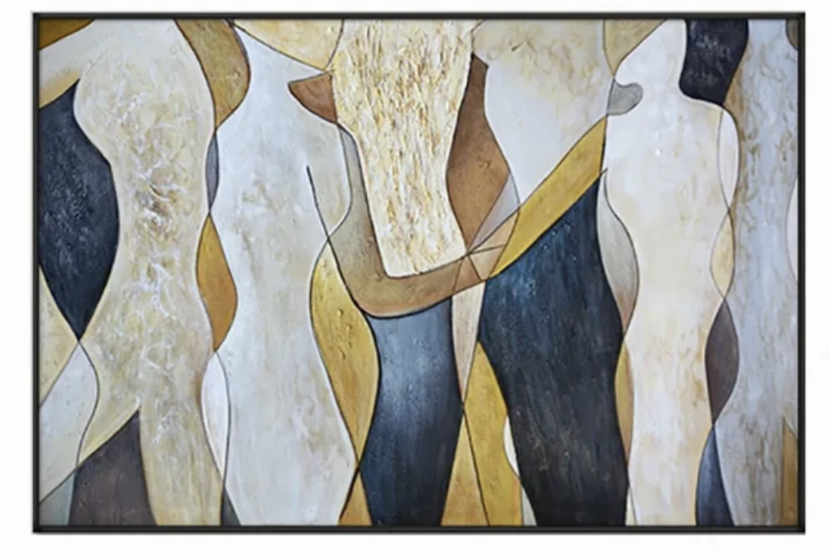
Figures dissolve into one another, held together by gold, slate, and cream.
Product reference
Piece: Abstract Figurative Gold Gathered Forms - Wall Art by Fir Gallery
Format: Hand-painted
Size family: medium
View the productAt first glance, this painting reads as a group of figures standing close together — but the longer you look, the more they soften into one another. Outlines blur, tones shift, and what looked like separate bodies becomes one continuous rhythm of cream, slate, warm gold, and brown. It's a figurative abstract, but it leans more abstract than literal, which is part of why it carries a wall so well.
What the Piece Actually Looks Like
The composition is built from broad, interlocking curves. A dense gold-toned mass sits near the center with visible texture — brushed, layered, almost sculptural — while smoother cream and slate sections flank it on either side. There's very little negative space, yet the eye moves easily through the painting because the tonal contrast does the work that empty space normally would. Where dark slate meets pale cream, there's a clean edge of tension. Nothing about it feels chaotic.
How It Reads in a Room
This is a grounded, horizontal piece. It feels calm rather than loud, but it has enough visual weight to behave like a focal point on a wide wall. In daylight, the gold center warms up and the textured passages catch light unevenly, which gives the canvas a hand-made depth. Under lamplight in the evening, the slate areas deepen and the cream sections soften — the painting reads quieter and more architectural.
Think of it as a statement piece that doesn't try to dominate. It's the kind of figurative abstract canvas that holds a room together without demanding the conversation.
Who It Suits
This works for rooms leaning soft modern, transitional, or lightly art deco — interiors where warm neutrals already do most of the talking. It pairs naturally with warm taupe upholstery, aged brass hardware, and medium walnut wood. If your space runs cool gray, stark white minimalism, or high-contrast black-and-white, this piece will feel out of step. It wants warmth around it.
It's also a good fit for buyers who like figurative work but don't want anything overtly representational on the wall. The figures are present but abstracted enough that the painting reads as form and color first, subject second.
One Realistic Styling Scenario
Picture a living room with a wide low-profile sofa in warm taupe, a walnut coffee table, and a pair of aged brass floor lamps. Hung centered above the sofa, this canvas fills the horizontal space and ties the metals, woods, and upholstery together through its gold and brown passages. The slate sections echo darker accents — a charcoal throw, a bronze tray — without matching them too literally. The room feels finished, not styled.
Common Misreads
A few things worth setting straight. This isn't a small accent piece — it's built to anchor a wall, so undersizing it on a narrow stretch will work against the composition. It's also not a high-contrast graphic print; the palette is layered and warm, closer to a painted mural than a poster. And while the figures are recognizable, don't expect portrait-level detail. The appeal lives in the silhouettes and the texture, not the faces.
How It Compares
Against a single-figure abstract, this piece feels fuller and more architectural. Against a pure color-field abstract, it has more narrative pull because the human forms give the eye something to track. And compared with a black-and-white line drawing of figures, it reads warmer, heavier, and more grounded — better suited to rooms where you want the art to settle the space rather than sharpen it.
Product Details
- Type: Hand-painted canvas, figurative abstract
- Size: Medium, horizontal orientation — scaled for sofas, headboards, and sideboards
- Palette: Cream, warm gold, brown, slate
- Texture: Built-up brushwork in the gold center; smoother cream and slate passages
- Best rooms: Living room above a wide sofa, bedroom behind a low headboard, dining room above a sideboard or facing a dark timber table
- Best interiors: Soft modern, transitional, lightly art deco
- Pairs with: Warm taupe upholstery, aged brass, medium walnut wood
For a closer look at the textures, palette, and full sizing, see Abstract Figurative Gold Gathered Forms - Wall Art by Fir Gallery.