
Scattered Light: A Textured Abstract That Lets a Room Breathe
This hand-painted abstract canvas builds its character from contrast: thick palette-knife impasto against thinner washes, scattered color blocks against an open cream field. It works as a focal piece without dominating, which makes it a flexible fit for living rooms, dining walls, and home offices leaning organic modern, soft modern, or transitional.
Quick read
Color fragments held in suspension, not arrangement.
Product reference
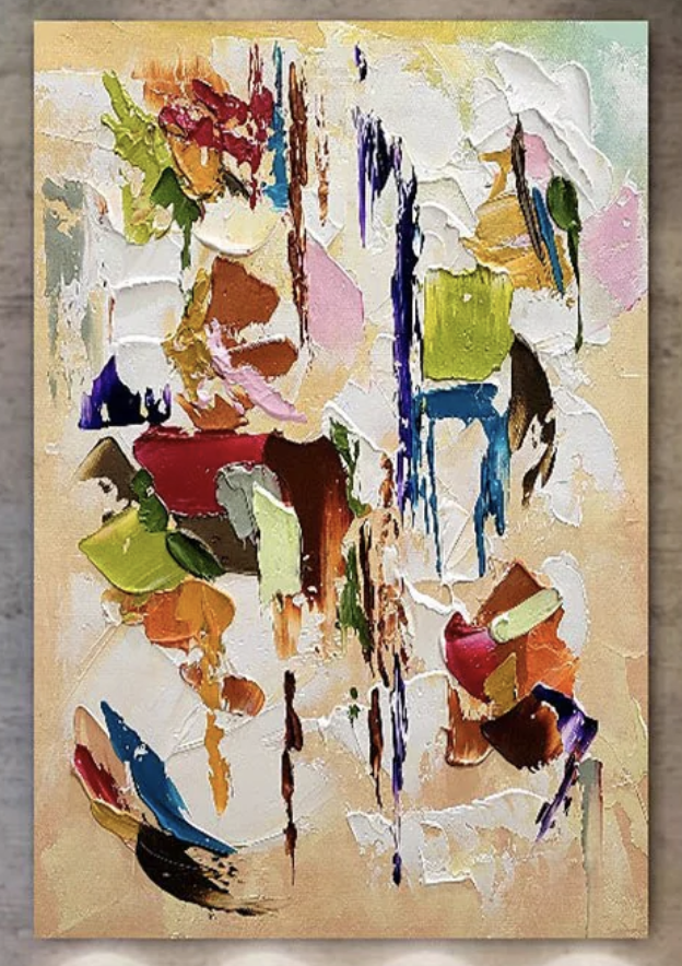
Piece: Colorful Abstract Textured Scattered Light - Wall Art by Fir Gallery
Format: Hand-painted
Size family: medium
View the productThe first thing you notice is the surface. Thick ridges of paint sit next to thinner, almost dry-brushed passages, and small drips of blue and brown run down the canvas in narrow vertical lines. Color shows up in fragments — deep red, olive green, cobalt, burnt sienna, soft pink — scattered across a warm cream ground with no obvious center. It reads as a textured abstract canvas that's been built up by hand, not printed flat.
What Makes It Visually Distinct
Most colorful abstract wall art leans into either bold geometry or a single dominant gesture. This one does neither. The composition stays loose and distributed, which means your eye keeps moving between clusters instead of locking onto one point. The cream field around the color does a lot of quiet work — it gives the piece air, and it keeps the brighter pigments from feeling busy.
Up close, the impasto reads almost sculptural. From across a room, it softens into a balanced field of warm and cool color.
How It Feels in a Room
The mood is expressive but not loud. There's energy in the brushwork and the dripped lines, but the generous negative space keeps everything calm. It feels closer to organic modern than maximalist — textured and hand-built, but not heavy.
In daylight, the cream ground brightens and the impasto throws small shadows that shift through the day. Under warm lamplight in the evening, the reds and ochres come forward and the blues recede, which gives the piece a slightly different personality after dark.
Who It Suits
This works well for buyers building a room around warm neutrals — warm white walls, light oak, linen upholstery in oatmeal or soft taupe. It's a natural match for soft modern, transitional, and lightly bohemian interiors that want a hit of color without committing to a saturated palette.
If your space is already busy with patterned rugs, gallery walls, and layered textiles, this piece can quiet things down while still adding personality. If your space is very minimal, it brings warmth and human texture that a clean print can't replicate.
Where It Earns Its Wall
Above a long, low sofa, the horizontal spread of color follows the line of the furniture and fills a wide wall without needing a second piece beside it. Behind a dining table, the cream background reads as neutral against most wood and upholstery tones, and the color fragments give guests something to look at without dominating the conversation.
In a home office, hang it on the wall opposite the desk. Scattered color holds attention lightly — it's something to glance at between tasks rather than a focal point that competes with your screen. Beside open shelving, the open composition balances the visual weight of stacked books and objects.
Realistic Expectations
Because it's hand-painted, the impasto, drip placement, and exact color distribution will carry small natural variations. That's part of what separates it from a printed canvas — you're getting genuine surface depth, not a photograph of texture. Buyers expecting a flat, uniform finish should consider a print instead.
One common misread: people assume scattered compositions feel chaotic. In practice, the open cream ground does the opposite — it makes the room feel more spacious, not less.
Product Details
- Type: Hand-painted abstract canvas, original brushwork with impasto texture
- Style: Organic modern, abstract art with graffiti-influenced gestural marks
- Palette: Warm cream ground with deep red, olive green, cobalt blue, burnt sienna, and soft pink fragments
- Texture: Mixed — thick palette-knife passages alongside thinner washes and vertical drip lines
- Best rooms: Living room above a sofa, dining room behind the table, home office opposite the desk
- Pairs with: Warm white linen, light oak, soft taupe upholstery
- Size tag: Medium — substantial enough to anchor a feature wall without overwhelming a smaller space
How It Compares
Against a large-scale single-gesture abstract, this piece is quieter and more layered — better for rooms where you want presence without a single dominant shape. Against a framed print, it brings real material weight and dimensional shadow that a print can't fake. Against a tight, geometric abstract, it feels looser and more human.
For a final look at the piece in detail, see Colorful Abstract Textured Scattered Light - Wall Art by Fir Gallery.