
Soft Bloom, Open Space: Why This Abstract Floral Painting Works in Almost Any Room
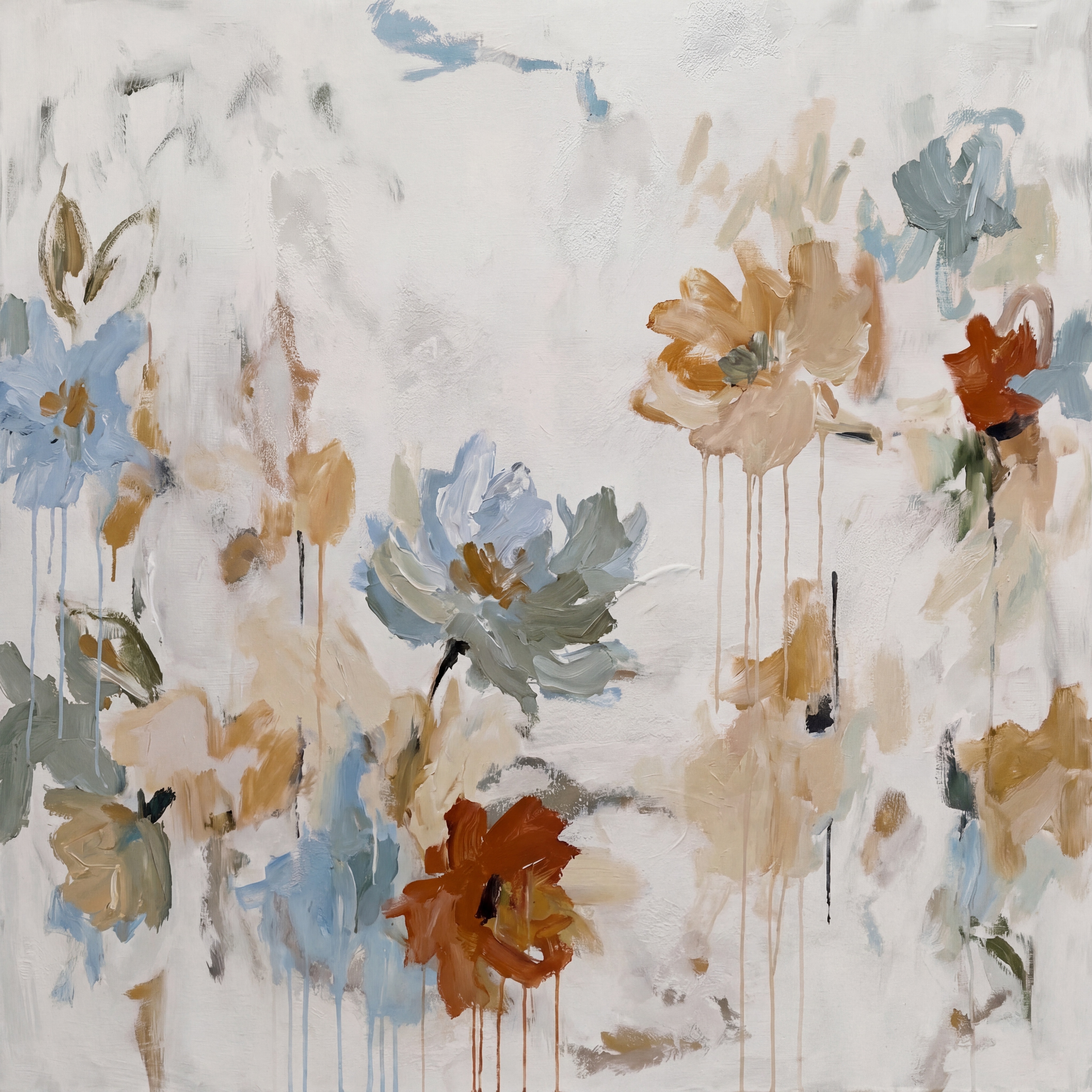
Abstract Floral Neutral Soft Bloom by Fir Gallery is a large hand-painted canvas featuring loosely rendered flowers in dusty blue, warm ochre, terracotta, and sage against an off-white ground. The composition leans heavily on negative space, letting the clustered lower blooms breathe rather than compete. It suits soft modern, French country, and transitional interiors equally well — and reads naturally above a sofa, behind a headboard, or across from a dining table.
Quick read
A textured, hand-painted floral canvas that holds its warmth without demanding your full attention — designed to settle into a room rather than perform in it.
Product reference
Piece: Abstract Floral Neutral Soft Bloom - Wall Art by Fir Gallery
Format: Hand-painted
Size family: large
View the productAt first glance, this painting reads as calm. Flowers drift loosely across an off-white ground — their edges unresolved, their petals built from layered impasto strokes rather than clean outlines. The colors are specific without being loud: dusty blue sits beside warm ochre, terracotta anchors the lower clusters, and sage leaves soften the transitions between blooms. Nothing competes. The palette holds together the way a well-edited room does — through restraint, not matching.
What Makes This Piece Visually Distinct
The surface is where this painting earns its keep. Brushwork is visible throughout, and paint drips trail downward from several of the blooms — a detail that could read as accidental but actually grounds the composition. Those drips give the piece a vertical rhythm that keeps the eye moving without rushing it. The upper half of the canvas is predominantly negative space, which is a deliberate compositional choice and one of the more useful things about this painting for real rooms: it doesn't fill every inch with information.
That open upper half is what separates this from a lot of floral wall art at this scale. Many large botanical canvases crowd their surfaces, which can feel heavy above low furniture or in rooms with modest ceiling heights. This one breathes.
How It Reads in a Room
In daylight, the sandy beige ground picks up warmth and the blue tones stay cool and recessive — the contrast is easy, not jarring. Under lamplight in the evening, the ochre and terracotta tones deepen slightly, and the piece reads warmer overall. It's one of those paintings that shifts mood with the light in the room rather than holding one fixed temperature all day.
Above a low sofa, the horizontal spread of blooms fills wall space comfortably without crowding the sightline. Pair it with linen upholstery and light oak furniture and the palette connects without being matchy. In a bedroom behind the headboard, the muted tones recede gently — present enough to register, quiet enough not to interfere with the room's purpose. A dining room with pale walls and a timber table would absorb it naturally, the terracotta and ochre pulling warmth from the wood grain.
Who This Painting Suits
Buyers drawn to soft modern, French country, or transitional interiors will find this canvas useful across more than one room. It doesn't commit hard to any single style identity, which is genuinely practical: it works with warm white linen, soft taupe upholstery, and light oak finishes without needing a style-matched space to land well.
It's a good choice for someone who wants an abstract that still reads as floral — or a botanical piece that reads more like painting than decoration. That middle ground is where this canvas lives, and it's a more useful position than it might sound when you're actually comparing options.
What to Expect — and What Not To
Because this is hand-painted, the surface has genuine tactile variation. Impasto strokes catch light differently at different times of day, and the edges of forms are intentionally unresolved — that's part of the aesthetic, not a production inconsistency. Buyers expecting sharp-edged botanical illustration or photorealistic flowers will want to look elsewhere. This piece is built around suggestion, not definition.
Scale matters here too. The composition's open negative space is designed for a large canvas. In a smaller format, that breathing room compresses, and the clustered lower blooms can feel dense. At large scale, the whole piece holds its proportion — and that proportion is what makes it work above major furniture pieces rather than feeling undersized.
A Quick Styling Scenario
Picture a living room with pale greige walls, a low-profile sofa in warm cream linen, and a light oak coffee table. The canvas goes centered above the sofa, with roughly six to eight inches of wall visible between the top of the sofa back and the bottom edge of the frame. The dusty blue in the painting echoes a throw pillow; the terracotta picks up a ceramic object on the side table. Nothing was bought to match — but it reads like it was planned. That's what a well-composed neutral floral canvas can do when the palette is genuinely considered rather than broadly inoffensive.
Product Details
- Type: Hand-painted original canvas — not a print
- Size tag: Large — specific dimensions available on the product page
- Surface: Textured impasto finish with visible brushwork and paint drips; surface is actively worked, not flat
- Palette: Dusty blue, warm ochre, terracotta, sage, sandy beige, off-white ground
- Framed vs. unframed: Confirm current options on the product page
- Best rooms: Living room above a sofa, bedroom behind a headboard, dining room above a sideboard or on a facing wall
- Interior styles: Soft modern, French country, transitional
- Furniture pairings: Warm white linen, light oak, soft taupe upholstery
- Ceiling height note: The open upper composition suits higher ceilings well; the negative space extends upward rather than compressing
For rooms that need visual warmth without visual noise, Abstract Floral Neutral Soft Bloom - Wall Art by Fir Gallery is a canvas that earns its wall space quietly — and keeps it.