
Quiet Bloom: The Abstract Floral That Earns Its Wall Space
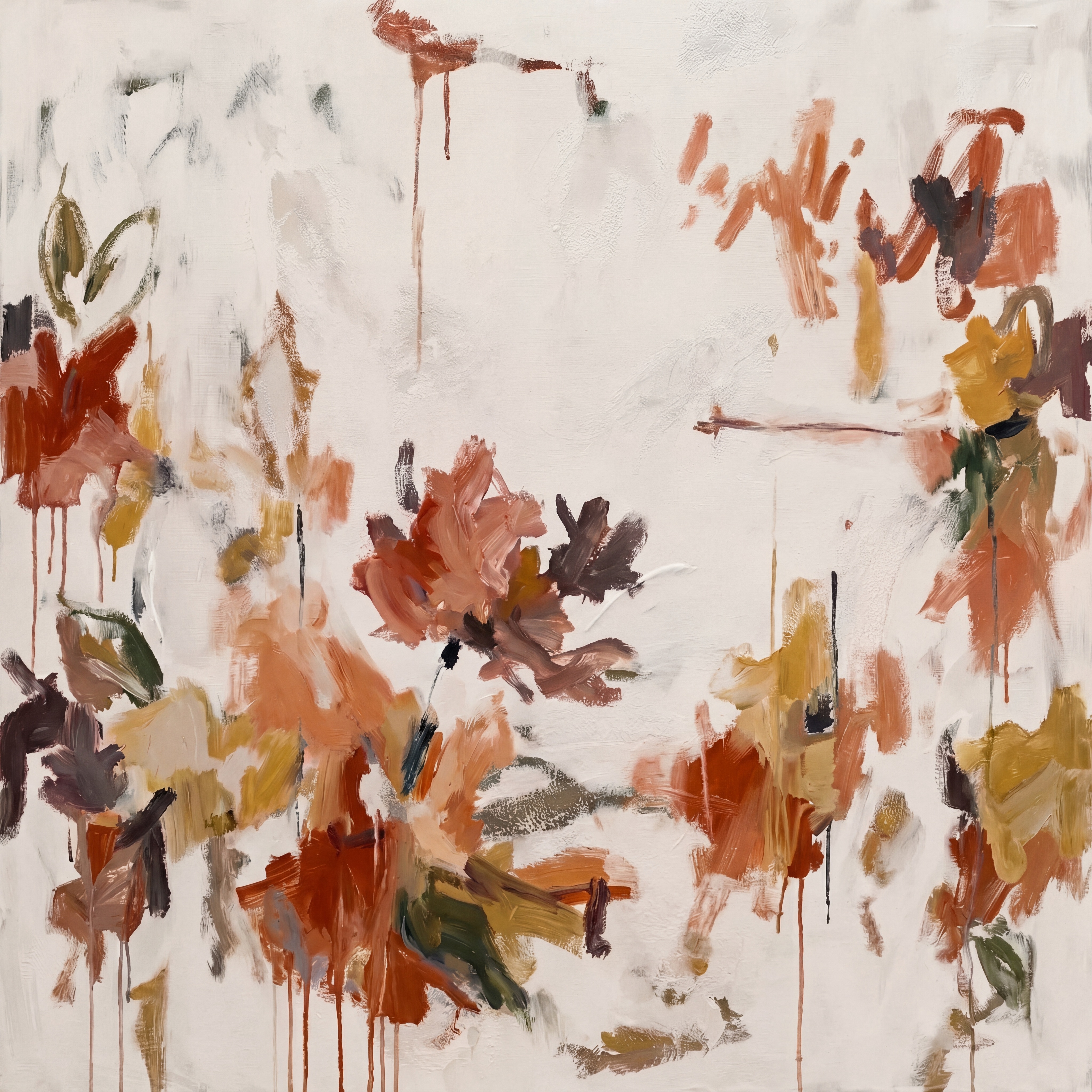
Abstract Floral Terracotta Quiet Bloom is a hand-painted large-format canvas that layers terracotta, burnt sienna, dusty rose, olive, and deep plum into loose botanical clusters. The composition leaves the center deliberately open, creating a natural visual pause that keeps the piece from feeling heavy despite its active edges. It suits living rooms, bedrooms, and dining rooms where warm neutrals and natural textures already carry the room's mood.
Quick read
An earthy abstract floral that settles into a room rather than demanding attention — balanced through accumulation, not arrangement.
Product reference
Piece: Abstract Floral Terracotta Quiet Bloom - Wall Art by Fir Gallery
Format: Hand-painted
Size family: large
View the productAt first glance, this is a painting that looks like it happened the right way. The brushwork is loose and clustered — terracotta, burnt sienna, dusty rose, olive, deep plum — gathering into soft botanical shapes that stop just short of becoming flowers. Nothing is committed, which is exactly the point. The open center holds steady while the edges accumulate color and texture, and thin paint drips trace vertically through several passages, adding a sense of weight and time that a cleaner composition wouldn't have.
How It Actually Reads in a Room
The pale off-white ground does real work here. It keeps the palette from feeling heavy, even where the lower half concentrates color most densely. In daylight, the earthy tones read warm and slightly muted — close to the quality of natural linen or aged plaster. Under lamp light in the evening, the terracotta and sienna passages deepen, and the piece takes on a quieter, more intimate quality. It doesn't shift dramatically between the two, which makes placement more forgiving than with high-contrast abstract work.
Scale matters with this one. Because the composition breathes through negative space rather than filling edge to edge, a large format is the right read — it gives the brushwork room to resolve visually from a normal viewing distance. A smaller version would compress the breathing room and lose the balance between density and openness that makes it work.
Where It Fits — and Where It Doesn't
Above a low linen sofa on a warm white or plaster wall, this piece lands naturally. The palette echoes undyed textiles and raw wood without matching them too literally. It works as a focal point without overpowering furniture that's already doing its own quiet work.
In a bedroom centered above a headboard, it provides enough visual density to anchor the wall — but the open center means it doesn't press down on the space the way a darker or more graphic abstract would. That distinction matters in rooms where restfulness is the goal.
A dining room with a wooden table and cane chairs is a strong fit, particularly on a long wall where the warm terracotta can echo natural timber across the room. Opposite a window, it responds well to shifting natural light throughout the day.
Where it doesn't belong: spaces that lean cool or graphic — charcoal, steel, white-on-white minimalism. The palette needs warmth to meet it halfway. Against cool gray walls or in rooms dominated by black metal fixtures, the earthy tones can read muddier than intended.
What Buyers Sometimes Misread
This is an abstract piece with botanical suggestion, not a botanical illustration. If you're looking for something representational — actual flowers with defined petals and stems — this won't deliver that. What it delivers is the feeling of botanicals: color, looseness, organic rhythm. That distinction is worth sitting with before purchasing.
The drips are intentional. They're part of the composition's sense of gravity, not artifacts of the painting process. If you prefer clean edges and controlled marks, a different piece in this palette would suit you better.
How It Compares
Compared to a print-based abstract floral in similar tones, the hand-painted surface reads differently at close range — the brushwork has actual texture and depth that photography partially captures but doesn't fully reproduce. Compared to a more graphic botanical canvas in the same earthy range, this piece is softer and less structured, which makes it more adaptable to rooms still in progress but slightly harder to anchor in spaces that need visual precision.
A Realistic Styling Scenario
A living room with warm white walls, a low oak credenza, and a sofa in oatmeal linen: hung centered above the sofa with a few inches of breathing room at the top, this canvas ties the room's warm undertones together without introducing a new color direction. Layered throws in terracotta and undyed cotton on the sofa pick up the palette without matching it directly. The result reads considered without feeling coordinated.
Product Details
- Type: Hand-painted canvas — not a print
- Size: Large format
- Palette: Terracotta, burnt sienna, dusty rose, olive, deep plum on pale off-white ground
- Surface: Textured brushwork with visible paint layering and intentional drip passages
- Best wall colors: Warm white, plaster, greige, soft cream
- Room fit: Living room above a sofa, bedroom above a headboard, dining room on a long feature wall
- Interior styles: Organic modern, bohemian, rustic modern, soft modern
- Not recommended for: Cool-toned or high-contrast minimalist spaces
If your walls run warm and your instinct leans toward textured, living color over graphic precision, Abstract Floral Terracotta Quiet Bloom - Wall Art by Fir Gallery is worth a close look.