
Caught Mid-Scatter: The Abstract Floral That Brings Warmth Without Weight
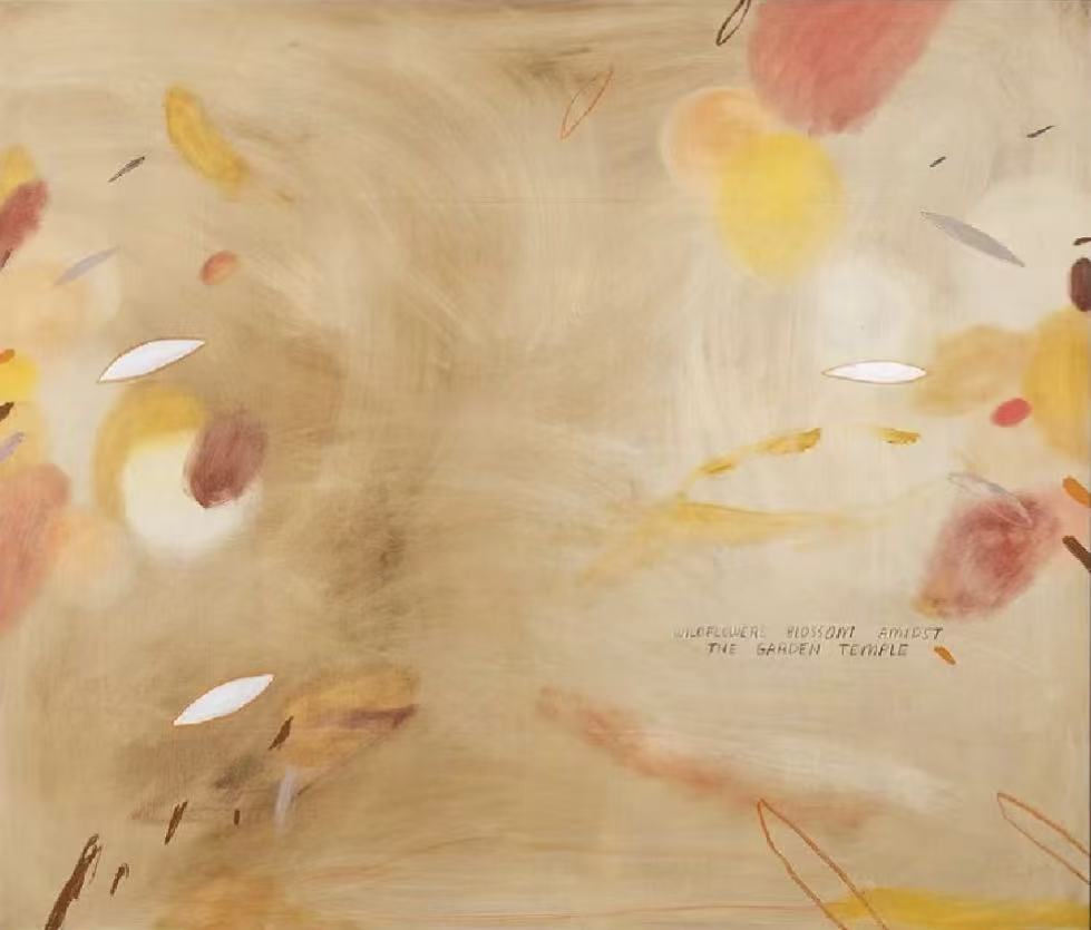
Abstract Floral Warm Garden Blossom by Fir Gallery is a large hand-painted canvas that drifts between botanical and abstract — loose petal forms, gestural marks, and eye-shaped voids of white suspended across a pale ochre ground. It works particularly well above a sofa or behind a headboard where its open center and muted warmth let the piece breathe without overwhelming the room.
Quick read
Warm ochre ground, blush and dusty rose petal forms, luminous open center — this piece earns its place on the wall by doing less, not more.
Product reference
Piece: Abstract Floral Warm Garden Blossom - Wall Art by Fir Gallery
Format: Hand-painted
Size family: large
View the productAt first glance, this painting reads almost like something caught mid-motion — petal-like forms drifting toward the edges, a pale center that opens rather than closes, thin gestural marks that cross the field without anchoring it. That quality of suspension is what makes Abstract Floral Warm Garden Blossom by Fir Gallery different from most large-format botanical prints. It doesn't present a composed floral arrangement. It presents a field caught between stillness and scatter.
What the Painting Actually Looks Like
The ground is a warm pale ochre — closer to unbleached linen than true white, and closer to natural plaster than beige. Soft blush, dusty rose, and muted yellow forms drift across it in loosely rendered clusters that suggest petals without illustrating them. The center of the composition opens into something almost luminous: a void that reads lighter than the surrounding canvas, creating quiet tension between fullness at the edges and restraint in the middle.
Punctuating the field at intervals are eye-shaped areas of white — not outlines, but actual reservations of light that hold space against the warmer tones. Thin marks in orange, grey, and brown move through the composition without resolving into anything specific. The effect is deliberate and considered, not unfinished.
How It Reads in a Room
This is a piece that settles rather than announces. On a warm white or pale plaster wall, the ochre ground continues the wall color without interruption, and the blush and yellow forms provide just enough variation to hold the eye across the room. It doesn't compete with textiles, furniture, or tableware — which makes it genuinely versatile in rooms where other large-format art tends to fight everything around it.
In daylight, the pale center becomes the visual anchor — the surrounding color drifts away from it. Under lamp light in the evening, the warmer tones lift slightly and the composition reads as richer and more enclosed. Both readings work. Neither one feels wrong.
Where It Fits Best
Above a low linen sofa is the most natural placement. The horizontal scatter of the composition mirrors the width of a standard sofa without needing to be perfectly centered. Behind a headboard in a bedroom, the open center gives the painting room to breathe against surrounding furniture — it doesn't feel like it's closing in. In a dining room hung opposite a window, the soft ochre and rose tones respond to shifting natural light across the day in a way that harder-edged abstract pieces don't.
It pairs most naturally with light oak surfaces, warm white walls, and undyed or natural linen upholstery. Against cooler greys or stark white furniture, the warmth reads as intentional contrast rather than mismatch — though the pairing requires more deliberate surrounding choices to land cleanly.
What Buyers Sometimes Misread
Because the palette is soft and the forms are loose, this piece is sometimes assumed to be quieter than it is at large scale. Hung at the right size, the composition has genuine presence. The gestural marks and white voids keep it from reading as decorative filler. It functions as a focal point — just not an aggressive one.
It also isn't a botanical print in the traditional sense. There are no identifiable flowers, no stems, no structured botanical illustration. Buyers expecting something more literal should know going in that this is abstract first, floral second.
Interior Styles It Suits
Soft modern interiors — warm whites, natural materials, restrained furniture profiles — are the most obvious fit. It also works well in bohemian rooms where layered textiles and organic shapes are already present, and in contemporary wabi-inspired spaces where surface imperfection and negative space are valued. It's less suited to highly graphic, high-contrast interiors where the muted tones would simply disappear.
Product Details
- Type: Hand-painted original artwork
- Size category: Large format
- Surface and finish: Canvas with visible gestural brushwork and layered dry marks — not a flat print finish
- Color direction: Warm ochre, blush, dusty rose, muted yellow, with white and light grey accents
- Framing: Check listing for current framed and unframed options
- Best rooms: Living room above a sofa, bedroom behind a headboard, dining room on a light-facing wall
- Furniture pairings: Light oak, warm white linen, soft taupe upholstery
- Wall color compatibility: Warm white, pale plaster, natural linen tones
If your room already leans warm and textured, this piece fits without adjustment. If you're working from a cooler baseline, it works as a deliberate warm note — just plan the surrounding palette accordingly.
Browse the full listing and available size options for Abstract Floral Warm Garden Blossom - Wall Art by Fir Gallery.