
A Quiet Kind of Drama: Inside Recca Art's Red Marble Fracture
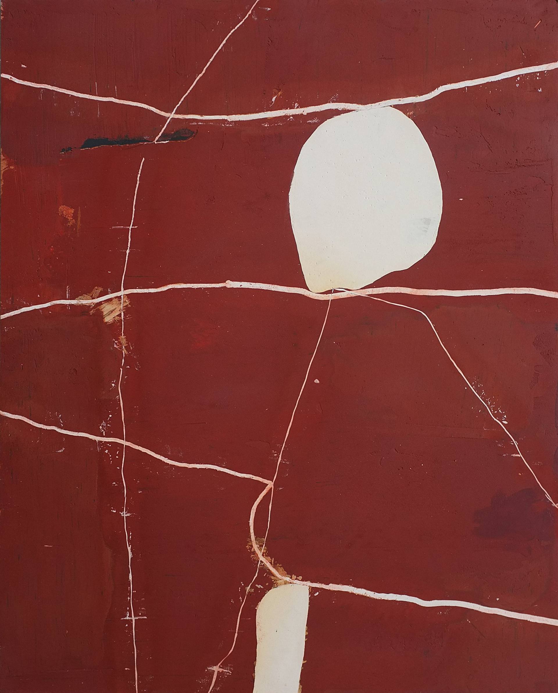
Red Abstract Marble Quiet Fracture by Recca Art is a contemporary abstract print built on a deep red field broken by cream forms and irregular white veining. It reads as warm, geological, and quietly architectural, which makes it a strong focal point above a sofa, headboard, or console without tipping into loud or busy territory.
Quick read
Burgundy depth, cream interruptions, fault-line veining — a grounded centerpiece with a calm pulse.
Product reference
Piece: Red Abstract Marble Quiet Fracture - Wall Art by Recca Art
Format: Print
Size family: small
View the productThe first thing you notice is the red. Not a bright, signaling red, but a deep burgundy that feels closer to stone than paint — varied in tone, warm in some places, almost shadowed in others. Cream-colored organic shapes sit on top of that field, and pale veining moves across the surface in irregular lines, the way a fault might travel through marble. It's abstract, but it reads as something physical.
That's the quiet trick of Red Abstract Marble Quiet Fracture by Recca Art. It looks composed at a distance and textural up close, which is a useful combination for a piece you'll see every day.
What the piece actually does in a room
This is a contemporary abstract print with a strong color statement and a minimalist line vocabulary. The red carries weight, but the cream shapes and white fractures keep the composition from feeling heavy. In daylight, the burgundy reads warm and earthy. Under lamplight, it deepens — closer to oxblood — and the veining picks up a soft glow.
It behaves like a focal point, not a supporting piece. If you hang it on a neutral wall, it becomes the anchor of the room. If you hang it against a saturated wall, you'll lose some of its quiet contrast, so most buyers will get the best result on cream, bone, warm white, greige, or pale oak paneling.
Who it suits
The piece fits comfortably inside Contemporary, Soft Modern, and Transitional interiors. It pairs naturally with warm cream linen upholstery, natural oak, walnut, and brass hardware. It also plays well with ceramics, travertine, and earth-toned textiles — anything with a slightly organic surface.
It's less suited to cool, high-gloss minimalism or rooms built on gray-blue palettes. The red has warmth in it, and that warmth wants warm neighbors.
A short styling scenario
Picture a living room with a long cream sectional, an oak coffee table, and a brass floor lamp angled toward the seating. The wall behind the sofa is bare and painted a soft off-white. Hung centered above the sofa, the print pulls the whole arrangement together — the red answers the wood tones, the cream shapes echo the upholstery, and the veining adds just enough movement to keep the wall from feeling static.
In a bedroom, the same logic applies behind a headboard with white or oatmeal linens. In a home office, it works best on the wall you face while working: present enough to break up a blank surface, calm enough not to compete with a screen.
Common assumptions worth checking
- It's not a loud red. The burgundy is closer to wine and clay than fire-engine red, so it grounds a room rather than energizing it.
- It's graphic, but not cold. The veining is irregular and hand-feeling, which keeps the composition from reading like pure geometry.
- Scale matters. Because this is a small-size print, it works best in tighter wall zones — above a console, a desk, a nightstand pairing, or as part of a curated arrangement rather than alone above a long sofa.
How it compares to nearby options
Compared to a black-and-white minimalist line print, this piece brings far more color presence and texture, so it changes a room's temperature rather than just adding a quiet accent. Compared to a heavily layered abstract expressionist print, it's more restrained — fewer gestures, more architecture. If you want warmth without busyness, it sits in a useful middle lane.
Product details
- Type: Contemporary abstract wall art print
- Size: Small format — best suited to focused wall zones such as above a console, desk, nightstand, or as part of a layered arrangement
- Palette: Deep burgundy ground, cream organic shapes, pale pink-white veining, small dark accents
- Visual character: Textured, geological, minimalist, warm
- Best rooms: Living room, bedroom, home office
- Best pairings: Cream linen upholstery, natural oak or walnut, brass fixtures, ceramic and stone accents
- Interior directions: Contemporary, Soft Modern, Transitional
For warmth that holds a wall on its own, take a closer look at Red Abstract Marble Quiet Fracture - Wall Art by Recca Art.