

The Brooklyn Bridge, Rebuilt in Geometry: A Closer Look at Recca Art's Art Deco Print
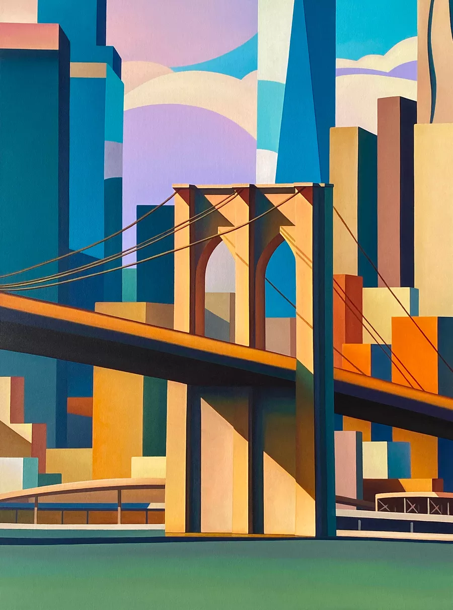
This print reimagines the Brooklyn Bridge as a flat, architectural composition built from angular towers, diagonal suspension cables, and warm-cool color blocking. It carries enough visual weight to anchor a sofa, sideboard, or desk wall, and it pairs naturally with Art Deco, contemporary, and mid-century interiors that already lean into structured furniture and warm metals.
Quick read
A skyline reduced to geometry, where color does the work that perspective usually would.
Product reference
Piece: Art Deco Brooklyn Bridge Crossing - Wall Art by Recca Art
Format: Print
Size family: small
View the productAt first glance, this isn't a bridge so much as a study in stacked geometry. The Brooklyn Bridge's stone towers sit dead center, arched openings cut clean through the composition, while the surrounding skyline breaks apart into flat planes of teal, amber, coral, and dusty lavender. The suspension cables read as precise diagonals, almost like ruled lines drawn across the canvas. It's recognizably New York, but filtered through an Art Deco lens that prizes structure over realism.
What Makes the Piece Visually Distinct
The composition leans on color temperature instead of traditional perspective. Warm oranges and yellows push forward, cool blues recede, and the eye keeps moving between them. There's no soft edge anywhere — every shape is hard-cut and deliberate. That graphic clarity is what gives the print its presence. It feels architectural rather than painterly, closer to a vintage travel poster than a fine-art landscape, but with a more contemporary color palette.
How It Feels in a Room
Hung on a wall, it behaves like a focal point. The vertical emphasis of the towers gives it height, and the saturated palette pulls attention from across the room. In daylight, the cooler blues and teals come forward and the piece feels crisp and structured. Under warm lamplight in the evening, the ambers and corals deepen, and the whole composition reads a little richer and more grounded. That shift is part of what makes it work in living spaces where lighting changes throughout the day.
Who It Suits
This print rewards interiors that already have some structure to them — Art Deco, contemporary, and mid-century modern rooms all give it a natural home. It pairs especially well with brass fixtures, rich leather seating, and deep navy or walnut tones, because the warm amber blocks echo those finishes without competing. If your space leans soft, rustic, or heavily traditional, this piece will feel like the loudest voice in the room. That's not necessarily wrong, but worth knowing going in.
Realistic Expectations
A few things to keep in mind. The geometry is flat and graphic, not textured or brushy — if you're after something that reads as a hand-painted oil from across the room, this isn't that. The colors are bold; they will pull a room toward a stronger palette rather than blending in. And because the composition is symmetrical and centered, it needs a wall that can give it room to breathe. Crowded above a small console, it loses its scale.
How It Compares to Other Cityscape Wall Art
Most Brooklyn Bridge prints fall into two camps: moody black-and-white photography or loose, painterly skyline art. This sits somewhere different. It's graphic without being minimalist, colorful without being playful, and architectural without being cold. If you've been weighing a photographic print and finding it too literal, or an abstract canvas and finding it too vague, this lands in the middle — recognizable subject, stylized treatment.
A Quick Styling Scenario
Picture a living room with a long, low sectional in cognac leather, a brass floor lamp, and a navy area rug. The wall behind the sofa is wide and currently empty. Centered above the sectional, this print pulls the brass and leather forward through its amber blocks, while the teal and navy sections of the composition tie back to the rug. The room suddenly has a center of gravity, and nothing else on the wall needs to compete with it.
Product Details
- Type: Fine-art print by Recca Art
- Style direction: Art Deco, geometric, illustrative
- Palette: Teal, amber, coral, dusty lavender, navy
- Subject: Stylized Brooklyn Bridge and skyline
- Best rooms: Living room above a sectional or sofa, home office behind a desk, dining room above a sideboard
- Pairs well with: Brass metal, rich leather brown, deep navy upholstery, walnut wood
- Wall fit: Works best on a wide, uncluttered wall where it can act as the room's focal point
If you want one piece to set the tone for a whole room, take a closer look at the Art Deco Brooklyn Bridge Crossing - Wall Art by Recca Art.