

A Quiet Center of Gravity: Living With Monochrome Textured Abstract Drawn In
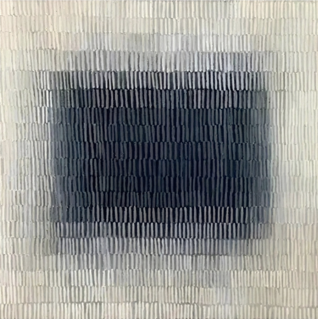
Monochrome Textured Abstract Drawn In is a hand-painted, large-scale abstract that reads like a slow accumulation of marks rather than a printed gradient. The pale outer field settles into a dense charcoal center, giving the piece real weight on a wall without ever tipping into loud contrast. It suits Japandi, Scandinavian, and minimalist rooms where texture matters more than color.
Quick read
A dark, quiet core surrounded by a field of hand-drawn marks — grounded, tactile, and unhurried.
Product reference
The first thing you notice about Monochrome Textured Abstract Drawn In is how the surface behaves. Rows of short vertical marks cover the entire canvas, and instead of blending into a smooth gradient, they build up in layered bands — pale off-white along the outer edges, deepening register by register into a dense charcoal rectangle at the center. It reads less like a painting of something and more like a field that has slowly gathered weight in the middle.
Because each mark is slightly raised, the piece casts its own micro-shadows. Up close, it feels almost woven. Step back, and the dark core takes over as a calm, grounded focal point. That shift between near and far is a big part of what makes this textured abstract wall art worth looking at more than once.
What kind of wall art this actually is
This is a large hand-painted monochrome abstract on canvas — not a print, not a digital reproduction. The palette stays inside a tight range of warm whites, soft greys, and deep charcoal, so it behaves as a neutral even though it has strong visual gravity at the center. Think of it as a textured neutral with a clear focal point, rather than a bold statement piece competing for attention.
How it changes a room
Above a low linen sofa, the dark center gives the seating arrangement something to sit under. It holds the wall without demanding the room reorganize around it. In a bedroom, hung behind a headboard on a wide wall, the concentric darkening pulls the eye inward and quiets the space — useful if the rest of the room already has pattern in bedding, rugs, or drapery.
In a home office, placed on the wall facing the desk, the repeating marks are structured enough to feel intentional but soft enough that they don't compete with a screen. It's the kind of piece that reads as restful without going flat.
Who it suits, and who it doesn't
This works best in rooms leaning Japandi, Scandinavian, or quietly minimalist — warm white walls, light oak, linen, stone, a bit of black metal. It pairs naturally with materials that already have some tactile honesty to them.
It's less at home in high-contrast maximalist rooms or spaces built around saturated color. If you want a painting that drives the palette, this isn't it. It's a supporting anchor with presence, not a centerpiece that dictates the rest of the decor.
Realistic expectations
A common misread on textured monochrome work is expecting it to look like a clean printed gradient. This piece doesn't behave that way in person. The bands are visibly hand-drawn, the transitions are uneven on purpose, and the surface catches light differently through the day — cooler and more graphic in daylight, softer and heavier under lamplight. That's the point. If you want perfect symmetry and a flat finish, a giclée print will serve you better.
How it compares to nearby options
Compared to a black-and-white abstract print, this piece has more physical depth and a slower read. Compared to a heavy impasto abstract, it's calmer and more architectural — the marks are disciplined, not gestural. And compared to a fully minimalist canvas, it offers more to look at without losing the quiet.
A quick styling scenario
Picture a living room with a wide oatmeal linen sofa, a light oak coffee table, and warm white walls. A single large piece centered above the sofa, bottom edge around 8 to 10 inches above the backrest. The charcoal core lines up roughly with the middle of the sofa, giving the whole arrangement a clear visual base. Add a stoneware lamp on a side table and the room already feels resolved.
Product details
- Type: Hand-painted abstract on canvas
- Size: Large-format, suited to full walls above sofas, headboards, or credenzas
- Palette: Warm off-white, soft greys, deep charcoal — monochrome throughout
- Surface: Raised vertical marks with subtle three-dimensional texture
- Best rooms: Living room, bedroom, home office
- Interior fit: Japandi, Scandinavian, organic modern, wabi-sabi, minimalist
- Pairs well with: Warm white linen, light oak, soft stone or concrete surfaces
- Placement notes: Works as a focal point on a wide, uncluttered wall; give it breathing room on either side
For the full view and current sizing options, see Monochrome Textured Abstract Drawn In.