
Looping Lines and Quiet Tension: A Closer Look at Blue Abstract Fluid Drift
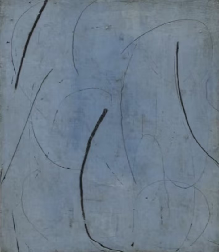
This hand-painted piece from Fir Gallery works through contrast rather than color: thin pencil-like curves sit alongside heavier black strokes on a blue-grey ground that shifts between soft periwinkle and pale steel. The result is restrained but not empty — a canvas that reads differently at different distances and suits minimalist, Japandi, and soft modern interiors across the living room, bedroom, and home office.
Quick read
A large blue abstract canvas that holds the wall with unhurried lines and quiet tonal depth — at home above a sofa, behind a headboard, or facing a desk.
Product reference
Piece: Blue Abstract Fluid Drift - Wall Art by Fir Gallery
Format: Hand-painted
Size family: large
View the productAt first glance, Blue Abstract Fluid Drift reads as a quiet piece — pale blue-grey field, looping lines, generous negative space. But spend a minute with it and the composition reveals something more deliberate. The lines are working in two registers at once: thin, almost pencil-traced curves that feel provisional and searching, and heavier black strokes that interrupt and anchor. That contrast is where the painting holds your attention.
What the Surface Actually Looks Like
The background is not a flat wash. It carries subtle tonal variation — shifting between pale steel and soft periwinkle — with faint horizontal striations that give the impression of depth beneath the marks. In natural daylight, those tonal shifts read clearly. Under warmer lamp light in the evening, the whole surface pulls slightly cooler and the lines come forward. It behaves differently across the day, which is worth knowing if you're deciding on placement.
This is a hand-painted canvas, not a print. The surface carries the physical presence of actual mark-making — weight variation in the strokes, slight texture beneath the lines — and that shows at close range in a way a reproduction doesn't replicate.
How It Reads in a Room
The composition is open. Negative space is generous, which means the piece doesn't crowd even on a wide wall. It holds the wall visually without pressing forward into the room — an important distinction for buyers deciding between a statement piece and something more architectural in feeling. This one lands closer to the latter. It adds structure and visual calm rather than asserting a focal point.
The cool palette — blue-grey, soft black, no warm tones — means it integrates easily with furniture in bleached oak, warm white linen, or soft grey upholstery. It doesn't compete with textured cushions or natural materials. If your room already has a strong warm anchor, this canvas offers a quiet counterbalance rather than a clash.
Room by Room: Where It Works Best
Above a low, wide sofa in the living room is the most natural placement. The horizontal openness of the composition echoes the sofa's silhouette and the cool tones sit comfortably against light walls. Unframed, the canvas reads slightly more raw and contemporary — better for minimalist or Japandi-leaning rooms. A simple thin frame in black or raw wood works if the wall needs more definition.
In a bedroom, centered behind a wide headboard, the muted palette and unhurried line quality contribute exactly the kind of visual rhythm that supports rest rather than stimulating it. It's not a piece that demands your attention as you're winding down — it settles.
A home office is a less obvious placement but a genuinely good one. Hung on the wall directly facing the desk, the layered lines are engaging without being distracting. There's enough visual complexity to hold peripheral interest, not enough to pull focus away from work.
What It Isn't
If you're looking for something warm, textured in an earthy way, or rich with saturated color, this piece won't deliver that. The palette is cool and restrained. The mark-making is deliberate rather than expressive in a loose or energetic sense. Buyers expecting bold gestural drama — the kind of abstract canvas that fills a room with movement — will find this quieter than expected. That restraint is the point, but it's worth stating plainly.
It also works better in rooms with some breathing room. In a smaller, darker space already full of pattern or warm material, the cool tones can read flat rather than calm.
A Real Placement Scenario
Picture a living room with a light grey linen sofa, bleached oak shelving, and walls in a warm off-white. The room has texture but no strong color. Hung above the sofa at standard height — roughly eight to ten inches above the back cushions — this canvas gives the wall a focal point without introducing color competition. The blue-grey reads as a cool neutral at that scale. Visitors notice it; it doesn't announce itself.
Product Details
- Type: Hand-painted canvas — not a print
- Size: Large format
- Color direction: Blue-grey ground, soft periwinkle to pale steel variation, black gestural lines
- Surface: Textured paint surface with visible mark variation
- Framing: Available framed or unframed — unframed suits more minimal settings; a simple thin frame adds definition on larger walls
- Room fit: Living room, bedroom, home office
- Interior styles: Minimalist, Japandi, soft modern
- Furniture pairings: Bleached oak, warm white linen, soft grey upholstery
- Lighting behavior: Reads cooler and more recessive under warm lamp light; tonal variation is most visible in natural daylight
For buyers who want a large abstract canvas that holds a wall with intelligence rather than volume, Blue Abstract Fluid Drift - Wall Art by Fir Gallery is a piece worth looking at carefully before you decide.