
Cloud, Horizon, Quiet: The Abstract Dusk Painting That Changes a Room Without Demanding Attention
This hand-painted piece from Fir Gallery splits its composition cleanly between a dense, organic upper zone and a wide, uninterrupted lower field. The result is a canvas that reads as landscape, abstract, and atmospheric all at once — grounded enough for a living room above a sofa, quiet enough for a bedroom wall, and focused enough for a home office you spend hours facing.
Quick read
A horizontal line holds two completely different moods in one frame — restless texture above, suspended stillness below.
Product reference
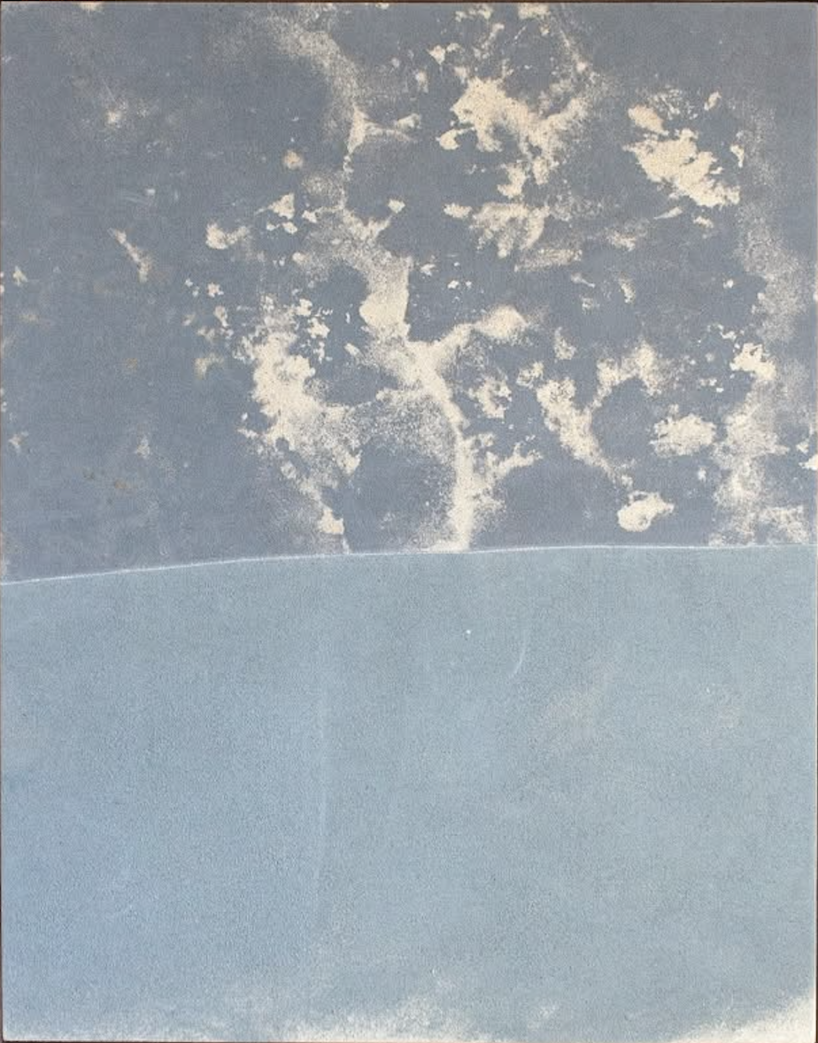
Piece: Blue Grey Abstract Dusk Horizon - Wall Art by Fir Gallery
Format: Hand-painted
Size family: large
View the productAt first glance, this piece reads almost like a weather photograph — pale cloud forms scattered across a cool blue-grey ground, a single horizontal line cutting cleanly across the lower third, and below that, nothing but open powder blue. It's quiet. Noticeably so. But there's enough texture in the upper half to keep the eye moving without making the room feel busy.
What the Composition Actually Does
The dividing line is the whole logic of the piece. Above it, the surface is dense with organic cream and off-white forms that feel accumulated rather than painted — closer to a cyanotype or salted paper print than a traditional brushwork abstract. Below it, the field goes almost completely still. That contrast — restless above, open below — is what gives the painting its spatial presence. The tension sits right at the horizon, then dissipates downward.
It's a genuinely unusual move for a large abstract. Most statement pieces push visual weight toward the center or across the full surface. This one deliberately leaves the lower half empty, and that decision is exactly what makes it useful in a real room.
How It Reads in a Living Room
Above a low, linear sofa, the composition behaves well. The visual weight sits above eye level, which keeps the lower portion of the wall feeling open rather than crowded. Against warm white plaster or light oak shelving, the blue-grey tones settle rather than compete. Soft grey upholstery picks up the cooler register of the upper field without matching it too precisely — there's enough contrast to let the piece stand on its own.
In daylight, the surface texture becomes more apparent — the grainy, slightly matte quality of the hand-painted ground catches light differently than a standard canvas print would. By lamplight, the pale lower field takes on a softer, more recessive quality. The piece shifts mood across the day in a way most prints don't.
Bedroom and Home Office Placement
Behind a low-profile headboard, the open lower half extends naturally into the visual calm of neutral bedding — linen, cotton, soft grey. It doesn't ask for much from the rest of the room. The upper texture provides just enough interest to keep the wall from feeling empty, while the lower stillness reinforces the sense that the room is designed to rest in.
In a home office, this piece works particularly well on the wall you face directly. The texture gives the eye somewhere to land between tasks without pulling focus. The lower stillness doesn't compete with a screen or a cluttered desk surface. It's one of the few large abstract pieces that functions as genuine background without disappearing entirely.
Interior Styles It Fits Naturally
Japandi interiors are the obvious match — the restrained palette, material surface, and compositional balance align closely with that aesthetic's priorities. Soft Modern and Scandinavian rooms work equally well, especially those built around warm whites, light oak, and muted textile tones. The piece doesn't suit maximalist spaces or rooms with heavily saturated color schemes. It needs some breathing room to read correctly.
What to Expect — and What to Watch For
Because this is hand-painted, the surface has a tactile quality that reproductions don't replicate. The grain and texture visible in the upper zone is part of the piece, not an artifact of the image. Scale matters here: this is a large work, and the composition's logic depends on that scale. A smaller version would lose the spatial weight the horizon line creates.
One common misjudgment is placing it in a room with a lot of competing pattern or warm-toned wood. The blue-grey palette is cool and calm — it needs a neutral ground to settle against. Light oak works. Dark walnut creates more friction.
Product Details
- Type: Hand-painted wall art
- Size: Large
- Surface: Textured matte ground with layered cream and off-white forms
- Color direction: Cool blue-grey upper field, pale powder blue lower field, cream and off-white organic forms
- Room fit: Living room above low sofa, bedroom behind headboard, home office facing wall
- Interior styles: Japandi, Soft Modern, Scandinavian
- Furniture pairings: Warm white linen, light oak, soft grey upholstery
- Light behavior: Surface texture more visible in daylight; lower field softens under warm lamp light
If your room needs a large piece that holds the wall without dominating the conversation, Blue Grey Abstract Dusk Horizon - Wall Art by Fir Gallery is one of the more considered options available right now.