
Reading the Room: A Cubist Print That Plays With Layers
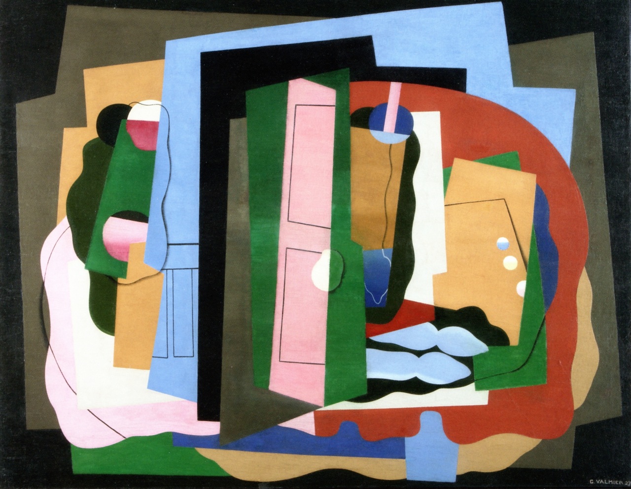
Cubist Abstract Layered Perspectives is a small-format geometric print that reads as a dense puzzle of greens, blues, pinks, and blacks. The layered composition gives the piece architectural weight while staying graphic enough to sit comfortably above a sofa, behind a desk, or across from a dining sideboard. It works best in contemporary, mid-century, and soft modern rooms where color and structure are already part of the conversation.
Quick read
Layered planes, quiet structure, loud color logic.
Product reference
Piece: Cubist Abstract Layered Perspectives - Wall Art by Recca Art
Format: Print
Size family: small
View the productAt first glance, Cubist Abstract Layered Perspectives looks like a stack of paper shapes caught mid-shuffle. Greens frame the composition, pinks and blues sit in the middle, and black linear edges hold everything in place. It's a small print with a lot happening inside the frame, which is part of its appeal — it reads as graphic from across the room and detailed up close.
What Makes the Piece Visually Distinct
The composition is built on overlap. Angular planes push forward while curved forms soften the edges, and the color rhythm shifts between deep forest tones, pale rose, cream, and cool sky blue. There's a deliberate spatial ambiguity here: depending on where you stand, certain shapes feel like they're floating, while others recede. That's classic cubist behavior — fragmented perspective treated as a feature, not a flaw.
It's expressive without being chaotic. The black framing lines do a lot of quiet work, giving the eye somewhere to rest between the bolder color blocks.
How It Feels in a Room
This is a graphic, architectural piece more than a soft or atmospheric one. It brings structure and color confidence to a wall, which makes it a good fit for rooms that lean neutral in their furniture choices. Against a white wall, the greens and pinks pop. Against a warm taupe or greige wall, the composition feels grounded and less clinical.
In daylight, the cooler blues and pinks come forward. Under lamplight, the deep greens and blacks pull more weight, which gives the piece a slightly different read in the evening — useful to know if your living room or dining space relies on warm lighting after dark.
Who It Suits
This print works for buyers who already like color and aren't looking for a calm landscape or a quiet line drawing. It belongs in:
- Contemporary living rooms with charcoal or neutral upholstery
- Mid-century setups with walnut wood and matte black accents
- Soft modern home offices that need personality on camera
- Dining rooms where the sideboard wall feels under-dressed
If your space is heavily patterned or maximalist, this piece may compete rather than complement. It does best when it gets to be the loudest thing on the wall.
Realistic Expectations
A common misread on cubist work is assuming it's busy. This composition is layered, but it's organized — there's a clear visual hierarchy between the big color planes and the smaller geometric accents. Still, it's not a minimalist piece. If you're comparing it against a single-line abstract or a muted watercolor, expect more presence and more color commitment.
Because this is a small-size print, plan accordingly. It's a supporting focal point above a console or desk, not a wall-filling statement on its own. For a sectional or a long dining wall, consider pairing it with a second piece or letting it sit inside a wider gallery arrangement.
A Quick Styling Scenario
Picture a home office: walnut desk, matte black task lamp, a charcoal task chair. The wall behind the desk is bare and a little flat on video calls. Hang this print centered behind the chair, roughly eye-level when seated. The greens and pinks read clearly through a webcam, the black linework keeps it from looking noisy, and the piece does the job of signaling that the room has a point of view — without turning the background into a distraction.
Product Details
- Type: Wall art print
- Size: Small format — best as a focal accent rather than an oversized statement
- Style: Abstract, geometric, cubist-inspired illustration
- Color direction: Forest green, pale rose, sky blue, cream, black linework, warm tan
- Best rooms: Living room (above a sectional), home office (behind the desk), dining room (opposite a sideboard)
- Pairs well with: Charcoal grey upholstery, warm walnut wood, matte black metal
- Interior fit: Contemporary, mid-century modern, soft modern
For modern rooms that need a graphic anchor with real color personality, see Cubist Abstract Layered Perspectives - Wall Art by Recca Art.