
The Quiet Green That Changes a Room Without Demanding Attention
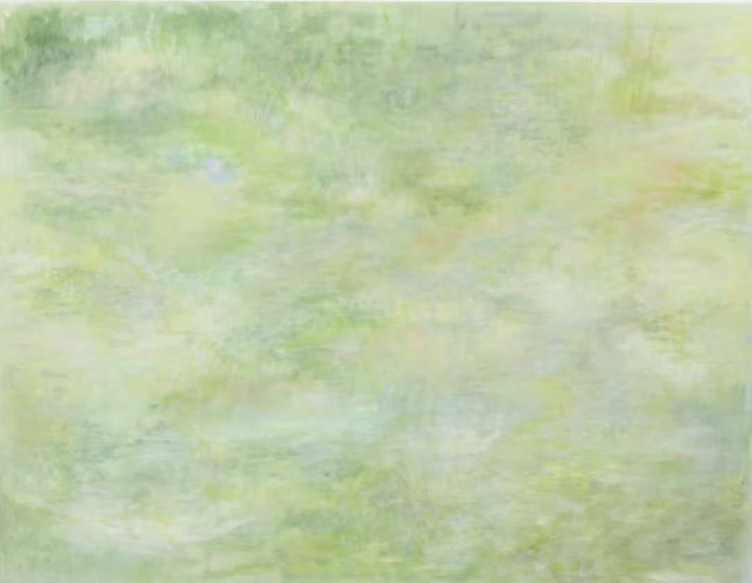
The Impressionist Green Abstract Quiet Field by Fir Gallery is a large hand-painted wall art piece built around a narrow cool-green palette — sage, pale yellow, muted blue, with brief warm ochre notes — that reads more like diffused light across a meadow than a conventional landscape. It suits interiors that lean organic and muted, and works particularly well above a sofa, behind a headboard, or on a wall facing a desk.
Quick read
A soft-field impressionist abstract in cool greens and pale yellows that holds a room with atmosphere rather than structure.
Product reference
Piece: Impressionist Green Abstract Quiet Field - Wall Art by Fir Gallery
Format: Hand-painted
Size family: large
View the productAt first glance, this piece reads as soft — almost pale. Loose, layered brushstrokes in sage, cool green, and washed yellow build a surface that suggests a field seen through diffused light, though nothing in the composition ever sharpens into a recognizable form. That ambiguity is the point. It isn't a landscape painting. It's closer to the feeling of one.
What You're Actually Looking At
The palette stays almost entirely within a cool-green register. Pale yellows and muted blues drift through the mid-ground, while occasional warm ochre and dusty rose notes surface briefly before dissolving back into the ground. Darker greens gather at the upper corners — not heavy, but present enough to give the composition a quiet sense of framing weight. The lower half washes lighter, which gives the whole piece an upward visual release that feels less like a painting and more like a clearing.
The surface reads as atmospheric rather than confident. If you're expecting bold mark-making or graphic contrast, this isn't that. It's closer to watercolor memory rendered in oil — soft-edged, layered, and intentionally unresolved.
How It Reads in a Room
Scale matters here. As a large-format piece, it holds a wall without relying on color contrast or compositional drama to do the work. The tonal range is narrow — there are no dark anchors, no saturated focal points — so the piece integrates rather than dominates. In daylight, the pale greens and yellows stay active and slightly luminous. Under warm lamp light in the evening, the whole surface quiets further, pulling back toward the wall in a way that feels intentional rather than underwhelming.
Rooms with white or warm ivory walls benefit most. The artwork's pale ground nearly dissolves against stark white, so a warm ivory or soft greige backdrop lets the color variation read properly. Light oak furniture, sage or stone linen upholstery, and natural textile layering all sit comfortably alongside it without competing.
Where It Actually Works
Above a low sofa in a living room is the obvious placement — and it genuinely works there. The horizontal composition fills the wall proportionally, and the soft upward movement in the lower half echoes the open feeling of a well-spaced seating arrangement. In a bedroom centered behind a headboard with natural linen bedding, it contributes a restful visual layer that you notice when you're looking for it and forget about when you're not. That's a quality worth naming — a lot of bedroom art either disappears entirely or draws too much focus when you're trying to wind down.
In a home office, the diffuse, non-directional quality of the composition earns its place on the wall facing a desk. It's visually present without creating visual noise. That balance is genuinely harder to find than it sounds.
Who This Piece Is For — and Who It Isn't
This works best for rooms already leaning toward organic, muted, or quietly layered aesthetics — Soft Modern, Japandi, Scandinavian-influenced spaces where the instinct is restraint over statement. If your room already has strong pattern, saturated color, or heavy contrast, the pale tonal range of this piece may read as too recessive to hold its own.
It's also worth being honest about the finish: this is a soft, atmospheric hand-painted surface, not a graphic print or high-contrast canvas. Buyers expecting crisp edges or bold color payoff will find it underwhelming. Buyers looking for something that feels considered, calm, and genuinely textured will find it lands exactly where they wanted it.
Product Details
- Type: Hand-painted wall art — original surface texture, not a print reproduction
- Size: Large format — sized to anchor a primary wall above a sofa, bed, or console
- Palette: Cool sage green, pale yellow, muted blue, with brief warm ochre and dusty rose notes
- Finish: Soft and atmospheric — reads closer to layered watercolor than impasto
- Best wall colors: Warm white, soft ivory, warm greige
- Furniture pairings: Light oak, sage linen, warm white upholstery, natural fiber textiles
- Recommended rooms: Living room above a low sofa, bedroom behind a headboard, home office on the desk-facing wall
- Interior styles: Soft Modern, Japandi, Scandinavian
If your room calls for something calm, considered, and visually layered without being decorative in an obvious way, you can see the full details and available sizing for Impressionist Green Abstract Quiet Field - Wall Art by Fir Gallery.