
Soft by Design: Why This Pastel Abstract Canvas Works in More Rooms Than You'd Expect
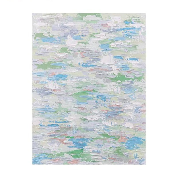
The Impressionist Pastel Abstract Drift by Fir Gallery is a hand-painted canvas built around loose horizontal brushwork, a muted coastal palette, and an impasto surface that reads as genuinely three-dimensional in natural light. It suits buyers who want something visually calm but not flat — a piece that holds the wall with texture rather than contrast.
Quick read
Textured, horizontal, and deliberately unhurried — this pastel abstract canvas is the kind of piece that makes a room feel edited without feeling decorated.
Product reference
Piece: Impressionist Pastel Abstract Drift - Wall Art by Fir Gallery
Format: Hand-painted
Size family: medium
View the productAt first glance, this canvas reads as calm — almost watery. Horizontal strokes in soft blue, sage green, and chalky white move across the surface in an even, unhurried rhythm, without a single focal point pulling the eye to one corner. That's intentional, and it's also what makes it genuinely useful as wall art rather than just decorative.
What You're Actually Looking At
This is a hand-painted impressionist-style abstract — not a print, not a reproduction. The surface has real impasto texture: paint applied thickly enough that individual strokes cast faint shadows in raking light. In a room with natural daylight coming in from the side, the piece shifts — the texture becomes more pronounced, and the color relationships between blue and green soften further at their edges. Under warmer lamplight in the evening, the white passages brighten and the muted lavender tones recede. It behaves differently at different times of day, which is something prints simply don't do.
Small flecks of blush and pale coral sit low in the composition — easy to miss on first look, but present enough to keep the palette from reading as cool or clinical. That's a thoughtful detail. Without it, a canvas this blue-and-white could feel cold in certain rooms.
How It Reads in a Room
The horizontal composition is a practical advantage. Above a sofa, it reinforces the visual line of the furniture rather than fighting it. Above a bed, the spread of color feels restful rather than stimulating. The piece doesn't ask for attention — it provides continuity, which is different and often more useful in spaces where the goal is calm rather than statement-making.
That said, this isn't a background piece in the forgettable sense. The impasto surface gives it enough material weight that it holds the wall on its own. It works harder than its soft palette suggests.
Who It's Actually For
Buyers drawn to coastal interiors, soft modern spaces, or Scandinavian-leaning rooms will find this an easy fit. The palette pairs naturally with warm white linen, light oak furniture, and soft grey upholstery — common choices in all three of those directions. It also works well in rooms with whitewashed or limewashed walls, where the canvas's own softness won't disappear into the background.
This is not the right piece for someone who wants high-contrast, graphic, or maximalist art. The color relationships here are gentle by design. If your room leans dark, moody, or jewel-toned, the palette may read as too muted to hold its ground.
A Realistic Styling Scenario
Picture a living room with light greige walls, a low linen sofa in warm white, and a natural oak coffee table. This canvas centered above the sofa at roughly eye level — with a few inches of breathing room between the bottom edge and the sofa back — would provide visual continuity across the whole wall without pulling focus from the seating area below. In a foyer with a narrow console table and a mirror, it works equally well: the horizontal spread fills the wall without making a tight space feel busier.
Common Mistaken Assumptions
Because the palette is soft, some buyers assume this piece will feel small or disappear in a larger room. The impasto texture prevents that. The surface catches light in a way that flat-printed canvas doesn't, and that physical presence reads across a room. Conversely, buyers expecting bold color saturation from the images should know the palette is genuinely muted in person — that's the intention, not a limitation.
Product Details
- Type: Hand-painted canvas — not a print
- Size category: Medium
- Style: Impressionist abstract
- Palette: Soft blue, sage green, white, muted lavender, with faint blush accents
- Texture: Visible impasto — paint applied in thick, layered strokes
- Best rooms: Living room, bedroom, foyer
- Furniture pairings: Warm white linen, light oak, soft grey upholstery
- Interior styles: Coastal, soft modern, Scandinavian
- Placement notes: Above a sofa, centered above a headboard, or above a narrow console in an entry; works best facing or beside natural light
If this direction fits your room, you can view sizing options and order directly through Impressionist Pastel Abstract Drift - Wall Art by Fir Gallery.