
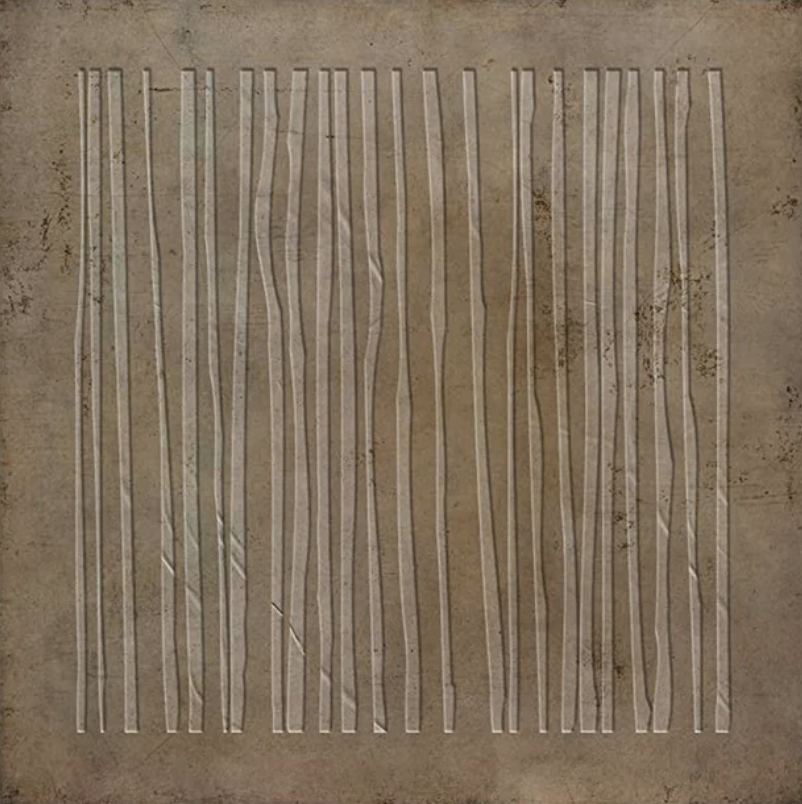
Still Interval: Why This Textured Line Painting Works So Well in Quiet Interiors
Some wall art earns its place through boldness. This one earns it through restraint. Still Interval by Fir Gallery is a hand-painted large abstract work built around a grid of vertical lines — some crisp, others subtly warped — set against a worn, plaster-like ground in warm umber and bone white. It reads as quiet but not passive, structured but not rigid. For interiors where the finish of a wall or the grain of a wood floor is already doing expressive work, this piece fits in without stepping on anything.
Quick read
Warm umber, raw sienna, and bone white lines pressed into a plaster-like ground — structured enough to anchor a room, irregular enough to feel alive.
Product reference
Piece: Minimalist Textured Lines Still Interval - Wall Art by Fir Gallery
Format: Hand-painted
Size family: large
View the productAt first glance, Still Interval looks almost architectural — a grid of vertical lines running the full height of a square canvas, evenly spaced, upright, controlled. Look longer, and something shifts. A few of those lines bend. Some press outward slightly, as though the surface itself is breathing. The background isn't flat paint; it reads like worn plaster, layered and faintly weathered, with a warmth that ranges from umber to raw sienna depending on the light. That combination — rigid structure, slight imperfection, material texture — is exactly what makes this piece worth considering seriously.
What It Actually Looks Like in a Room
Scale matters here. As a large-format piece, the vertical lines don't just sit on the wall — they activate it. Above a low linear sofa, the composition pulls the eye upward and creates a visual counterweight to all that horizontal furniture. The pale bone-white lines lift against the warm ground without ever feeling stark. In a room with natural light, the hand-applied texture catches and shifts throughout the day. Under warm lamp light in the evening, the whole surface reads deeper and more amber — closer to aged parchment than painted canvas.
It doesn't demand attention the way a high-contrast or colorful abstract would. The mood is closer to a linen curtain catching afternoon light — present, textured, unhurried.
Where It Fits Best
This piece was clearly conceived with specific interior environments in mind. Japandi rooms — where aged oak, raw linen, and matte walls already carry the aesthetic load — are the most natural home for it. The warm neutrals coordinate without effort. Contemporary minimalist spaces work equally well, especially when the furniture palette runs toward warm white, greige, or natural wood.
In a home office, centered on the wall facing a desk, it provides something harder to find than decoration: visual stillness. It's structured enough to anchor focus without competing for attention. In a bedroom above a low-profile headboard, the warm ground reads as grounded and calm rather than stark or cold — a meaningful distinction when you're choosing art for a sleep space.
What Buyers Sometimes Misread
Because the composition is so restrained, some buyers assume it will feel thin or decorative in person. The opposite tends to be true with hand-painted textured work — the surface has physical presence that photography doesn't fully capture. The plaster-like background isn't a printed effect; it's built up through the painting process, which means the piece has a material weight that shows differently at different viewing distances.
It's also worth noting that the slight irregularities in the lines are intentional. This isn't a print or a digital pattern. The variation in curvature is part of the rhythm the piece creates — remove it, and the work loses its tension between order and imperfection.
One Room Scenario Worth Picturing
Imagine a living room: low cream sofa, aged oak coffee table, matte warm-white walls, a single floor lamp with a linen shade. The room is calm but slightly flat — it needs a vertical moment without introducing color. Hung centered above the sofa, Still Interval gives that vertical cadence and adds texture to a wall that otherwise has none. It doesn't redirect the room's personality; it completes it.
Product Details
- Type: Hand-painted original, textured abstract wall art
- Format: Large-scale square canvas
- Palette: Warm umber, raw sienna, bone white
- Texture: Plaster-like surface with dimensional line relief; not a flat print
- Style direction: Minimalist, Japandi, wabi-inspired, contemporary neutral
- Best placements: Above a low sofa (living room), facing a desk (home office), above a low headboard (bedroom)
- Pairs with: Raw linen upholstery, aged oak furniture, matte plaster or warm white walls
- Not ideal for: High-contrast or maximalist rooms, spaces that need color or figurative content
If your room is already working in warm neutrals and natural materials, Minimalist Textured Lines Still Interval - Wall Art by Fir Gallery is the kind of piece that settles in and makes everything around it feel more considered.