
Still Motion, Visible Atmosphere: Inside the Misty Green Abstract by Fir Gallery
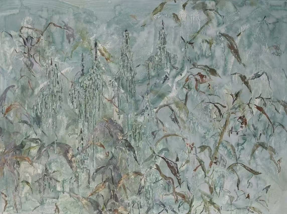
The Misty Green Abstract Still Motion by Fir Gallery is a dense, hand-painted canvas where leaf-like forms, elongated brushstrokes, and vertical dripping structures share the surface without competing. The palette stays narrow — soft celadon, sage, muted grey-green — which gives the work an unusual foggy depth rather than surface contrast. It reads quietly from across a room, rewards a closer look, and fits a wider range of interiors than most abstract art at this scale.
Quick read
This is abstract wall art that chooses atmosphere over statement — and earns its place by how it changes the room, not how it commands it.
Product reference
Piece: Misty Green Abstract Still Motion - Wall Art by Fir Gallery
Format: Hand-painted
Size family: large
View the productAt first glance, this painting reads as a single continuous tone — a soft, foggy field of grey-green that feels more like weather than imagery. Look longer and the surface starts to resolve: leaf-like forms, vertical dripping structures, elongated brushstrokes layered over and through each other across the entire picture plane. There is no central focal point pulling your eye. The tension is held evenly, which is harder to achieve than it sounds.
What Makes It Visually Distinct
The palette is deliberately narrow. Celadon, sage, and muted grey-green stay close in value throughout, so the work creates depth through layering rather than contrast. Darker marks anchor clusters of activity; the pale ground breathes between them. The result is something between a botanical study and a misty abstract landscape — recognizable enough to feel grounded, abstract enough to avoid literalism.
For buyers used to bold-contrast abstract prints, this one can look underwhelming in thumbnail. In a room, especially at large scale, that restraint becomes the point. The painting adds visual weight without adding visual noise.
How It Reads in a Room
Above a long, low sofa against pale plaster or light stone walls, it provides consistent texture across a wide horizontal span — no single element pulls focus, which matters when furniture arrangement already creates enough structure. The eye can move across it or rest on it, depending on where you're sitting.
In a bedroom centered behind the headboard, the muted cool tones settle into the wall rather than projecting forward. It doesn't disappear, but it doesn't compete with the rest of the room either. That balance — present but not insistent — makes it easier to live with long-term than more graphic abstract work.
A home office benefits from this kind of measured complexity on a desk-facing wall. There's enough visual detail to give the eyes somewhere to land during a pause, not enough to pull concentration away from the screen.
Who This Suits — and Who It Doesn't
The sage and celadon tones pair naturally with warm linen upholstery, pale oak shelving, and interiors leaning toward organic material choices. Contemporary wabi-inspired rooms, Japandi spaces, and soft modern interiors all absorb this piece without adjustment. If your space already includes muted terracottas, raw plaster, rattan, or bleached wood, the color relationship is practically effortless.
It's less at home in rooms with high contrast — dark walls, graphic black-and-white furniture, or very warm amber tones. The painting's softness can get lost or look unintentional against backgrounds that demand stronger visual presence.
Realistic Expectations
Because this is hand-painted, no two canvases are exactly alike. The brushwork and drip structures carry natural variation — small shifts in mark density and edge definition are part of the process, not inconsistencies. Buyers expecting the precision of a giclee print should know that going in. For most buyers, that variation is a reason to choose hand-painted work in the first place.
Daylight and lamp light read differently here. In strong natural light, the grey-green tones clarify and the layering becomes more legible. Under warm artificial light in the evening, the celadon flattens slightly and the whole piece reads warmer and softer. Neither reading is wrong — they're just different moods from the same canvas.
How It Compares
Compared to large-format botanical prints in similar tones, this canvas has substantially more surface complexity and none of the decorative flatness that botanical illustration can carry. Compared to loose gestural abstracts in bold greens, it's quieter and more considered — better for spaces where you want texture without energy. It sits between those two categories, which makes it genuinely versatile rather than just broadly marketed.
Product Details
- Type: Hand-painted canvas wall art
- Size: Large format — verify current dimensions at checkout
- Palette: Celadon, sage, muted grey-green with darker anchoring marks
- Finish: Layered brushwork with visible texture and natural variation between pieces
- Framed vs. unframed: Check listing for available options
- Best rooms: Living room above a long sofa, bedroom behind a headboard, home office on a desk-facing wall
- Interior styles: Contemporary wabi-inspired, Japandi, soft modern
- Pairs well with: Warm white linen, light oak, soft sage upholstery, pale plaster walls
If this is the direction you're looking for, you can find full size options and current availability on the Misty Green Abstract Still Motion - Wall Art by Fir Gallery product page.