
Still Interval: Why This Monochrome Abstract Belongs on Your Feature Wall
This hand-painted abstract canvas from Fir Gallery works in horizontal bands — black, sage, blush, and white — with visible paint drag and surface texture that make it feel genuinely worked rather than printed. It suits soft modern, Japandi, and minimalist interiors, and reads particularly well above low sofas, behind headboards, or on the wall opposite a desk.
Quick read
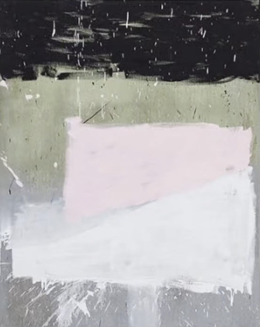
Four tonal bands, visible brushwork, and a blush form that fades rather than holds — this piece earns its wall space by doing less, not more.
Product reference
Piece: Monochrome Pink Abstract Still Interval - Wall Art by Fir Gallery
Format: Hand-painted
Size family: large
View the productAt first glance, the Monochrome Pink Abstract Still Interval reads as restraint made visible. Four horizontal bands occupy the canvas — a dense, brushed black across the top, a muted sage field below it, then a pale blush rectangle sitting slightly off-center, and finally a broad white sweep that settles into cool grey at the base. None of the transitions are clean. Paint drags across zone boundaries. Scratch marks and streaks run through the surface. The overall effect is of something accumulated rather than designed.
That worked quality is what separates this from a printed abstract. It has texture you can read from across the room — not decorative roughness, but the kind that suggests actual process.
How It Reads in a Room
The composition has a particular kind of visual logic. The dark register at the top presses down with real weight, while the lower half — blush fading into white, white dissolving into grey — exhales. The blush form is the quietest element of the four. Its lower edge is diffuse, almost uncertain, fading into the white beneath rather than holding a firm boundary. That softness keeps the piece from feeling graphic or hard-edged despite the strong tonal contrast above.
In daylight, the sage middle band shifts noticeably — it can read warmer or cooler depending on the light source and wall color. In lamplight, the whole lower half softens further, and the black at the top becomes even more dominant. Both readings are interesting, which is not something you can say about every abstract canvas at this scale.
Where It Works Best
Above a low, linen-upholstered sofa, this piece anchors the wall without interrupting the surrounding calm. The horizontal layering extends naturally across a wide feature wall, and the muted palette keeps it from competing with softer furnishings. It doesn't demand attention — it holds the wall without shouting.
In a bedroom behind the headboard, the descending palette from dark to near-white mirrors the natural way the eye settles at rest. It's an unusual choice for that placement, but it works — the piece feels grounded rather than energizing, which is exactly right for a bedroom wall.
In a home office on the wall directly opposite a desk, the horizontal layering gives the eye somewhere to land without distraction. It provides rhythm rather than stimulation, which is harder to find than it sounds in large-format abstract work.
What Interior Styles It Fits
This canvas is most at home in soft modern, Japandi, and minimalist interiors. It pairs naturally with light oak surfaces, warm white walls, and unbleached textiles. Soft taupe upholstery works well alongside it. What it doesn't suit is a heavily layered, pattern-rich room — its quietness needs a degree of surrounding restraint to register properly.
What to Know Before You Buy
Large monochrome abstract canvases are often misread in person versus on screen. The sage band in particular can look grey-green or khaki-green depending on your wall color and light. If your walls are a cool white, expect the sage to read warmer. On a warm white or off-white, it may shift slightly greener. Worth keeping in mind if you're matching to existing soft furnishings.
The blush is genuinely pale — closer to white with a faint pink cast than anything approaching a statement pink. Buyers expecting a stronger blush tone will likely be surprised by how close it sits to neutral. That's part of what makes the piece work at scale, but it's worth knowing going in.
Product Details
- Type: Hand-painted canvas — not a print
- Size: Large format
- Color palette: Black, muted sage, pale blush, white, cool grey
- Surface: Visible texture — paint drag, scratch marks, layered application
- Best rooms: Living room, bedroom, home office
- Pairs with: Light oak, warm white walls, linen and taupe upholstery
- Interior styles: Soft modern, Japandi, minimalist
- Placement notes: Above low sofas, behind headboards, opposite desk walls — all perform well; allows generous clearance above furniture for the composition to read fully
For anyone building a neutral interior that still wants something with tactile presence and compositional weight, take a closer look at the Monochrome Pink Abstract Still Interval - Wall Art by Fir Gallery.