

The Quiet Weight of Monochrome Sage Abstract Still Ground
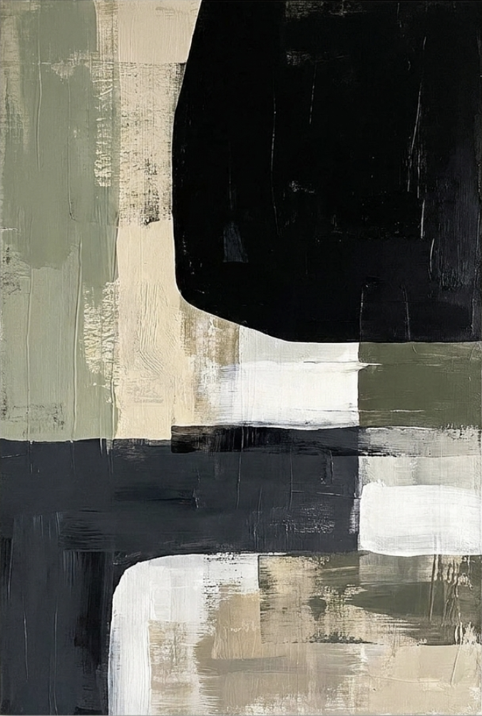
This piece from Fir Gallery leans on weighted color blocks and dry-brush texture instead of imagery. Black, sage, and linen tones divide the canvas into pressed-together zones, giving the composition tension without a single focal point. It reads as calm, architectural, and grounded — suited to Japandi, minimalist, and rustic modern rooms.
Quick read
A restrained abstract that holds a wall through weight and rhythm rather than color or drama.
Product reference
Piece: Monochrome Sage Abstract Still Ground
View the productMonochrome Sage Abstract Still Ground opens with weight. A deep near-matte black mass sits in the upper right, rounded on one edge and cut abrupt on the others, while a column of dry-brushed sage holds the left side. Between them, horizontal bands of cream, white, and charcoal press against one another without blending. There's no single subject to land on — the composition distributes tension across the surface, so the eye moves rather than settles.
It's a neutral abstract painting in the truest sense: the palette stays quiet, but the surface carries visible friction. Dry-brush drag, layered banding, and unresolved lower intervals give it a hand-worked feel that reads more like a considered painting than a flat print.
How It Reads in a Room
Hung above a long, low sofa, this piece anchors the wall without competing with the seating below it. The dark upper block gives the composition a natural top-weighted rhythm, which keeps sightlines calm when you're seated. Against flat white or warm grey walls, the sage and cream regions register clearly; against a busy gallery wall, they'd get lost — this is a piece that wants space around it.
In a home office facing the desk, the horizontal banding acts almost like a visual pause. It doesn't demand attention, so it works as ambient structure rather than a distraction. In a foyer or hallway with enough vertical clearance, the black-and-sage contrast still registers in passing, even at a glance.
Who It's For
This suits interiors already leaning quiet: Japandi rooms with light oak and linen, minimalist spaces that need weight without color, or rustic modern setups with concrete, matte black metal, or unfinished wood. If your room runs bright and saturated — jewel tones, glossy finishes, a lot of pattern — this piece will feel muted against it. It's designed for rooms that treat neutrals as a real palette, not a backdrop.
It also plays well as a supporting piece rather than a loud focal point. If you're comparing it against high-contrast graphic prints or bright abstract canvases, the difference is intent: this one holds the wall through composition and texture, not through immediate visual impact.
Realistic Expectations
A common mistake with neutral abstracts is expecting them to do more than they should. This piece won't add color energy to a room, and it won't function as a conversation-starter across the space. What it will do is give a large wall a sense of intentional weight — the kind of surface that makes the rest of the room feel more composed.
Under daylight, the sage warms slightly and the cream bands open up. Under lamplight, the black mass deepens and the composition feels heavier, more grounded. Both readings are part of the piece.
A Quick Styling Scenario
Picture a living room with a warm grey wall, a low linen sofa in oatmeal, a light oak coffee table, and a matte black floor lamp. Center this canvas above the sofa with about six to ten inches of breathing room. The black mass echoes the lamp; the sage column picks up any greenery nearby; the cream banding sits comfortably against the upholstery. Nothing shouts — the room just reads more finished.
Product Details
- Style: Neutral abstract, textured, block-composition
- Palette: Black, sage green, cream, linen, charcoal
- Finish: Matte surface with visible dry-brush texture and layered banding
- Best rooms: Living room (above a low sofa), home office (facing the desk), foyer (above a narrow console)
- Pairs with: Warm linen upholstery, light oak, concrete, matte black metal frames
- Interior directions: Japandi, minimalist, rustic modern
- Placement note: Needs breathing room on the wall; not suited to dense gallery arrangements
For a closer look at scale, framing options, and available sizes, see Monochrome Sage Abstract Still Ground.