

A Quiet Balance of Weight and Air: Looking at 'Abstract Blue Green Held Open'
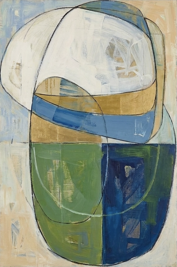
Abstract Blue Green Held Open is a medium-scale hand-painted canvas built around two stacked rounded forms. The upper half stays pale and airy, the lower half grounds the composition in olive and navy, and a dusty blue band cuts through the middle. It reads as considered but not overworked — a modern abstract that works as a focal point without dominating the room.
Quick read
Painterly geometry with room to breathe.
Product reference
Abstract Blue Green Held Open reads, at first glance, like two rounded shapes leaning into each other. The upper form sits in soft, layered near-white brushwork — depth without hard edges. Underneath, a lower form splits cleanly between olive green and deep navy, with a dusty blue band cutting horizontally through the middle and ochre passages warming the transition. Charcoal-like outlines travel across the whole composition, holding the shapes together without flattening them.
It's hand-painted, not printed, and the surface shows it. Brush direction, small tonal shifts, and the way each color holds its own boundary give the piece a quiet physical presence that a flat reproduction can't quite replicate.
How It Feels in a Room
The piece is vertical, medium in scale, and built on contrast between weight and air. The pale upper half keeps the wall feeling open, while the olive and navy anchor the lower portion — so the composition doesn't float or feel top-heavy. In daylight, the ochre passages warm noticeably. Under lamplight, the navy deepens and the blue band recedes slightly, letting the painterly texture come forward.
Mood-wise, it lands closer to calm and considered than graphic or loud. It's an abstract that rewards a second look rather than announcing itself from across the room.
Who It Suits
This one fits interiors leaning Mid-Century Modern, Soft Modern, or Transitional — rooms where furniture already has some warmth and the walls need something with structure but not aggression. Light oak, warm linen upholstery, and aged brass hardware all sit comfortably next to it. If your palette runs pure cool grey and chrome, the ochre notes may feel out of key.
It works best as a primary focal point on a modest wall, or as a strong supporting piece on a longer wall paired with softer neutrals. It is not a background piece — the charcoal linework and color blocking carry too much intention for that.
Realistic Expectations
A few things worth knowing before you commit:
- The near-white upper half is painterly, not crisp. Expect visible brushwork and slight tonal variation rather than a flat white field.
- The navy reads deep and matte, closer to ink than royal blue.
- Because it's hand-painted, small variations in line weight and color coverage are part of the piece, not flaws.
- At medium scale, it holds a sofa wall well but won't fill a wide open two-story wall on its own.
A Quick Styling Scenario
Picture a living room with a low linen sofa in a warm oat tone, a light oak coffee table, and a matte black floor lamp off to one side. Hung centered above the sofa with roughly six to eight inches of breathing room between the frame edge and the sofa back, the painting pulls the whole seating area together — the navy talks to the lamp, the ochre picks up the oak, and the pale upper half keeps the wall from feeling crowded. Add a ceramic vessel in soft cream on the console and the room reads finished without feeling styled.
How It Compares
Against a large-scale geometric abstract canvas in high-contrast primaries, this piece is quieter and more livable. Compared to a minimalist ink-line print, it brings more color weight and more surface interest. And next to a fully textured, heavily impasto abstract, it feels more composed — the geometry is doing as much work as the brushwork.
Product Details
- Type: Hand-painted canvas, original brushwork
- Style: Abstract, minimalist-leaning, geometric with painterly line
- Palette: Near-white, dusty blue, ochre, olive green, deep navy, charcoal outline
- Size tag: Medium — suited to sofa walls, desk-facing walls, and bedroom side walls
- Orientation: Vertical composition
- Best rooms: Living room above a low sofa; home office facing the desk; bedroom side wall near a reading chair or above a low dresser
- Pairs well with: Light oak furniture, warm linen upholstery, aged brass or matte black hardware
- Interior directions: Mid-Century Modern, Soft Modern, Transitional
If you want a piece that shapes a room quietly rather than shouting from the wall, spend a few minutes with Abstract Blue Green Held Open and see how the color weight sits against your own furniture.