
A Quiet Field of Marks: Inside Fir Gallery's Neutral Abstract Painting
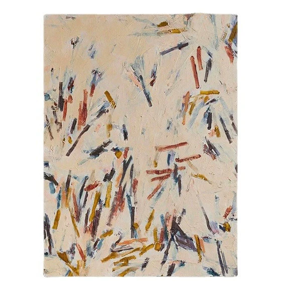
Neutral Abstract Scattered Marks by Fir Gallery is a hand-painted abstract canvas built on a warm cream field with short, gestural strokes in rust, ochre, slate blue, and charcoal. The marks cluster low and thin out toward the top, giving the piece a quiet rhythm that reads well above a sofa, bed, or desk. It suits soft modern, Scandinavian, and Japandi rooms grounded in light oak, linen, and taupe.
Quick read
A muted, textured abstract that holds a wall without crowding it.
Product reference
Piece: Neutral Abstract Scattered Marks - Wall Art by Fir Gallery
Format: Hand-painted
Size family: medium
View the productAt first glance, Neutral Abstract Scattered Marks reads as a soft, sand-toned field with handfuls of short brushstrokes drifting across it. Look longer and the structure shows up: rust and ochre marks weighted against slate blue and charcoal, clustered along the lower left and thinning as they move up and to the right. Nothing shouts. The palette stays close in value, so your eye wanders rather than locks onto a focal point.
That's what makes it unusual among neutral abstract canvas art. A lot of muted abstracts go fully quiet and end up reading flat on the wall. This one keeps a layered, hand-painted surface — paint built up in short intervals — so even from across a room you sense texture, not just color.
How It Reads in a Room
Hung above a low, linear sofa, the open cream upper field gives the wall room to breathe while the denser lower marks settle the composition over the seating. It anchors without weighing things down. In a bedroom, centered above the headboard against warm white or greige walls, it behaves more like a quiet backdrop — present, but not competing with bedding or a reading nook nearby.
In a home office, especially on the wall facing the desk, the scattered mark-making does something useful: it gives the eye a place to rest between tasks without becoming a distraction. That's a harder balance than it sounds.
Who It's For
This piece tends to land well with people building a soft modern, Scandinavian, or Japandi interior — rooms leaning on light oak, warm linen, and taupe rather than high-contrast black-and-white. If your space already runs neutral and you want wall art that adds texture without introducing a new color story, it slots in cleanly.
It's less suited to rooms that need a graphic, high-impact focal point. Buyers looking for bold color blocks or sharp linework will likely find this one too restrained. Think of it as a supporting piece with quiet authority, not a statement painting that takes over a wall.
Realistic Expectations
Because the palette is muted and close in value, lighting matters more than usual. In daylight, the rust and ochre warm up and the slate blue marks recede slightly. Under lamplight, the cream ground takes on a softer, almost candlelit tone and the charcoal strokes feel more grounded. Expect the painting to shift mood across the day — that's part of why it works in living rooms and bedrooms where you spend hours, not minutes.
One common assumption: that neutral means safe or generic. This piece isn't generic. The mark distribution has intent — clustered, then thinning — and the built-up surface gives it a presence that flat prints can't match.
How It Compares
Against a smooth giclée print in similar tones, the hand-painted texture here reads more like a real object on the wall and less like decor. Against a bolder abstract with saturated color, it asks less of the room and pairs more easily with existing furniture. If you've been weighing a minimalist line drawing versus something with more material weight, this sits comfortably between the two.
A Quick Styling Scenario
Picture a living room with a low oak-framed sofa in oatmeal linen, a pale wool rug, and a slim ceramic lamp on a side table. The wall above the sofa has been empty for months because nothing felt right — anything too bright fought the room, anything too plain disappeared. A medium-scale canvas like this one fills the gap: textured enough to register, neutral enough to belong.
Product Details
- Type: Hand-painted abstract canvas
- Size: Medium — well-scaled for above a sofa, headboard, or desk
- Palette: Warm cream ground with rust, ochre, slate blue, and charcoal marks
- Surface: Layered brushwork with visible texture and material density
- Best room fit: Living room, bedroom, home office
- Style direction: Soft modern, Scandinavian, Japandi
- Pairs with: Light oak wood, warm linen upholstery, soft taupe tones
For a closer look at the brushwork, scale, and full color range, see Neutral Abstract Scattered Marks - Wall Art by Fir Gallery.