
A Sunlit Pause: Living With the Impressionist Green Figures Nap
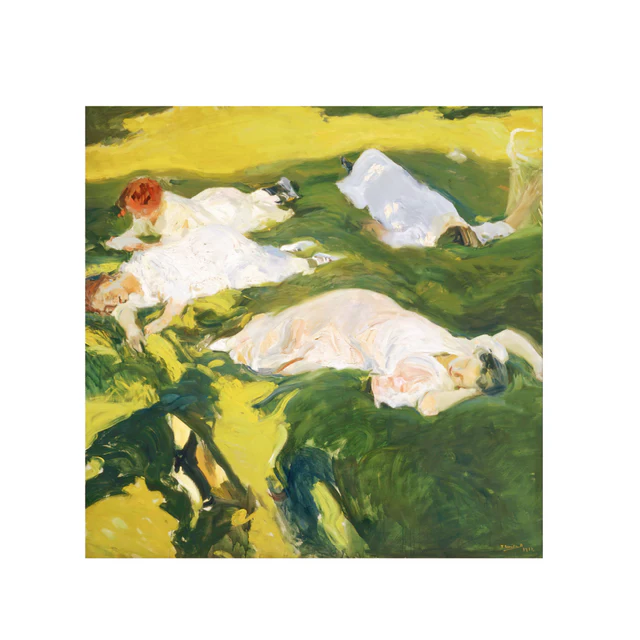
The Impressionist Green Figures Nap is a hand-painted, horizontally composed wall art piece showing white-clad figures resting on a sunlit green field. Its loose brushwork and bright color rhythm make it a strong above-sofa focal point in soft modern, transitional, and French country rooms.
Quick read
Broad greens, quiet whites, and a kind of summer stillness you can hang on a wall.
Product reference
Piece: Impressionist Green Figures Nap - Wall Art by Fir Gallery
Format: Hand-painted
Size family: medium
View the productThe first thing you notice is the green. Not a flat backdrop green, but a field that shifts between shadowed moss, deep grass, and an almost acid yellow where the sun lands. Across it, three figures in white rest in loose, unhurried poses, their forms half-dissolved into the brushwork. It reads as a painting of a warm afternoon more than a painting of people — the kind of scene where light is doing most of the talking.
The Impressionist Green Figures Nap is a hand-painted impressionist figurative work with a strong horizontal composition. The brushwork is broad and confident, the shadows fall in decisive dark strokes, and the whites of the garments hold a quiet luminosity against the saturated field. It's expressive without being chaotic, and decorative without feeling decorative-for-its-own-sake.
How It Reads in a Room
This is a piece that warms a wall rather than dominates it. The horizontal spread of figures gives it a calm, settled silhouette, so it tends to anchor a room instead of pulling the eye into a single point. In daylight, the yellows lift and the greens feel almost outdoor-bright. Under lamplight in the evening, the same painting softens — shadows deepen, the whites turn creamier, and the whole thing reads more like a remembered afternoon than a literal one.
It leans expressive and painterly, not graphic or minimal. If your room is already busy with pattern, this won't quiet it down. If your room is soft, neutral, and wood-forward, it brings life without breaking the calm.
Who It Suits
This painting fits naturally with soft modern, transitional, and French country interiors — spaces that lean on natural materials rather than hard contrast. It pairs especially well with warm oak furniture, aged linen upholstery, and cream or putty-toned walls. Buyers comparing impressionist wall art for a living room or dining room tend to land on pieces like this when they want something with real brushwork energy but a relaxed subject.
It's less suited to high-contrast modern rooms with black metal, cool grays, and sharp geometry. The palette is too earthy and the brushwork too loose to sit cleanly in that kind of styling.
Common Assumptions Worth Adjusting
People sometimes assume an impressionist green painting will read as a quiet, recessive landscape. This one doesn't. The greens are saturated enough that it acts as a color statement, even though the subject is restful. Expect it to influence the color temperature of the wall around it — surrounding tones will look warmer and slightly more golden by comparison.
Another assumption: that hand-painted means fragile-looking. The brushwork here is structural. Up close you see the strokes and ridges; from across the room, the figures and field resolve cleanly.
A Quick Styling Scenario
Picture a long, low sofa in oatmeal linen against a warm white wall. A wood coffee table, a ceramic lamp, maybe a stack of books. Hung centered above the sofa, the painting's horizontal layout mirrors the seating below, and the green pulls the room toward something gardenlike without any actual plants in the frame. Swap the setting to a dining room — wood table, rattan or upholstered chairs, a warm pendant overhead — and it shifts into something that feels almost like an open window.
Product Details
- Type: Hand-painted wall art, impressionist figurative
- Size tag: Medium — works well above standard sofas, consoles, and queen headboards
- Orientation: Horizontal composition, ideal for wide wall spans
- Palette: Saturated greens, sunlit yellow, soft whites, deep shadow accents
- Texture: Visible brushwork with built-up strokes; reads painterly up close, resolved at viewing distance
- Best rooms: Living room above a long sofa, dining room facing the table, bedroom above a wide wooden headboard
- Pairs with: Warm oak, aged linen, cream and putty neutrals, natural-material interiors
- Interior directions: Soft modern, transitional, French country
How It Compares
Against a botanical print, this piece carries more brushwork energy and a stronger sense of mood. Against a moody abstract, it's brighter and more inviting. Against a minimalist line drawing, it's the warmer, more atmospheric choice — better when you want a room to feel lived-in rather than gallery-cool.
For a hand-painted impressionist piece that quietly takes ownership of a sunlit wall, the Impressionist Green Figures Nap - Wall Art by Fir Gallery is worth a closer look.