
Still Pause: A Hand-Painted Neutral Abstract That Holds a Room Without Competing With It
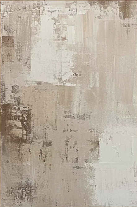
Some wall art announces itself. Still Pause does the opposite — it settles into a room and makes the space feel more considered without drawing attention to itself. The hand-painted surface layers warm ivory, taupe, and ash brown in broad vertical passes, building a texture that reads differently in daylight than under a lamp. It is a genuinely restful piece, and for interiors that rely on tonal quiet rather than contrast, it is one of the more versatile large-format options available.
Quick read
Layered ivory, taupe, and ash brown move vertically across a textured hand-painted surface — calm, unhurried, and built to hold a wide wall without creating visual noise.
Product reference
Piece: Neutral Abstract Textured Still Pause - Wall Art by Fir Gallery
Format: Hand-painted
Size family: large
View the productAt first glance, Still Pause looks like a wall that has accumulated history — not quite paint, not quite plaster, somewhere in between. Layers of warm ivory, taupe, and ash brown move vertically across the canvas in broad overlapping passes, some dense and opaque, others worn back to reveal earlier marks underneath. It is a hand-painted large-format abstract, and the surface texture is the point. This is not a smooth print approximating depth. The depth is actual.
What the Painting Actually Looks Like Up Close
The left edge carries more tension — darker tones gather there, creating a subtle anchor. The right side opens out into softer, more diffuse passages. There is no central focal point, no compositional peak that draws the eye and holds it. Instead, the eye moves steadily across the surface without arriving anywhere specific, which gives the whole piece a settled, unhurried quality that is harder to find than it sounds.
In direct daylight, the texture reads clearly — you see the layering, the built-up ridges, the areas where earlier marks show through. Under warm lamp or pendant light, the surface flattens slightly and the tonal warmth deepens. Both readings work. They just read differently, which is part of what makes a genuinely textured hand-painted piece worth owning over a printed alternative.
How It Reads in a Room
Above a low, wide sofa, the vertical rhythm of the composition fills a broad wall without creating visual noise. It holds the space rather than directing it — a meaningful distinction if your living room already has enough going on at eye level with furniture, cushions, and layered textiles.
In a bedroom centered behind the headboard, the tonal restraint reads as calm rather than flat. The warm greige palette does not compete with soft lighting or linen bedding. It adds weight without adding contrast, which matters in a room where you want the visual temperature low.
A home office wall facing the desk is a genuinely good placement for this piece. The irregular surface gives the eyes something to rest on during pauses — not a pattern to decode, not a color that demands a response, just a surface that absorbs attention without holding it hostage.
What Interior It Suits Best
The palette — warm ivory, taupe, ash brown — pairs naturally with light oak shelving, linen upholstery, matte white walls, and warm plaster finishes. Soft modern interiors, Japandi-leaning rooms, and spaces with a wabi-inspired material sensibility are the clearest fits. It also works in contemporary rooms where the goal is tonal restraint over graphic impact.
It is less well-suited to rooms that rely on high contrast, bright accent colors, or bold graphic furniture. The painting does not anchor that kind of visual energy — it absorbs and quiets it, which is not always the effect you want.
Realistic Expectations
Buyers sometimes expect a neutral abstract to function as a background piece — something that disappears into the wall. Still Pause does not disappear. The texture and the scale give it genuine presence. What it avoids is demand: it does not ask you to look at it, but when you do, there is enough happening on the surface to reward attention.
Worth noting: the surface variation means no two pieces are identical. Hand-painted works carry slight differences in mark-making and tonal weight from piece to piece, which is part of their value and worth factoring into expectations if you are coordinating with a very precise color story.
How It Compares
Against printed canvas art in similar neutral palettes, the texture difference is obvious in person and visible in close photography. Printed neutrals tend toward smoothness and evenness — reliable, but flat. Still Pause reads more like a physical object than a decorated surface, which changes how a room feels around it.
Compared to other hand-painted abstracts in this size range, the composition is quieter than most. There are no gestural marks, no color surprises, no obvious brushwork drama. That restraint is intentional and is exactly what makes it useful in rooms that do not need more visual activity.
Product Details
- Type: Hand-painted original-style canvas — not a print
- Size: Large format — suited to wide walls above sofas, beds, or console tables
- Palette: Warm ivory, taupe, ash brown — greige-leaning, no cool grays
- Texture: Built-up surface with layered mark-making; reads as aged plaster rather than smooth paint
- Finish: Matte — no gloss, no sheen
- Best placements: Above a low linen sofa, centered behind a headboard, on the wall facing a desk, between two windows on a feature wall
- Interior fit: Soft modern, Japandi, contemporary wabi-inspired, tonal neutral interiors
- Furniture pairings: Light oak, warm white linen, soft taupe upholstery, matte or plaster-finish walls
For anyone furnishing a soft modern, Japandi, or wabi-inspired interior and looking for large neutral abstract wall art that earns its wall space without demanding attention, Neutral Abstract Textured Still Pause - Wall Art by Fir Gallery is worth a close look.