
Still and Considered: The Pebble Stone Texture Wall Art That Changes How a Room Breathes
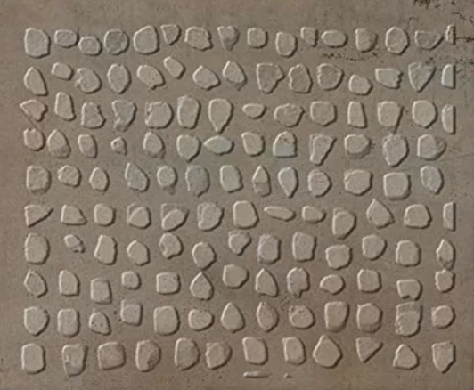
This hand-painted piece from Fir Gallery arranges hundreds of small rounded pebbles across a warm grey field in loose horizontal rows. The palette stays narrow — ivory, ash, soft sand — and the surface reads as shallow stone relief. It suits living rooms, home offices, and foyers equally well, and pairs naturally with raw linen, unfinished oak, and light concrete without any visual negotiation.
Quick read
Not decorative in the conventional sense — this is wall art that works through restraint, texture, and patient repetition rather than color or focal drama.
Product reference
Piece: Pebble Stone Texture Still Scatter - Wall Art by Fir Gallery
Format: Hand-painted
Size family: large
View the productAt first glance, the Pebble Stone Texture Still Scatter reads almost like a material sample — a section of stone wall rendered with enough variation and shadow to feel geological rather than decorative. Hundreds of small rounded pebbles sit across a warm grey ground in loose horizontal rows, each one slightly different in silhouette and edge. The relief is shallow, but it's real. This is a hand-painted piece, and the surface holds the kind of unhurried specificity that a print simply can't replicate at scale.
What You're Actually Looking At
The palette barely moves across the entire composition: pale ivory, cool ash, soft sand. There's no accent color, no focal anchor, no single point the eye snaps to. Instead, the visual energy runs laterally — the eye drifts left to right across the stone field rather than landing anywhere specific. That lateral rhythm is deliberate, and it matters more than it sounds. In a room with a lot of vertical elements — doorways, shelving, tall furniture — this piece provides horizontal counterweight without needing to make noise about it.
The negative space between each pebble is where the composition actually breathes. It keeps the surface from reading as dense or heavy despite the quantity of forms. The result is something that feels grounded and airy at the same time, which is a harder balance to pull off than most wall art achieves.
How It Reads in a Room
Above a low linen or concrete sofa, this piece settles naturally. The grey-stone palette connects to the sofa without matching it literally, and the scale of the composition holds the wall without overpowering the furniture below. It doesn't compete with soft furnishings — it contextualizes them.
In a home office, the lateral drift of the composition turns out to be genuinely useful. Hung on the wall opposite a desk, it gives the eye somewhere to rest without providing anything specific to focus on — a quiet visual field that supports concentration rather than interrupting it. That's not a common quality in wall art at this size.
A foyer application works particularly well when the piece is centered on the entry wall facing the door, or positioned above a slim console. The stone motif carries a grounded, material quality that reads well in transitional spaces — it sets a tone without announcing one.
Who This Is For
This piece suits buyers who are working in a Japandi, contemporary wabi-inspired, or restrained minimalist direction. It pairs naturally with raw linen upholstery, unfinished oak furniture, and light concrete surfaces. Warm white or greige walls don't require any visual accommodation — the palette simply fits.
It's worth being clear about what it isn't. This isn't a statement piece in the bold or graphic sense. There's no contrast drama, no strong silhouette, no single compositional moment. Buyers looking for a focal point that commands a room from across the space may find this too quiet. But buyers who want a wide wall to feel finished, grounded, and materially interesting without adding visual noise — this is exactly that.
A Common Mistaken Assumption
Some buyers assume that a piece built on neutral tones will read as background filler. That's not what happens here. The hand-painted texture gives the surface enough dimensional presence that it holds its own in daylight, and under warmer lamp conditions in the evening, the shallow relief becomes more pronounced. It reads differently at different times of day — which is something to actually look forward to rather than manage around.
Product Details
- Type: Hand-painted wall art on canvas
- Size: Large format
- Texture: 3D-textured surface with shallow stone relief
- Palette: Pale ivory, cool ash, warm sand on a grey ground
- Style: Abstract, minimalist, wabi-sabi
- Best rooms: Living room, home office, foyer
- Works above: Low sofas, slim console tables, desk-facing walls, wide entry walls
- Pairs with: Raw linen, unfinished oak, light concrete, warm white or greige walls
If your room needs grounding without weight and texture without noise, this is one of the more honest answers available in large-format wall art right now — and you can see the full options for the Pebble Stone Texture Still Scatter - Wall Art by Fir Gallery to find the size that fits your wall.