
The Quiet Pull of a Single Line: Inside Fir Gallery's Purple Loop Painting
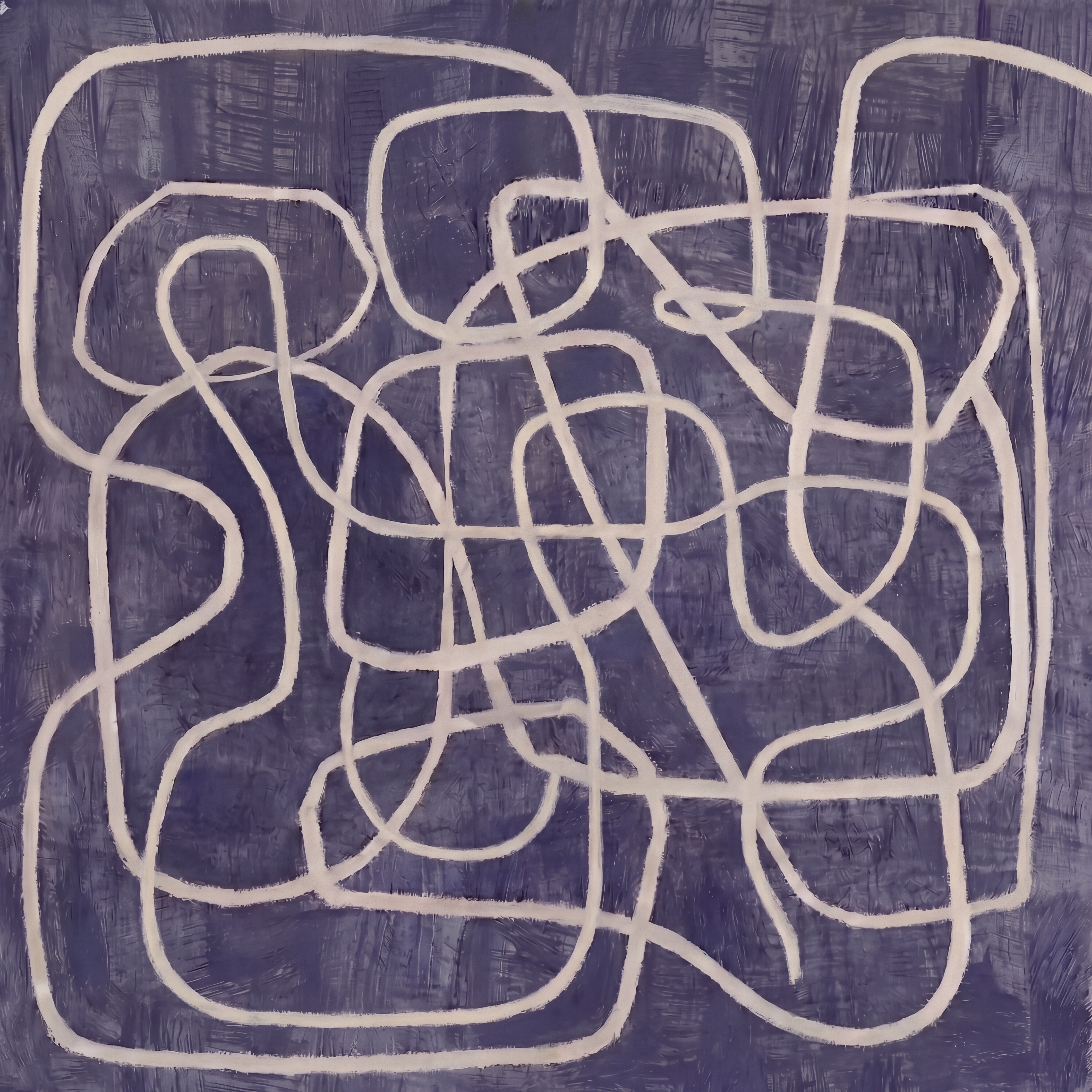
Fir Gallery's Purple Abstract Line Continuous Loop is a hand-painted piece built around a single unbroken line traveling across a brushed violet field. The cream line holds steady weight as it compresses at the center and opens near the edges, creating rhythm without clutter. It suits soft modern, minimalist, and Japandi rooms, and reads well above sofas, beds, and desks in homes that lean toward muted palettes and natural textures.
Quick read
Quiet movement on a violet ground — one line, continuously drawn, never rushed.
Product reference
Piece: Purple Abstract Line Continuous Loop - Wall Art by Fir Gallery
Format: Hand-painted
Size family: medium
View the productAt first glance, it reads as a single gesture: one cream-white line moving across a deep blue-violet field, looping back on itself, crossing, pausing in tight clusters, then releasing into open space near the edges. The line never breaks. That's the quiet trick of the piece — your eye follows it almost without deciding to.
The ground isn't flat. Horizontal and vertical brushstrokes sit beneath the violet, giving the surface a soft, textile-like weight. It keeps the contrast between line and background from feeling sharp or printed. Instead, the whole canvas feels worked by hand, which it is.
What the piece actually does in a room
This is a painting that adds movement without adding noise. The loops compress toward the center and loosen at the perimeter, so there's tension in the middle and breathing room around it. On a wall, that translates to a composition that holds your attention for a beat, then lets you move on — useful in rooms where you spend real time.
The palette does a lot of the work. Violet reads as a cool neutral here, closer to dusk than to purple in the crayon-box sense. Against warm white walls it feels grounded; against grey or blue-toned walls it almost dissolves into the palette, with the cream line carrying the visual line of the room.
Who it's for
It fits homes leaning soft modern, minimalist, or Japandi — interiors built around linen, pale wood, plaster finishes, and low-contrast color. If your room already has a lot of pattern, bright art, or competing focal points, this piece will feel muted. If your room is quiet and you want one wall to carry a bit of rhythm, it does that job well.
It works as a focal point above a sofa or bed, but it also holds up as a supporting piece — the kind of art you live with rather than announce.
Realistic expectations
A few things worth knowing before you buy. The violet is deep and slightly dusty, not vivid. In daylight it leans cooler; under warm lamplight it softens toward mauve. The line itself is cream, not stark white, so it won't pop the way high-contrast black-and-white line art does. That's intentional — the piece is built for calm, not drama.
Because it's hand-painted, expect small variations in brushwork and line weight. That texture is part of why it doesn't read like a print.
How it compares to similar wall art
Against a standard black-on-white continuous line print, this one reads warmer, moodier, and more atmospheric. Against a large abstract color-field canvas, it's more graphic and active. And against busier abstract paintings with multiple colors, it's noticeably quieter — closer in spirit to a drawing than a painting, even though it's on canvas.
If you've been comparing minimalist line art, Japandi-leaning abstracts, and moody neutrals, this piece sits at the intersection.
A quick styling scenario
Picture a living room with a low, warm-white linen sofa, a light ash coffee table, and a soft grey-blue wall. Hang the canvas centered above the sofa, leaving about eight to ten inches between the frame of the sofa back and the bottom of the painting. Add a ceramic table lamp on a side console. The violet ground settles into the wall tone, the cream line carries the eye across the seating area, and the room reads composed without feeling staged.
In a home office, hang it on the wall opposite your desk — visible when you look up, easy to rest your eyes on, not demanding enough to pull focus. Above a bed, center it on the headboard wall and keep bedding in warm neutrals so the violet stays the dominant cool tone.
Product details
- Type: Hand-painted canvas, abstract line composition
- Size tag: Medium — suited to standard sofas, queen headboards, and single-wall placements
- Palette: Deep blue-violet ground with a continuous cream-white line
- Finish: Visible brushwork in the background; matte, textile-like surface feel
- Best rooms: Living room, bedroom, home office
- Interior styles: Soft modern, minimalist, Japandi
- Pairs well with: Warm white linen, light ash or oak wood, dusty mauve upholstery, plaster or matte-painted walls
- Placement notes: Above a low sofa, centered over a headboard, or on the wall facing a desk
For the full view, sizing, and ordering details, see Purple Abstract Line Continuous Loop - Wall Art by Fir Gallery.