
Minerals and Honeysuckle: The Quiet Intelligence of This Soft Abstract Painting
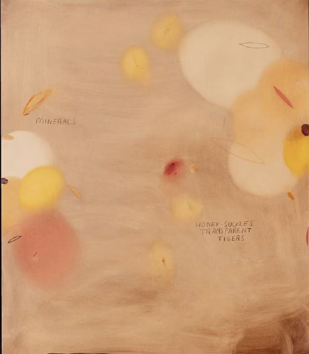
Soft Abstract Yellow Minerals by Fir Gallery is a hand-painted large-format abstract that layers loose pools of warm yellow, blush, and near-white across a pale linen ground. Handwritten words appear directly on the surface — 'Minerals' and 'Honey-Suckles Transparent Tigers' — giving the composition a quiet, almost literary undertone. The result reads as atmospheric rather than decorative, and works consistently well in soft modern, Japandi, and contemporary wabi-inspired interiors.
Quick read
Warm, luminous, and lightly literary — this piece brings atmospheric depth to neutral interiors without asking for attention.
Product reference
Piece: Soft Abstract Yellow Minerals - Wall Art by Fir Gallery
Format: Hand-painted
Size family: large
View the productAt first glance, Soft Abstract Yellow Minerals reads as a soft-field painting — warm yellows and blush pinks drifting across a pale, almost bare ground. Nothing is sharply defined. The forms hover somewhere between dissolved and present, the kind of composition that takes a moment to fully register. That unhurried quality is exactly what makes it work in a room.
What You're Actually Looking At
The canvas is hand-painted, and the surface shows it. Pools of warm yellow and near-white sit at varying intensities, some almost luminous, others barely lifted from the linen ground. Blush shapes drift toward the lower left. Thin leaf-shaped marks and small dark accents interrupt the softness at intervals — enough tension to keep the eye moving, not enough to disrupt the mood.
Then there's the text. Handwritten directly on the surface in a loose, unpretentious script: Minerals to the left, Honey-Suckles Transparent Tigers lower right. These aren't decorative labels — they feel more like private notations, like something written in the margin of a sketchbook. They anchor the composition with logic that's quiet and slightly mysterious, and they're a meaningful part of why this piece reads differently from standard abstract canvas art.
How It Feels in a Room
Large neutral abstracts can go either way — they either add atmosphere or they flatten a wall. This one adds atmosphere. The pale linen ground blends into warm white walls rather than sitting on top of them, so the painting feels like it extends the room rather than interrupting it. In daylight, the yellow tones are soft and warm. Under lamp light in the evening, the blush and near-white areas shift slightly, giving the surface a different quality depending on when you look at it.
It's not a piece that demands to be the center of attention. It works better as the mood of a room than the focal point — which, for a lot of interiors, is exactly what's needed.
Where It Actually Fits
Above a low sofa in a living room is the most natural placement. If the upholstery is warm linen, oatmeal, or soft taupe, the painting's pale ground extends the color story of the room without repeating it. Light oak shelving or a natural fiber rug nearby reinforces the warmth without feeling coordinated.
In a bedroom, placed wide and uncluttered behind a simple wooden headboard, the dispersed composition settles rather than activates — useful in a space where you want visual interest without energy. The blush tones are soft enough to read as restful rather than decorative.
A home office placement is less obvious but genuinely effective. With the piece on the wall your desk faces, the text elements and slow color movement give the eye somewhere to rest during the day. It's not distracting — it's the opposite of distracting.
What to Expect Realistically
This is a calm painting. If you're looking for something graphic, high-contrast, or visually bold, it will likely read as too quiet. The color palette is warm but restrained — buyers who expect saturated yellows based on thumbnail previews sometimes find the actual tones more muted in person, which is worth knowing in advance. On warm white or greige walls, that restraint is an asset. On very cool or dark walls, the piece can lose its presence.
The handwritten text is a detail that either resonates or doesn't. For buyers who respond to art that carries a private, slightly literary quality, it's a distinctive feature. For those who prefer purely visual abstraction, it may feel like an intrusion.
How It Compares
Compared to printed abstract canvas art in a similar color range, the hand-painted surface reads differently up close — there's depth and variation in the paint application that prints don't replicate. Compared to busier abstract paintings with layered gestural marks, this one is noticeably quieter and more considered. It occupies a space between fine art and understated home decor that works well in soft modern and Japandi-influenced interiors specifically.
Product Details
- Type: Hand-painted original-style canvas
- Size category: Large format
- Color direction: Warm yellow, blush pink, near-white, pale linen ground
- Surface: Painted canvas with visible texture and brushwork
- Wall fit: Warm white, greige, or soft oatmeal walls; less effective on cool or dark backgrounds
- Best placements: Above a low linen sofa; behind a bedroom headboard on a wide wall; on the desk-facing wall in a home office
- Interior styles: Soft Modern, Japandi, Contemporary Wabi-Inspired
- Furniture pairings: Light oak, warm white linen, soft taupe upholstery, natural fiber textiles
If your room is already leaning toward warmth and quiet, this piece holds that direction well — you can find it listed as Soft Abstract Yellow Minerals - Wall Art by Fir Gallery.