
Quiet Interval: A Textured Neutral Abstract That Actually Works in a Room
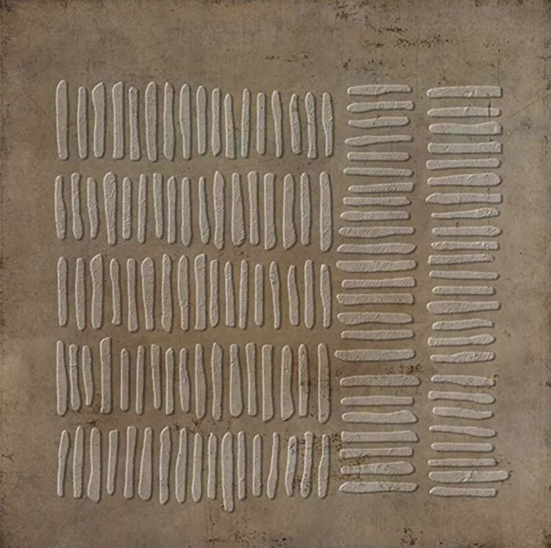
Quiet Interval by Fir Gallery is a large hand-painted abstract wall art piece built around rows of elongated raised marks on a warm bronze-brown surface. The composition shifts rhythm from left to right — longer vertical strokes on one side, shorter compressed marks on the other — creating visual movement that stays calm. The sculptural, plaster-like texture catches light and casts faint shadows that change through the day, making it one of those pieces that reads differently in morning sun than under a lamp at night.
Quick read
A measured, hand-applied composition in warm brown and cream that brings tactile depth and breathing calm to any wall it occupies.
Product reference
Piece: Textured Neutral Abstract Quiet Interval - Wall Art by Fir Gallery
Format: Hand-painted
Size family: large
View the productAt first glance, Quiet Interval looks like a composition study — rows of elongated raised marks arranged across a warm bronze-brown ground, slightly irregular, clearly made by hand. Look a little longer and the piece starts to reveal its logic. The left side carries longer vertical strokes in loose columns. Moving right, the marks shorten and tighten into two denser groupings. It is the same visual language, compressed. The rhythm shifts without the mood ever breaking.
What Makes It Distinct
The surface is sculptural rather than flat. Each mark has a plaster-like raised edge that catches light at an angle, casting faint shadows that shift as daylight moves across the wall. Under a warm lamp in the evening, the piece reads darker and more atmospheric. In morning window light, the cream marks lift and the composition feels more open. That responsiveness to light is something flat-printed abstracts simply cannot replicate — and it is one of the clearest reasons to choose a hand-painted piece at this scale.
The negative space between marks carries as much weight as the marks themselves. This is not a dense or busy composition. It breathes.
How It Reads in a Room
Above a long, low sofa, the horizontal spread of the piece provides exactly the kind of anchoring visual weight that a large living room wall needs — without competing with furniture or textiles below it. Against warm white or greige plaster walls, the bronze-brown ground recedes softly and the cream marks hold the eye without demanding attention.
In a home office placed on the wall directly opposite the desk, the measured repetition works as a genuine resting point. It gives the eye somewhere to land that is neither blank nor visually noisy. That is a harder balance to achieve than it sounds.
A dining room sideboard wall is another natural fit. The earthy palette aligns easily with linen tablecloths, ceramic vessels, and raw wood — the kind of material layering that defines well-considered casual dining spaces.
Who It Suits
This piece sits most naturally in Japandi, soft modern, and wabi-inspired interiors — spaces that prioritize texture, restraint, and material honesty over color or pattern. Light oak furniture, undyed textiles, matte plaster finishes, and warm greige walls all work with it rather than against it.
It is less suited to high-contrast environments or spaces built around cool grays and bright whites. The warmth in the ground tone is specific, and that specificity is part of what makes it feel resolved rather than generic.
Realistic Expectations
Hand-painted texture means minor variation in mark placement and surface depth — no two pieces are identical. The irregularity is intentional and is what gives the grid a breathing quality rather than a mechanical one. Buyers who expect print-level uniformity should know that going in. Buyers who value the handmade quality will find it a feature, not a flaw.
The piece is large in scale. It benefits from a wall with some unbroken run — a feature wall, a single sofa span, or a wide sideboard backdrop. Tight or narrow walls will compress the composition and reduce its impact.
Compared to Other Options
Against a plain abstract print in similar tones, the 3D surface here adds a dimension that changes how the piece reads across different times of day. Against other textured canvases, the restraint of the palette — warm brown and cream only — keeps it from feeling decorative in the wrong way. It is abstract art that does not announce itself, which is exactly what certain rooms require.
Product Details
- Type: Hand-painted original wall art
- Size category: Large
- Surface: 3D raised textured marks, plaster-like finish
- Palette: Warm bronze-brown ground, cream raised marks
- Finish: Matte, sculptural
- Best placement: Above a low sofa, opposite a desk, above a sideboard or credenza
- Room fit: Living room, home office, dining room
- Interior styles: Japandi, soft modern, contemporary wabi-inspired
- Works with: Light oak, undyed linen, warm greige plaster, matte ceramics
If you are ready to see the full size options and details, the full listing is available here: Textured Neutral Abstract Quiet Interval - Wall Art by Fir Gallery.