
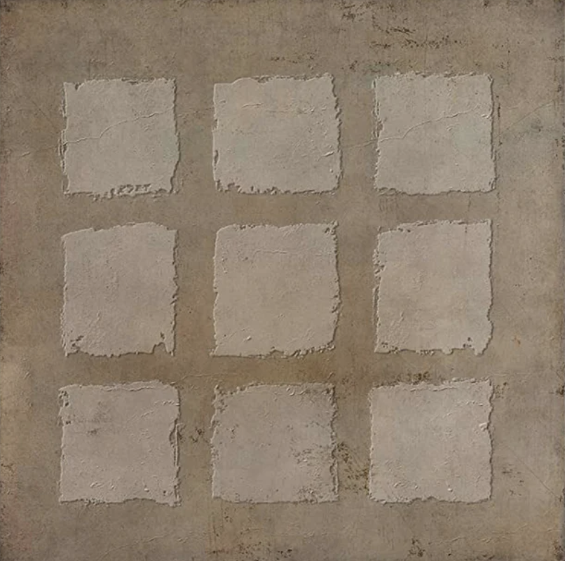
Built, Not Printed: Why This Plaster-Effect Grid Art Works Where Others Don't
Most textured wall art leans one way or the other — either too graphic or too soft to hold a wall on its own. The Textured Neutral Grid Quiet Nine from Fir Gallery lands somewhere more useful: a nine-panel hand-painted composition with genuine material depth, earthy neutral color, and a quiet geometric order that reads well above furniture without competing with the rest of the room.
Quick read
Warm taupe, raised plaster squares, hand-painted surface — structured and grounded without being rigid.
Product reference
Piece: Textured Neutral Grid Quiet Nine - Wall Art by Fir Gallery
Format: Hand-painted
Size family: large
View the productAt first glance, the Textured Neutral Grid Quiet Nine reads as a grid — nine squares arranged three by three, separated by slightly recessed lines against a darker concrete-toned ground. But look at it for another few seconds and the geometry becomes secondary. What actually holds your attention is the surface: each square carries a raised, roughened texture that catches light differently depending on the time of day and where you're standing. This isn't a print that simulates depth. It's a hand-painted piece with actual material relief, and that distinction matters the moment it goes on your wall.
What the Surface Actually Does
The squares themselves sit lighter than the surrounding field — warm stone and taupe rather than stark white — and each one has its own slight variation. Some show faint hairline marks, others a smoother compression. The grid lines between them are uneven in a way that feels worn rather than constructed. Nothing here is perfectly regular, and that's the point. The composition reads as ordered without feeling mechanical, which is a harder balance to pull off than it sounds.
In direct daylight, the raised texture throws small shadows that define the grid structure and give the piece real visual weight. Under warmer lamplight in the evening, those shadows soften and the whole surface shifts toward something quieter and more atmospheric. It's one of the more honest things you can say about a piece: it changes through the day, and both versions are worth having.
How It Fits a Room
This is large-format wall art built for wide walls. Above a low sofa, the three-by-three arrangement distributes weight evenly across the horizontal span — it doesn't pull toward any single corner, which makes it easier to balance against side tables, lamps, or shelf arrangements below. Paired with warm white linen cushions and light oak furniture, the earthy neutrals in the piece feel continuous with the room rather than imported into it.
In a dining room behind a timber table, it brings material presence without pulling focus from the table itself. That's a specific thing to ask of wall art in a dining space, and the neutral palette and matte surface handle it well. In a home office placed on the wall directly opposite the desk, the measured repetition works as a low-key focal point — structured enough to feel intentional, quiet enough that it doesn't distract during long work sessions.
Who This Piece Suits
Buyers drawn to Japandi, rustic modern, or contemporary wabi-inspired interiors will find this fits naturally. It works alongside matte clay plaster walls, raw oak or walnut furniture, linen and cotton textiles, and earthy ceramic accents. It's less at home in spaces built around high-gloss finishes, strong saturated color, or maximalist layering — not because it clashes technically, but because the restraint of the piece gets lost in busier surroundings.
One realistic expectation worth setting: the texture reads best with some distance. Up close, you see the material quality clearly. From across a room — which is how most wall art actually lives — what you register is the grid structure, the warm neutrals, and the overall calm of the composition. Both readings are good, just different.
Where It Has an Edge Over Similar Options
Compared to flat canvas prints in similar neutral palettes, the hand-painted texture here adds something that photography and digital reproduction can't replicate on their own. Compared to heavily dimensional sculptural wall art, this piece stays flat enough to read as a cohesive whole rather than a collection of objects. It occupies a specific middle ground — more material than a print, more composed than mixed-media work — that suits buyers who want presence without drama.
Product Details
- Type: Hand-painted wall art with raised 3D plaster-effect texture
- Size: Large format — suited to wide walls, broad feature walls, and the span above low furniture
- Color direction: Warm taupe, aged stone, raw concrete tones — neutral and earthy throughout
- Surface: Textured canvas with genuine material relief; matte finish
- Style fit: Contemporary wabi-inspired, Japandi, rustic modern
- Room fit: Living room above sofa, dining room behind table, home office on desk-facing wall or above a low credenza
- Furniture pairings: Warm white linen, light oak, matte clay plaster finishes
If you're weighing large neutral wall art for a room that needs structure without noise, Textured Neutral Grid Quiet Nine - Wall Art by Fir Gallery is worth a close look.