
Quiet Order: Why This Textured Grid Panel Works in Rooms That Don't Need More Color
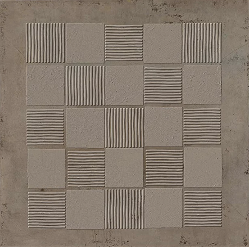
The Textured Neutral Grid Quiet Order wall art by Fir Gallery is a large-format hand-painted relief panel built around a five-by-five grid of square tiles on a weathered stone-toned ground. Each tile alternates between a smooth matte surface and one combed with fine parallel ridges — some horizontal, some vertical — so the composition reads as a low-relief checkerboard of shadow and texture rather than contrast or color. It's a distinctly architectural piece that suits rooms already working in material restraint: Japandi interiors, warm minimalist living rooms, considered home offices.
Quick read
A textured grid that earns its place through what it withholds — color, contrast, noise — rather than what it adds.
Product reference
Piece: Textured Neutral Grid Quiet Order - Wall Art by Fir Gallery
Format: Hand-painted
Size family: large
View the productAt first glance, it reads almost like a stone tile installation — a five-by-five grid of square panels centered on a weathered, stone-toned ground. Look closer and the logic reveals itself: every tile alternates between a perfectly smooth matte surface and one combed with fine parallel ridges, some running horizontal, some vertical. No color change. No contrast. Just shadow, catching differently across each surface depending on where the light lands.
What Makes It Visually Distinct
The palette holds a single register throughout — warm greige, consistent from panel to panel. What varies is texture alone. The ribbed tiles cast just enough shadow to read differently from their flat neighbors, creating a low-relief checkerboard that the eye can follow without effort. From across a room it feels architectural. Standing close, it feels almost tactile — like something you'd want to press a hand against.
That restraint is the whole point. This isn't a piece trying to introduce mood through color or image. It introduces it through surface and repetition, which makes it unusually useful in rooms that are already doing a lot with materials — plaster walls, linen upholstery, raw concrete, light oak. It belongs there the way good furniture hardware does: quietly structural.
How It Actually Reads in a Room
Above a low sofa in a living room, the grid's symmetry anchors the seating area with a kind of settled visual weight. Against a warm white or greige wall, the tonal continuity is what makes it work — the piece doesn't pop, it deepens. That's a meaningful distinction for buyers who are tired of art that competes with everything around it.
In a home office placed on the wall directly facing a desk, the grid offers a measured focal point — something to land on during a pause without pulling focus. It doesn't stimulate the way a bold abstract would. It steadies.
Hallway end walls suit it well too. The corridor framing acts almost like a second border, and the grid holds naturally within that geometry.
Who It's For — and Who Might Want Something Different
This piece is for buyers who've already resolved the color question in their space and are now looking for something that adds dimension without noise. Japandi interiors, warm minimalist rooms, and wabi-inspired spaces are the clearest fits. If your room is built around contrast — dark walls, bold upholstery, graphic rugs — this panel may disappear rather than anchor.
It's also worth being honest about the tone: this is a quiet piece. Buyers expecting visual drama or a strong focal-point moment from across a large open-plan room may find it underperforms at distance in brighter, high-contrast environments. In a tonal room with considered lighting, though, it can be the most interesting surface in the space.
A Realistic Styling Scenario
Picture a living room with greige plastered walls, a low linen sofa in oat, a light oak coffee table, and no art yet on the main wall. The room is calm but feels unfinished — like it needs one more material to land. Hung centered above the sofa, this panel does exactly that. It introduces relief and shadow without breaking the room's palette or asking the eye to do extra work. The grid's symmetry echoes the sofa's horizontal line. The ridged texture answers the linen's weave. Nothing competes.
Product Details
- Type: Hand-painted 3D textured wall art
- Size: Large format — well-suited to primary wall placements above sofas, beds, or console tables
- Finish: Low-relief sculptural surface; alternating smooth matte and fine-combed ribbed panels
- Color: Warm greige throughout — tonal, not high-contrast
- Material feel: Architectural, plaster-adjacent, tactile at close range
- Best rooms: Living room, home office, foyer or hallway end wall
- Interior styles: Japandi, minimalist, contemporary wabi-inspired
- Pairs with: Light oak wood, warm white linen, raw concrete or plaster surfaces
- Lighting note: Raking light — from a side window or angled lamp — brings the ridge texture to life most clearly; flat overhead light flattens the relief effect
For rooms that are done adding color and ready to add depth, this is the kind of piece that finally feels right — browse the full listing for sizing and placement details at Textured Neutral Grid Quiet Order - Wall Art by Fir Gallery.