
A Quiet Conversation in Black: Inside This Figurative Diptych
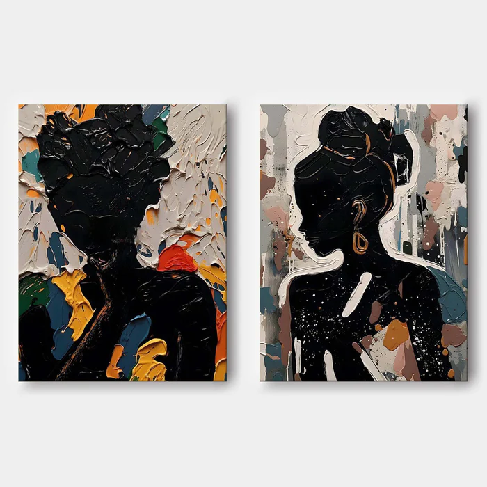
This diptych pairs two black figurative silhouettes against rich, painterly backgrounds — one panel dense and impasto-heavy, the other softer and more atmospheric. Together they read as a single, deliberate statement: graphic enough to anchor a wall, textured enough to keep rewarding a second look.
Quick read
Two figures, two moods, one wall — held together by black silhouette and brushwork.
Product reference
Piece: Abstract Black Figurative Silhouette Diptych - Wall Art by Fir Gallery
Format: Hand-painted
Size family: large
View the productThe first thing you notice is the silhouette. Two figures in deep, opaque black sit at the center of each canvas, calm and almost monumental against backgrounds that won't stop moving. The left panel pushes hard into texture — thick strokes of cream, teal, orange, and gold pressed into a surface that's nearly sculptural. The right panel exhales: blush, taupe, dripped white, and a single gold earring that lands like punctuation in an otherwise gestural field.
As a pair, they're talking to each other. One panel is loud, one is suspended. The figures hold still while everything around them shifts. That tension is what gives this diptych its presence on a wall — it isn't decorative in a quiet way, and it isn't chaotic either. It sits in between.
What Makes It Visually Distinct
This is a hand-painted abstract figurative diptych, which means the texture is real — built up in layers, not printed to mimic depth. The black silhouettes act as anchors, while the surrounding fields carry the energy: impasto ridges, dragged color, dripped highlights. You get the graphic clarity of pop-art portraiture and the surface interest of a textured abstract, in one set.
The two panels aren't identical, and that's the point. The left is denser and warmer; the right is airier and cooler. Hung together with a measured gap, they read as a conversation rather than a mirror.
How It Feels in a Room
Big, but not heavy-handed. Because the figures are silhouettes, the eye reads shape before detail, which keeps the piece from competing with everything else on the wall. The textured backgrounds change with the light — sharper and more chromatic in daylight, moodier and more sculptural under warm lamps in the evening.
It tends to ground a space rather than energize it. Think focal point with weight, not a pop of color.
Where It Works Best
Above a low sofa, hung as a pair with a clean gap between panels, it spans a wide living room wall comfortably and gives each figure room to breathe. On the wall facing the bed, the dark forms add visual weight without crowding a quieter room. In a home office, placed opposite the desk or beside dark shelving, it brings a gallery feel to a working space without turning it into a showroom.
It pairs naturally with dark walnut wood, warm white linen, and matte black or brushed gold frames. Contemporary interiors are the easiest fit, but it also slots into bohemian rooms with layered textiles, or art deco spaces where the gold accents pick up brass and marble.
Realistic Expectations and Common Misreads
A few things worth setting straight. The texture is genuine impasto, so each panel has its own surface character — small variations are part of the medium, not a flaw. The black isn't flat; it carries brushwork you'll see up close. And while the palette includes warm color, the overall read is still grounded and moody, not bright.
If you're comparing this against a single large canvas or a symmetrical gallery wall, the diptych sits in its own lane: more deliberate than a gallery wall, more dynamic than a single piece, and easier to balance over long furniture than one oversized canvas.
A Quick Styling Scenario
Picture a living room with a low charcoal sofa, a walnut coffee table, and warm white walls. The diptych hangs above the sofa with about four to six inches between panels, centered on the seating. A brass floor lamp leans in from one side. In daylight, the teal and orange in the left panel catch the eye. After sunset, the impasto ridges throw soft shadows and the gold earring on the right panel quietly glows.
Product Details
- Type: Hand-painted canvas diptych (set of two panels)
- Style: Abstract figurative with pop-art and graffiti influence
- Surface: Heavy impasto texture on the left panel, softer washes and drips on the right
- Palette: Deep black silhouettes with cream, teal, orange, gold, blush, and taupe
- Size tag: Large — best suited to wide walls and long furniture
- Framing: Reads well unframed for a raw studio look, or with matte black or brushed gold floater frames for a more finished gallery feel
- Best rooms: Living room above a low sofa, bedroom facing the bed, home office opposite the desk, or a foyer feature wall
- Pairs with: Dark walnut wood, warm white linen, matte black metal, brass accents
For a closer look at scale, texture, and the full pairing, see the Abstract Black Figurative Silhouette Diptych - Wall Art by Fir Gallery.