
Neutral Textured Diptych Wall Art: How It Reads in Real Rooms
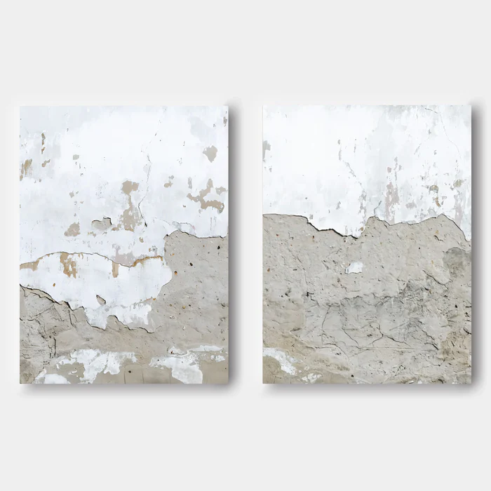
Neutral Textured Abstract Still Layers is a hand-painted diptych that behaves like a continuous stretch of weathered plaster wall. The upper halves stay close to white while the lower halves open into sand and warm grey, with real surface texture across both panels. It works best as a wide, low-key focal point above a sofa, behind a headboard, or at the end of a hallway in contemporary wabi, Japandi, and soft modern interiors.
Quick read
Two panels, one slow horizon — restrained, textural, and quietly architectural.
Product reference
Piece: Neutral Textured Abstract Still Layers - Wall Art by Fir Gallery
Format: Hand-painted
Size family: large
View the productAt first glance, Neutral Textured Abstract Still Layers looks less like a painting and more like a section of an old plaster wall that's been carefully lifted and framed. Two panels share one continuous field: pale, almost paper-white at the top, slowly dissolving into warm grey and sand near the bottom where the undercoat has worn through. There's pitting, flaking, and fine cracking across the surface — yet the overall mood stays calm.
That tension is what makes the piece interesting. It carries a lot of visual information without ever feeling busy.
What This Diptych Actually Is
This is a hand-painted, two-panel abstract in the wabi-sabi and minimalist tradition — neutral textured wall art designed to read as a single horizontal composition. The gap between panels isn't a break; it's a pause. The eye crosses it the same way it crosses a seam in a real plaster wall.
Color stays in a narrow band: chalky white, warm bone, soft sand, weathered grey. There's no strong line, no center of gravity, no obvious subject. The composition lives in the slow dissolve between the upper and lower zones.
How It Changes a Room
In a room, the diptych acts more like architecture than decoration. The texture catches daylight in the morning, holds soft shadow in the afternoon, and warms noticeably under lamplight — the sand tones get richer, the white reads creamier.
It's a quiet focal point, not a graphic one. Hang it above a low sofa and the horizontal spread mirrors the furniture line; the room feels longer and more grounded. Behind a headboard, the two panels add mass without visual weight, which is hard to pull off with a single large canvas. At the end of a hallway, it gives the corridor somewhere to land.
Who It's For
This piece suits interiors that already lean tactile and neutral — contemporary wabi-inspired rooms, Japandi spaces, soft modern living rooms with linen upholstery, raw oak, and matte plaster walls. If your palette runs in the white-oat-bone-clay family, it slides in without negotiation.
It's a harder fit for rooms built on saturated color, glossy lacquer, or high-contrast graphic art. The diptych doesn't compete; it recedes. In a room that wants a loud anchor, this isn't the piece.
A Common Misread
People sometimes assume textured neutral art is filler — quiet equals safe. In practice, this kind of work is doing real compositional labor. Because the panels are so close in tone, scale and placement matter more than usual. Hung too small or floated too high, the diptych loses its presence and starts to look like two beige rectangles. Sized correctly to the wall and dropped to a comfortable sightline, it behaves like a built surface.
How It Compares to Nearby Options
Against a single large abstract canvas, this diptych spreads the visual weight horizontally instead of concentrating it. That's useful above long sofas and king beds, where one panel can feel undersized and a triptych can feel over-segmented.
Against framed neutral prints, the hand-painted surface reads very differently in person — real texture, not photographed texture. And against pure minimalist canvases, the plaster language gives it more warmth and a sense of age, closer to wabi-sabi than gallery minimalism.
A Quick Styling Scene
Picture a living room with a long, low linen sofa, a light oak coffee table, and warm white walls. The diptych sits centered above the sofa, panels spaced a few inches apart. A ceramic lamp on a side console throws light across the lower halves at night, and the worn grey tones pick up a soft glow. Nothing in the room shouts. The wall just feels finished.
Product Details
- Type: Hand-painted abstract diptych (two-panel set)
- Style: Wabi-sabi, minimalist, 3D textured abstract
- Size tag: Large — built for wide walls and full-room sightlines
- Surface: Real applied texture with pitting, cracking, and flaked plaster effects
- Color direction: Chalk white at the top, warm grey and sand below, no strong accent color
- Best rooms: Living room (above a low sofa), bedroom (behind a queen or king headboard), foyer (terminal hallway wall or above a slim console)
- Pairs well with: Raw linen upholstery, light oak, warm plaster walls, matte ceramics
- Placement note: Treat the two panels as one composition; keep the gap tight and the centerline at standard sightline height
For a closer look at scale, texture, and available sizing, see Neutral Textured Abstract Still Layers - Wall Art by Fir Gallery.