
A Quiet Abstract That Breathes: Inside Fir Gallery's Blue-Grey Still Interval
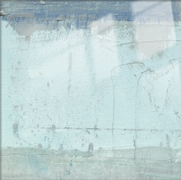
This Fir Gallery piece works through restraint. A washed blue-grey field, a darker slate band at the top, and a faint white drift on the upper right give the canvas a sense of overcast light and worn plaster. It settles above sofas, headboards, and foyer consoles without demanding the room, pairing easily with oatmeal linen, light oak, and matte white surfaces.
Quick read
Open but not empty, worn but not damaged — a wall that holds its breath.
Product reference
Piece: Abstract Blue Grey Still Interval - Wall Art by Fir Gallery
Format: Hand-painted
Size family: large
View the productAt first glance, Abstract Blue Grey Still Interval reads like a wall remembered rather than a wall painted. A pale blue-grey field spreads across the canvas with the flat stillness of overcast sky seen through old window glass. A deeper slate band runs along the top edge, grounding the composition, while a soft white form drifts into the upper right — the only real warmth in the piece. Up close, the surface has the pocked, striated feel of weathered plaster. From across the room, it simply looks calm.
It's a hand-painted abstract, not a print, and that shows in the way the layers sit on the canvas. Washed blues settle into near-white at the center. Faint vertical marks descend through the lower half, reading as rain, time, or both. The piece holds tension between dissolution and structure, which is part of why it doesn't feel decorative in the shallow sense.
How It Reads in a Room
This is a quiet focal point, not a graphic statement. The palette is cool and diffuse, so it absorbs daylight rather than bouncing it back. In a bright living room, the canvas softens — the blues go almost white near the window and deepen as you move away. Under warm lamplight in the evening, the slate band pulls forward and the texture becomes more visible. You notice different things at different hours, which is something flat prints rarely give you.
It leans calm, airy, and lightly architectural. Think weathered, not distressed. Coastal without the literal beach imagery. Japandi without the strict minimalism.
Who It Suits
This piece fits people who are editing their rooms down rather than filling them up. If your interior leans Coastal, Japandi, or Soft Modern, the tonal range here — pale blue, bone white, muted slate — will slide in without negotiation. It works best alongside light oak, warm white linen, and soft grey upholstery. It's less comfortable in high-contrast, saturated, or heavily patterned rooms, where its subtleties tend to get lost.
A common mistaken assumption: that a piece this soft will disappear on the wall. In practice, the texture and the darker upper band give it enough weight to hold a wide surface, especially at large scale. It recedes, but it doesn't vanish.
Focal Point or Supporting Piece?
Compared with bolder abstract canvases — high-contrast black-and-white work, oversized color-field paintings, or textured oil pieces with heavy impasto — this one sits further toward the quiet end of the spectrum. If you've been weighing a statement abstract against something more restrained, this is firmly the restrained choice. It's the canvas you pick when you want the furniture, the light, and the room itself to stay visible.
A Short Styling Scenario
Picture a living room with a low oatmeal linen sofa, a light oak coffee table, and a single tall window on the side wall. Centered above the sofa, this canvas at large scale reads almost like a second window — same cool light, same sense of distance. Swap in a bedroom: mounted behind the headboard on a full-width wall, opposite a window, it gives the room that even, diffuse quality people usually chase with paint colors and fail to get. In a foyer, placed on an end wall beside a light oak console, it sets the tone before anyone takes their coat off.
Product Details
- Type: Hand-painted canvas wall art, original surface texture
- Size tag: Large — suited to wide walls above sofas, beds, or consoles
- Style: Abstract, minimalist, wabi-sabi leaning
- Palette: Pale blue-grey, bone white, muted slate
- Finish: Matte, layered, weathered-plaster feel
- Best rooms: Living room, bedroom, foyer
- Pairs with: Light oak wood, warm white linen, soft grey upholstery
- Interior directions: Coastal, Japandi, Soft Modern
Framing and hanging choices will shift how formal the piece feels — a slim natural oak float frame leans Japandi, while unframed keeps it closer to a studio, gallery-wall mood. Either way, the composition does most of the work.
For the full view, sizing, and current options, see Abstract Blue Grey Still Interval - Wall Art by Fir Gallery.