
Still Drift: A Quiet Aerial Abstract in Navy and Sage
Abstract Green Landscape Still Drift is a horizontal hand-painted canvas built around a diagonal navy river flanked by textured bands of sage and brushed white. It reads as an aerial landscape, anchoring wide walls in living rooms, bedrooms, and home offices with quiet depth rather than visual noise.
Quick read
Built up, not painted flat — the surface carries the composition as much as the color does.
Product reference
Piece: Abstract Green Landscape Still Drift - Wall Art by Fir Gallery
Format: Hand-painted
Size family: large
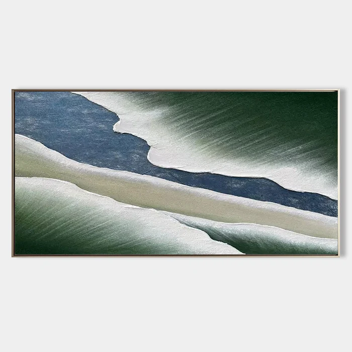
View the productThe first thing you notice about Still Drift is the diagonal. A narrow channel of deep navy cuts across the canvas, separating two broad fields of brushed white and sage that taper toward the right edge. It looks less like a painted scene and more like something seen from above — a river between snowfields, or a coastline read from altitude. The reading is abstract, but the geometry feels landscape.
The greens deepen at the outer edges, almost forested in density, before dissolving inward into soft white. That gradient is what gives the piece its weight. There's tension in the narrow blue where the two pale banks nearly meet, and stillness in the wide green margins holding everything in place.
How It Reads in a Room
This is a hand-painted canvas, and the surface shows it. The texture is built up rather than applied flat, with a finish that suggests compressed earth or wind-packed snow depending on the light. In daylight, the sage edges look cooler and more aerial. Under lamplight, the navy channel pulls forward and the whites warm slightly, giving the painting a softer, more grounded presence in the evening.
It behaves like a focal point without demanding the room. The horizontal format spreads attention sideways instead of pulling the eye to a single center, which is why it sits so comfortably above long furniture. You get presence without pressure.
Who It Suits
Still Drift fits naturally into Japandi, soft modern, and wabi-inspired interiors — rooms that already lean on natural materials, restrained palettes, and a little breathing room. If your space includes light oak, warm stone grey, sage linen, or unpolished ceramics, the painting reads as part of the same material conversation.
It's less suited to high-contrast, maximalist rooms or spaces built around saturated jewel tones. The painting's strength is its quiet — putting it in a loud room dulls what makes it interesting.
Realistic Expectations
A few things worth knowing before committing to a piece like this:
- Because it's hand-painted, the texture varies subtly across the surface. That's the point, but it means the piece looks best when there's enough wall around it to be seen as an object, not just an image.
- The palette is cool and grounded. It won't add warmth to a room — it will add calm. If you need a piece that brightens a dim corner, this isn't it.
- It needs scale. On a narrow wall or crowded gallery arrangement, the composition loses its aerial quality and starts to feel cramped.
Compared with Nearby Options
Against a typical abstract print, Still Drift trades graphic punch for material depth. A flat print in similar colors will read cleaner and more uniform; this canvas reads slower and rewards a second look. Compared with a darker, moodier seascape abstract, it stays lighter and more livable — closer to a misted aerial view than a storm.
If you're choosing between this and a minimalist line-based piece, the deciding factor is usually texture. Line work feels architectural. Still Drift feels geological.
A Quick Styling Scenario
Picture a living room with a low linen sofa in warm grey, a light oak coffee table, and a wool rug in oatmeal. Centered above the sofa, Still Drift extends the horizontal of the seating and pulls the eye across the wall in a slow left-to-right drift. The sage echoes any plant life in the room; the navy gives the palette a quiet anchor so the space doesn't float into beige. Nothing else on that wall — the painting carries it.
In a bedroom, the same painting behind a low headboard turns the wall into a settled backdrop rather than a statement. In a home office, hung on the wall opposite the desk, it works as something calm to look up at between tasks.
Product Details
- Type: Hand-painted canvas, large horizontal format
- Style: Abstract landscape with wabi-sabi and 3D textured surface qualities
- Palette: Deep navy, sage green, brushed white, with forested edges fading inward
- Texture: Built-up surface, varied across the canvas; reads differently in daylight vs lamplight
- Best rooms: Living room above a wide low sofa; bedroom centered behind a headboard; home office on a desk-facing wall
- Pairs with: Light oak, warm stone grey, sage linen, natural stone surfaces
- Best avoided: Narrow walls, crowded gallery walls, high-saturation color schemes
For a closer look at the full piece, dimensions, and finish, see Abstract Green Landscape Still Drift - Wall Art by Fir Gallery.