
Where the Wave Breaks: Living With a Textured Ocean Painting
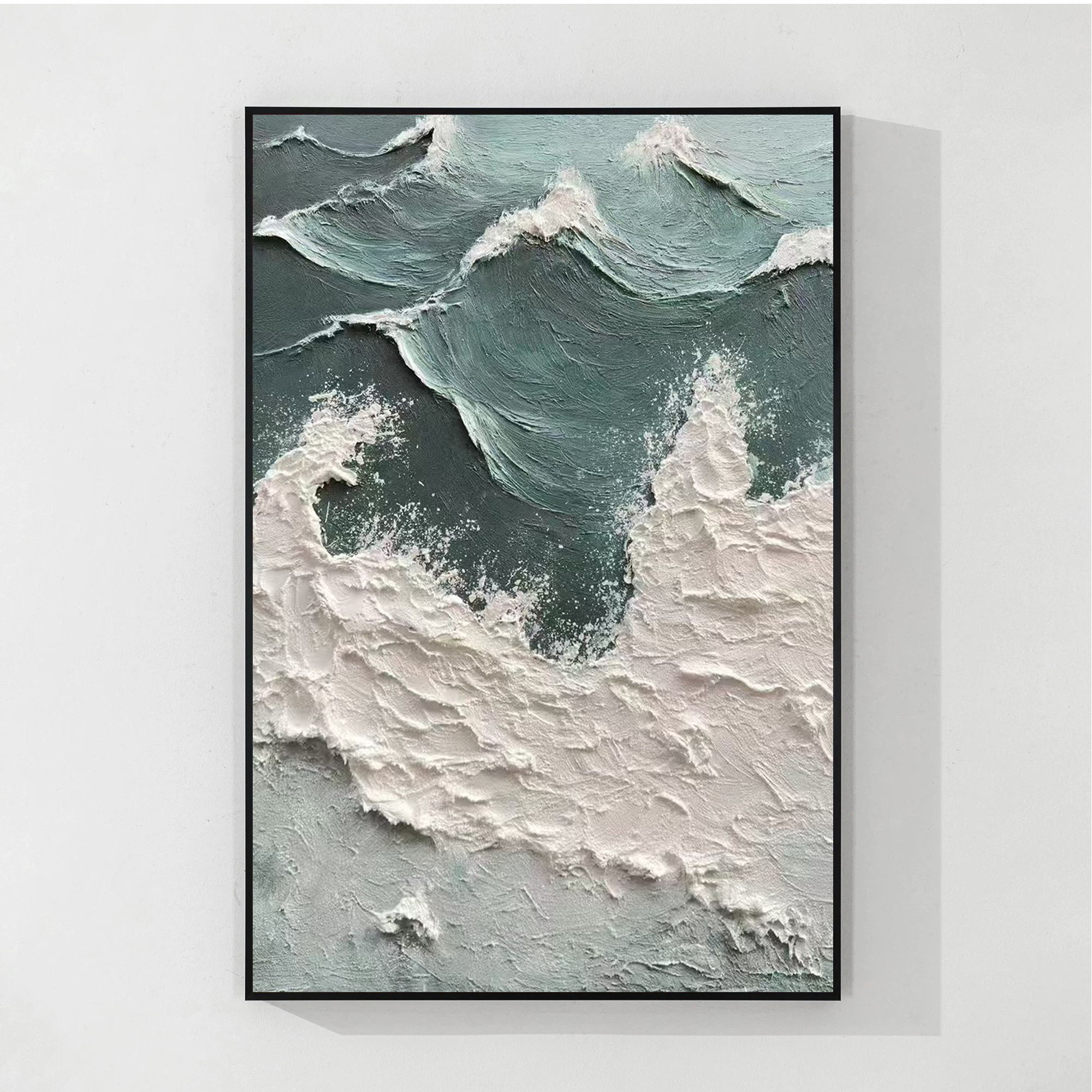
Abstract Ocean Wave Shore Break is a large hand-painted canvas built up in thick impasto, moving from deep teal water to a dense ridge of off-white foam. The surface carries real dimensional weight, which lets it act as a calm focal point above a sofa, bed, or dining wall without overwhelming a neutral room.
Quick read
Texture does the talking — color stays quiet.
Product reference
Piece: Abstract Ocean Wave Shore Break - Wall Art by Fir Gallery
Format: Hand-painted
Size family: large
View the productThe first thing you notice is the ridge. A thick band of white pigment runs across the lower half of the canvas, built up high enough to throw its own shadow. Above it, deep teal water settles into smaller crests near the top edge. The painting reads as a wave breaking, but the recognition comes from mass and rhythm — not from any literal drawing of water.
This is a hand-painted impasto seascape, finished in heavy palette work rather than smooth brushing. The surface is genuinely dimensional: ridges sit proud of the canvas, the teal recesses hold their darkness, and the foam zone reads almost like sculpted plaster. It's abstract in handling but unmistakably ocean in feel.
How It Reads in a Room
The piece holds a wall through weight, not drama. The composition splits cleanly — cooler teal up top, dense off-white and sand tones below — so the eye lands on the break line first, then settles into the textured lower mass. That structure makes it easy to live with. It doesn't compete with conversation areas or sleep zones the way a high-contrast graphic print can.
In daylight, the impasto ridges cast soft, shifting shadows across the surface. Under warmer lamplight in the evening, the white zones turn slightly creamier and the teal deepens. It's the kind of artwork that quietly changes throughout the day.
Who It Suits
This works well for rooms leaning coastal, soft modern, Japandi, or wabi-sabi. It pairs naturally with warm white linen upholstery, light oak wood, pale greige fabrics, and plaster or whitewashed walls. If your interior already runs textural — bouclé, raw linen, unpolished stone — the painting reinforces that language instead of fighting it.
It's a less obvious fit for high-gloss, jewel-toned, or maximalist rooms. The palette is too quiet to anchor a heavily saturated space, and the texture asks for some breathing room around it.
Common Misreads
Two things buyers sometimes get wrong. The first: assuming a textured ocean painting will feel busy. This one doesn't — most of the canvas is calm, and the activity concentrates along the break line. The second: expecting a literal seascape. There's no horizon, no sky, no shoreline detail. The ocean reference is structural, not narrative.
A Real Styling Scenario
Picture a living room with a low linen sofa in warm white, a light oak coffee table, and a wall that gets indirect afternoon light. Hung centered above the sofa, the painting fills the wall without crowding it. The white foam zone picks up the linen, the teal grounds the lighter wood, and the impasto shadows give the wall depth that flat prints can't match. Swap the setting to a bedroom behind a headboard, and the same palette reads softer — more about quiet than impact.
Product Details
- Type: Hand-painted canvas, not a print
- Finish: Heavy impasto with sculpted ridges and visible palette work
- Palette: Deep teal, off-white, pale sand
- Size: Large-format, suited to statement walls above sofas, beds, or dining tables
- Style fit: Coastal, soft modern, Japandi, wabi-sabi, minimalist
- Best rooms: Living room above a low sofa, bedroom above a headboard, dining room opposite a window, or a calm home office wall
- Pairs with: Warm white linen, light oak, pale greige upholstery, plaster or whitewashed walls
For a closer look at the textured surface and full sizing, see Abstract Ocean Wave Shore Break - Wall Art by Fir Gallery.