
A Quiet Study in Connection: Inside Fir Gallery's Gentle Support
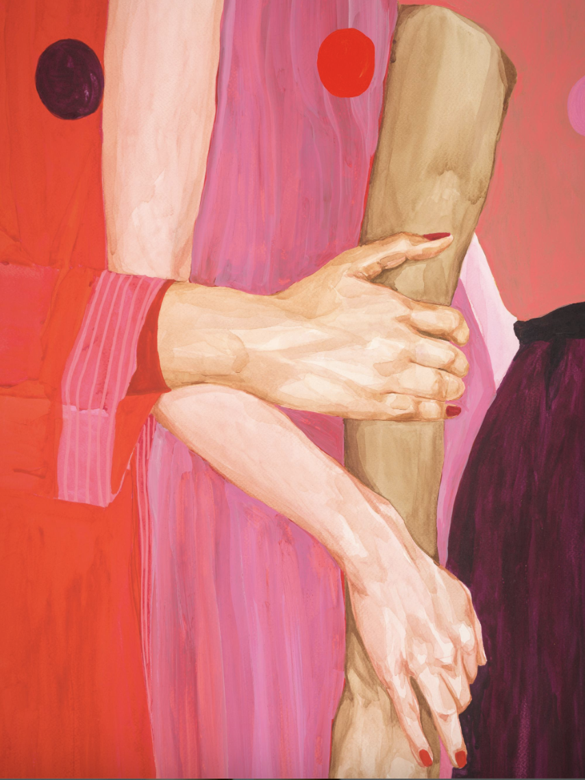
Gentle Support Modern Figurative Wall Art by Fir Gallery centers two hands in a quiet, deliberate grip against layered washes of coral, pink, and deep burgundy. The vertical composition, warm flesh tones, and small circular accents make it read as both grounded and dreamlike — a piece that feels expressive without becoming loud, and works best above a neutral sofa, behind a headboard, or along a narrow wall where its color rhythm can breathe.
Quick read
Figurative, warm, and quietly composed — a print that holds the wall without demanding it.
Product reference
Piece: Gentle Support Modern Figurative Wall Art by Fir Gallery
Format: Print
Size family: medium
View the productThe first thing you notice in Gentle Support isn't the color, even though the color is doing a lot of work. It's the gesture. Two hands meet at the center of the canvas — one resting, one holding — painted in warm, believable flesh tones against vertical bands of coral, soft pink, and deepening burgundy. Small circular shapes float in the background like distant suns. The figurative part feels human and specific. The background feels like weather.
That contrast is the whole idea. It's a modern figurative print that reads as intimate up close and graphic from across the room.
What the piece actually looks like on a wall
The brushwork is restrained. Color is built through transparent washes rather than thick application, which gives the pinks and corals a watercolor-like depth instead of a flat printed feel. From a few steps back, the vertical color planes do most of the heavy lifting — they pull the eye upward and make the piece feel taller than its footprint. Step closer and the hands take over: the knuckles, the slight tension in the fingers, the small marks of red at the nails.
It's expressive without being dramatic. The mood is closer to quiet warmth than statement-piece intensity.
How it changes a room
In a living room with cream upholstery and light wood furniture, the coral and pink tones warm everything around them without clashing. The burgundy edge keeps it from feeling sweet. In a bedroom, hung behind the headboard, the vertical format and human subject add a sense of closeness that abstract art often can't deliver.
Daylight brings out the subtler pink-to-burgundy transitions. Under warm lamplight in the evening, the piece deepens — the corals get richer, and the hands feel more sculptural. It's one of those prints that genuinely looks different at 10 a.m. and 9 p.m., which is part of why it holds up over time.
Who it suits — and who it doesn't
This piece works best in soft modern, contemporary, and transitional interiors that already lean warm. Think cream linen sofas, light ash or warm white oak furniture, plaster walls, natural textiles. It also pairs well with rooms that have a single deeper accent — a wine-toned throw, a terracotta rug, a dark wood frame elsewhere.
It's not the right call for cool-toned, high-contrast, gallery-white interiors where the warmth would feel isolated. It's also not a true focal-point statement piece in the oversized sense — it's a medium-scale print that anchors a wall rather than dominates it.
Compared to other figurative prints
A few honest comparisons worth making:
- Against line-drawing figurative art, this piece feels fuller, warmer, and more painterly.
- Against large abstract color-field prints, it gives you a human subject to land on, which makes a room feel more personal.
- Against portrait-style figurative work, it's less direct — no face, no eye contact — so it tends to feel calmer above a sofa or bed.
If you've been drawn to contemporary figurative painting but found portraits too intense for a living space, this is closer to the middle ground.
A real styling scenario
Picture a living room with a cream linen sectional, a light oak coffee table, and a jute or low-pile wool rug in a neutral tone. Hang Gentle Support centered above the sofa, roughly six to eight inches above the backrest. Add one ceramic lamp in a warm off-white, a small stack of books with a burgundy or oxblood spine facing out, and a single trailing plant on the side table. That's it. The print does the color work; everything else stays quiet.
Product details
- Type: Modern figurative art print
- Style: Modern Illustrative Realism — painterly, warm, and composed
- Subject: Two clasped hands against vertical color bands
- Color direction: Coral, soft pink, burgundy, warm flesh tones, with small red and deep purple accents
- Size category: Medium, vertical format
- Best rooms: Living room (above a neutral sofa), bedroom (behind a headboard or beside a dresser), narrow hallway walls
- Pairs well with: Cream linen, light ash wood, warm white oak, natural textiles
- Lighting note: Reads softer in daylight, richer under warm lamplight
For a closer look at the full composition and sizing, see Gentle Support Modern Figurative Wall Art by Fir Gallery.