
Still Shore: Why This Monochrome Landscape Belongs on Your Wall
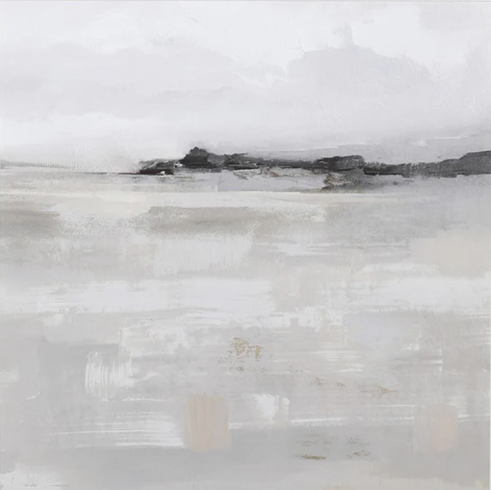
The Monochrome Landscape Still Shore is a hand-painted abstract seascape built around a muted, almost fully desaturated palette. A narrow band of dark rocky forms sits at the compositional midpoint, held between a pale layered foreground and a quiet open sky. It reads as both landscape and abstraction — specific enough to feel grounded, loose enough to let the room breathe around it.
Quick read
Minimal in color, deliberate in texture — this is wall art that earns attention by asking for very little.
Product reference
Piece: Monochrome Landscape Still Shore - Wall Art by Fir Gallery
Format: Hand-painted
Size family: medium
View the productAt first glance, Still Shore reads as a landscape — a wide horizon, a low band of dark rocky forms, and an open sky that takes up most of the upper canvas. Look longer and the abstraction becomes clear. The brushwork is loose and layered, especially in the lower half, where broad horizontal strokes overlap in a way that suggests tidal flats or a fog-covered shore without committing to either. It sits somewhere between impression and memory.
What the Palette Actually Does
The color range is narrow by design. Cool whites and soft greys run through most of the surface, with faint traces of warm stone showing through in a few places — just enough to keep the piece from feeling cold. The sky and the foreground share similar tones, which collapses the usual sense of depth and gives the whole composition a single, continuous stillness. That tonal compression is what makes it feel so quiet on the wall. It doesn't pull the eye in one direction — it settles the room.
Hand-Painted Texture and What It Means in Practice
This is a hand-painted canvas, which matters here more than it might with a graphic or typographic print. The surface has visible layering — brushwork that catches light slightly differently depending on where you're standing and what time of day it is. Under direct daylight, the texture reads more clearly and the warm undertones in the stone band come forward. Under lamplight in the evening, the piece shifts toward softer greys and the dark horizon line becomes more pronounced. It behaves differently across the day, which is something a flat print doesn't offer.
Where It Reads Best in a Room
Above a long, low sofa is the natural fit. The horizontal composition extends across the wall in a way that reinforces the furniture line rather than working against it. Light linen upholstery and pale timber floors are easy partners — the piece doesn't compete, it coheres. In a bedroom centered above the headboard, the wide format stretches the visual width of the wall and keeps the mood restful. A home office with white or light grey walls benefits from having this on the desk-facing wall specifically: the open sky tone is genuinely easy to rest your gaze on during long working sessions.
Who It Suits — and Who Might Want Something Different
This piece is well-suited to minimalist, Japandi, and soft modern interiors where the room is already working with a limited color range. It pairs with warm white linen, light oak, soft grey upholstery — furniture that doesn't compete for visual attention. If your space leans more maximalist, or if you're looking for something with strong color contrast or bold graphic structure, this piece will likely feel too recessive. The tension it offers is subtle — a narrow dark band against an open field — and that restraint is either the point or it isn't, depending on what your room needs.
Realistic Expectations
Because the palette is so muted, room lighting matters more than usual. In a dim or north-facing room with very little natural light, the piece can read flatter than it does in well-lit spaces. It rewards rooms with some daylight. The scale also matters: this is listed as a medium-format piece, which means it works best above furniture rather than on a large open feature wall where a single medium canvas might get lost. If you're working with a wide or tall wall, consider pairing it with a second complementary piece or choosing the larger size option if available.
Product Details
- Type: Hand-painted canvas wall art
- Style: Abstract, minimalist, wabi-sabi, impressionist
- Subject: Seascape / neutral abstract landscape
- Size category: Medium
- Palette: Cool whites, soft greys, faint warm stone — fully desaturated with minimal contrast
- Texture: Visible brushwork, layered surface finish
- Best rooms: Living room, bedroom, home office
- Interior styles: Minimalist, Japandi, soft modern
- Placement notes: Above a long sofa, centered above a headboard, or on the wall facing a desk
- Lighting note: Reads best in spaces with natural daylight or warm ambient lighting
If this piece fits the direction you're working toward, you can find full size options and details on the Monochrome Landscape Still Shore - Wall Art by Fir Gallery page.